大家好,基于Python的数据科学实践课程又到来了,大家尽情学习吧。本期内容主要由智亿同学与政委联合推出。
本次将继续学习如何用Plotly绘制更加美观的统计图。具体的,我们讲学会如何使用Plotly绘制主流图形。
还记得在Matplotlib小节,绘制箱线图的步骤吗?接下来,我们一起学习如何绘制箱线图。这里只展示与上一小节略有区别的参数,未展示的参数可以认为是一致的。
表1 箱线图go.Box()
例1 箱线图
1def group_buyer(x):
2 if x 500:
3 return 0
4 if x 1000:
5 return 1
6 if x 1500:
7
return 2
8 if x 2000:
9 return 3
10 else:
11 return None
12
13
14merge_data['购买人数等级'] = merge_data['购买人数'].apply(group_buyer)
15
16
17layout = go.Layout(
18 title = '购买人数等级评价数关系图',
19 xaxis = {
20 'title': '购买人数等级',
21 },
22 yaxis = {
23 'title': '评价数',
24 'range': [0, 1500]
25 },
26 showlegend = True
27)
28
29
30trace1 = go.Box(
31 x = merge_data['购买人数等级'],
32 y = merge_data['评价数'],
33
34 marker = {
35 'color': 'blue',
36 },
37 name = '购买人数等级',
38)
39
40
41fig = go.Figure(data=[trace1], layout=layout)
42iplot(fig)
运行结果如图1。
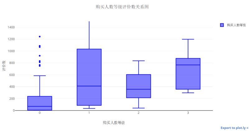
图1 箱线图
每个箱体颜色都一样,看起来一点都不高端大气上档次,让我们来点美化!
例2 箱线图美化
1d1 = merge_data['评价数'][merge_data['购买人数'] 500]
2d2 = merge_data['评价数'][merge_data['购买人数'] >= 500][merge_data['购买人数'] 1000]
3d3 = merge_data['评价数'][merge_data['购买人数'] >= 1000][merge_data['购买人数'] 1500]
4d4 = merge_data['评价数'][merge_data['购买人数'] >= 1500][merge_data['购买人数'] 2000]
5ys = [d1, d2, d3, d4]
6xs = [1, 2, 3, 4]
7
8import numpy as np
9colors = ['hsl('
+str(h)+',50%'+',50%)' for h in linspace(0, 360, 4)]
10
11
12layout = go.Layout(
13 title = '购买人数等级评价数关系图',
14 xaxis = {
15 'title': '购买人数等级',
16 },
17 yaxis = {
18 'title': '评价数',
19 'range': [0, 1500]
20 },
21 showlegend = True
22)
23
24
25traces = []
26for x, y, c in zip(xs, ys, colors):
27 trace = go.Box(
28 y = y,
29 marker = {
30 'color': c,
31 },
32 name = x,
33 boxpoints = 'all'
34 )
35 traces.append(trace)
36
37
fig = go.Figure(data=traces, layout=layout)
38iplot(fig)
运行结果如图2。
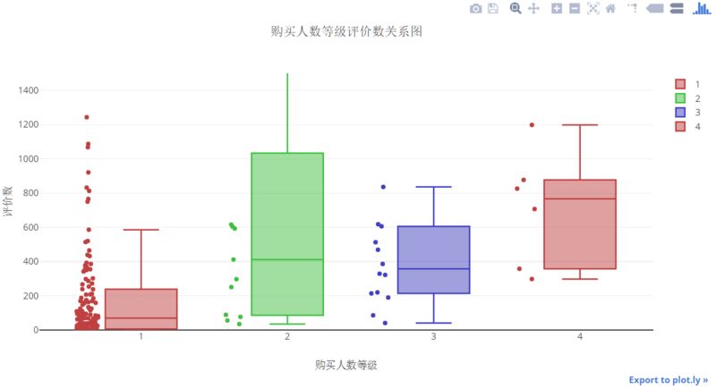
图2 箱线图美化
是不是瞬间又提升了逼格呢 :-)。构建不同颜色的箱线图,首先得把每组数据分好,再通过for循环的方式插入Trace,这样就调用4次go.Box()函数,最终画在一幅图上。因为每次调用Box函数时,只画一组数据点,所以x就不用设置了(没有分组数据了)。
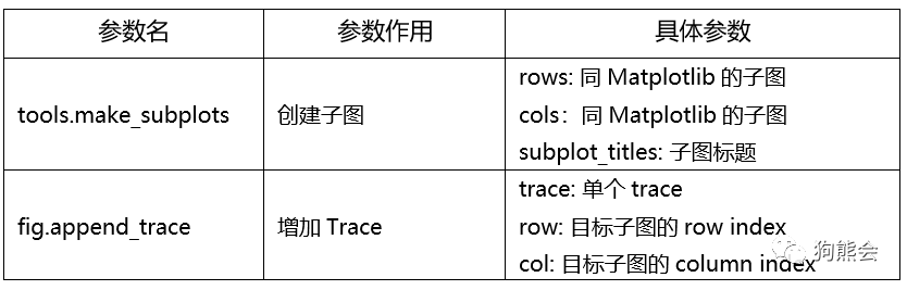
在Matplotlib小节,柱状图使用了两个子图。到目前为止,我们并没有使用Plotly进行子图绘制,接下来,我们一起学习如何用Plotly绘制多子图柱状图。再次强调,共同的参数在此不再罗列。
表2 柱状图的Layout参数
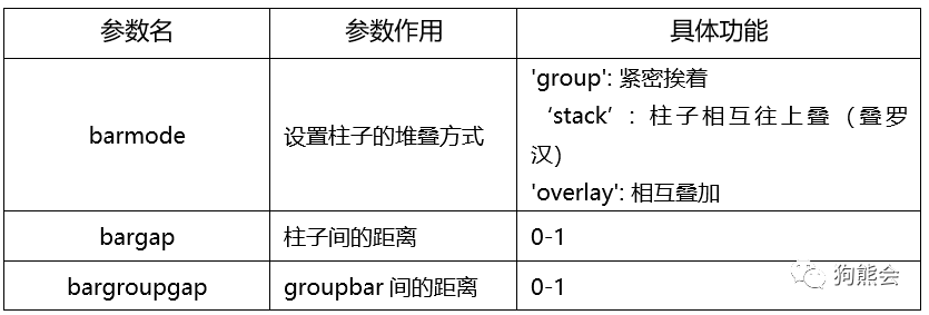
表3 多子图
例3 柱状图
1from plotly import tools
2
3width = 0.25
4labels = ['人均', '团购价', '评价数', '购买人数']
5ticks = [0.25, 1.25, 2.25]
6ticklabels = ['低评分', '中评分', '高评分']
7
8trace1 = go.Bar(
9 x = ticklabels,
10 y = data_for_bar[labels[0]],
11 width = width,
12 name = labels[0]
13)
14trace2 = go.Bar(
15 x = ticklabels,
16 y = data_for_bar[labels[1]],
17 name = labels[1]
18)
19trace3 = go.Bar(
20 x=ticklabels,
21 y=data_for_bar[labels[2]],
22 width = width,
23 name = labels[2]
24)
25trace4 = go.Bar(
26 x=ticklabels,
27 y=data_for_bar[labels[3]],
28 width = width,
29 name = labels[3]
30)
31
32data = [trace1, trace2, trace3, trace4]
33fig = tools.make_subplots(rows=1, cols=2, subplot_titles=('团购价商家等级', '购买人数商家等级'))
34fig.append_trace(trace1, 1, 1)
35fig.append_trace(trace2, 1, 1)
36fig.append_trace(trace3, 1, 2)
37fig.append_trace(trace4, 1, 2)
38
39# 注意多子图情况下,layout中的xy轴一定要带1,2,3,比如xaxis1代表第一幅图的x轴。
40fig['layout'].update(
41 title = '多子图绘制',
42 xaxis1 = {
43 'title': '商家等级',
44 },
45 yaxis1 = {
46 'title': '团购价',
47 'range': [0, 160]
48 },
49 xaxis2 = {
50 'title': '商家等级',
51 },
52 yaxis2 = {
53 'title': '购买人数',
54 'range': [0, 350]
55 },
56 showlegend = True,
57 barmode = 'group',
58 bargap = 0.5,
59)
60
61iplot(fig)
运行结果如图3所示。
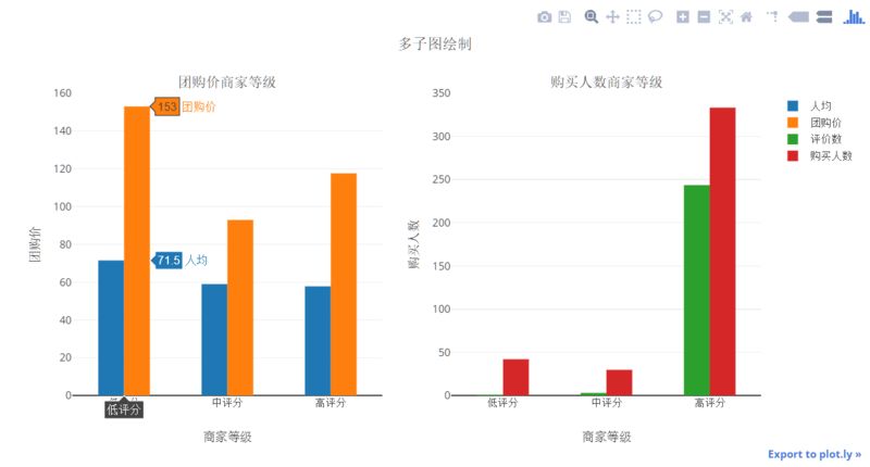
图3 柱状图
注意,这里由于每个Trace要指定到相应的子图上,所以Figure对象要提前于Layout创建,Layout的修改要使用update的方法进行修改。
在上一节,我们利用了Matplolib进行循环的方式绘制多子图柱状图,这里如何使用Plotly进行循环呢?赶紧动手试一试!
饼图、直方图的参数设置比较简单。
表4 饼图
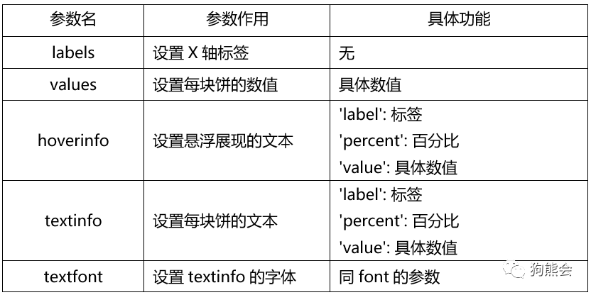
例4 饼图
1# 1、设置图的layout
2layout = go.Layout(
3 title = '商家评分等级',
4 showlegend = True
5)
6
7trace1 = go.Pie(
8 labels = ['中低评分', '高评分'],
9 values = [9, 151],
10 hoverinfo = 'label+percent', textinfo = 'value',
11 textfont = dict(size=20),
12 marker = {
13 'colors': ['#FEBFB3', '#E1396C'],
14 'line': {
15 'width': 2,
16 'color': '#fff'
17 }
18 },
19)
20
21fig = go.Figure(data=[trace1], layout=layout)
22iplot(fig)
运行结果如图4所示。
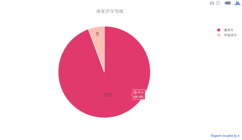
图4 饼图
再来看看直方图。
表5 直方图
例5 直方图
1
2layout = go.Layout(
3 title = '商家评分等级',
4 showlegend = True,
5 width = 600,
6 height = 400,
7 yaxis = {
8 'range': [0, 160],
9 }
10)
11
12trace1 = go.Histogram(
13 x = merge_data2['评分'],
14 name = '商家评分',
15 nbinsx = 30,
16 cumulative = {
17 'enabled': True,
18
'direction': 'increasing',
19 },
20 xbins = {
21 'start': 0,
22 'end': 5,
23 'size': 0.1,
24 },
25 marker = {
26 'color': 'red',
27 'line': {
28 'color': 'yellow',
29 'width': 0.5
30 }
31 }
32)
33
34fig = go.Figure(data=[trace1], layout=layout)
35iplot(fig)
运行结果如图5。
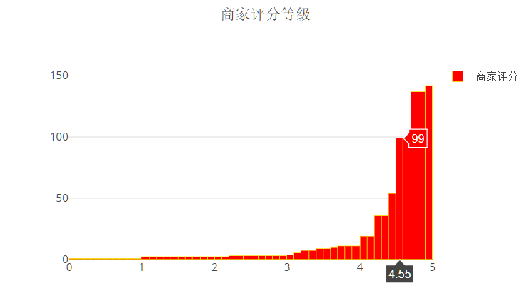
图5 直方图
整体来说,只要理解了Plotly的基于Json的实现方法,学习起来几乎没有什么难度。可能有小伙伴会觉得:Plotly参数这么多,记起来真难且慢。在你想说完这句话前,请把之前小节的参数说明再过一遍,Layout参数其实只有8个常用的,Scatter()、Box()、Bar()、Pie()、Histogram()这五个图形至少有一半参数是共通的(比如marker、text),不一样的只是图形的输入和排列方式,稍加运用即可熟练掌握。
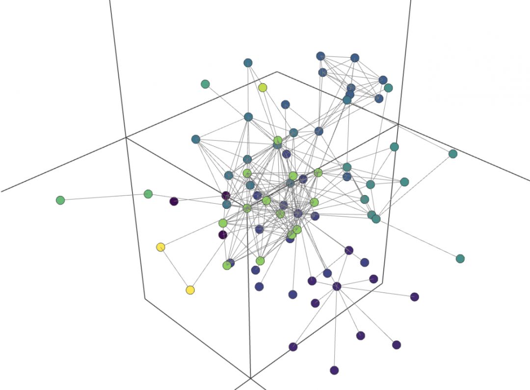
此外,Plotly还近百种图形,地图、3D图、网状图、蜡烛图,甚至动态图也不在画下。无论是什么专业,一定有你满意的图形!
好了,今天就讲到这里。
作业:打开Plotly官网,并找到其中的绘图例子。找到你喜欢的一个例子(例如如下社交网络图),学习绘制这样的图形。