本文意在创建一个得分图,该图同时描绘了从场上不同位置投篮得分的百分比和投篮次数,这和 Austin Clemen 个人网站上的帖子 http://www.austinclemens.com/shotcharts/ 类似 。
为了实现这个得分图,笔者参考了 Savvas Tjortjoglou 的帖子 http://savvastjortjoglou.com/nba-shot-sharts.html。这篇帖子很棒,但是他只描述了从不同位置投篮的次数。而笔者对在不同位置的投篮次数和进球百分比都很感兴趣,所以还需要进一步的工作,在原有基础上添加些东西,下面是实现过程。
#import some libraries and tell ipython we want inline figures rather than interactive figures.
%matplotlib inline
import matplotlib.pyplot as plt, pandas as pd, numpy as np, matplotlib as mpl
首先,我们需要获得每个球员的投篮数据。利用 Savvas Tjortjoglou 贴出的代码,笔者从 NBA.com 网站 API 上获取了数据。在此不会贴出这个函数的结果。如果你感兴趣,推荐你去看看 Savvas Tjortjoglou 的博客。
def aqcuire_shootingData(PlayerID,Season):
    import requests
    shot_chart_url = 'http://stats.nba.com/stats/shotchartdetail?CFID=33&CFPARAMS='+Season+'&ContextFilter='\
                    '&ContextMeasure=FGA&DateFrom=&DateTo=&GameID=&GameSegment=&LastNGames=0&LeagueID='\
                    '00&Location=&MeasureType=Base&Month=0&OpponentTeamID=0&Outcome=&PaceAdjust='\
                    'N&PerMode=PerGame&Period=0&PlayerID='+PlayerID+'&PlusMinus=N&Position=&Rank='\
                    'N&RookieYear=&Season='+Season+'&SeasonSegment=&SeasonType=Regular+Season&TeamID='\
                    '0&VsConference=&VsDivision=&mode=Advanced&showDetails=0&showShots=1&showZones=0'
    response = requests.get(shot_chart_url)
    headers = response.json()['resultSets'][0]['headers']
    shots = response.json()['resultSets'][0]['rowSet']
    shot_df = pd.DataFrame(shots, columns=headers)
    return shot_df
接下来,我们需要绘制一个包含得分图的篮球场图。该篮球场图例必须使用与NBA.com API 相同的坐标系统。例如,3分位置的投篮距篮筐必须为 X 单位,上篮距离篮筐则是 Y 单位。同样,笔者再次使用了 Savvas Tjortjoglou 的代码(哈哈,否则的话,搞明白 NBA.com 网站的坐标系统肯定会耗费不少的时间)。
def draw_court(ax=None, color='black', lw=2, outer_lines=False):
from matplotlib.patches import Circle, Rectangle, Arc
if ax is None:
ax = plt.gca()
hoop = Circle((0, 0), radius=7.5, linewidth=lw, color=color, fill=False)
backboard = Rectangle((-30, -7.5), 60, -1, linewidth=lw, color=color)
outer_box = Rectangle((-80, -47.5), 160, 190, linewidth=lw, color=color,
fill=False)
inner_box = Rectangle((-60, -47.5), 120, 190, linewidth=lw, color=color,
fill=False)
top_free_throw = Arc((0, 142.5), 120, 120, theta1=0, theta2=180,
linewidth=lw, color=color, fill=False)
bottom_free_throw = Arc((0, 142.5), 120, 120, theta1=180, theta2=0,
linewidth=lw, color=color, linestyle='dashed')
restricted = Arc
((0, 0), 80, 80, theta1=0, theta2=180, linewidth=lw,
color=color)
corner_three_a = Rectangle((-220, -47.5), 0, 140, linewidth=lw,
color=color)
corner_three_b = Rectangle((220, -47.5), 0, 140, linewidth=lw, color=color)
three_arc = Arc((0, 0), 475, 475, theta1=22, theta2=158, linewidth=lw,
color=color)
center_outer_arc = Arc((0, 422.5), 120, 120, theta1=180, theta2=0,
linewidth=lw, color=color)
center_inner_arc = Arc((0, 422.5), 40, 40, theta1=180, theta2=0,
linewidth=lw, color=color)
court_elements = [hoop, backboard, outer_box, inner_box, top_free_throw,
bottom_free_throw, restricted, corner_three_a,
corner_three_b, three_arc, center_outer_arc,
center_inner_arc]
if outer_lines:
outer_lines = Rectangle((-250, -47.5), 500, 470, linewidth=lw,
color=color, fill=False)
court_elements.append(outer_lines)
for element in court_elements:
ax.add_patch(element)
ax.set_xticklabels([])
ax.set_yticklabels([])
ax.set_xticks([])
ax.set_yticks([])
return ax
我想创造一个不同位置的投篮百分比数组,因此决定利用 matplot 的 Hexbin 函数 http://matplotlib.org/api/pyplot_api.html 将投篮位置均匀地分组到六边形中。该函数会对每个六边形中每一个位置的投篮次数进行计数。
六边形是均匀的分布在 XY 网格中。「gridsize」变量控制六边形的数目。「extent」变量控制第一个和最后一个六边形的绘制位置(一般来说第一个六边形的位置基于第一个投篮的位置)。
计算命中率则需要对每个六边形中投篮的次数和投篮得分次数进行计数,因此笔者对同一位置的投篮和得分数分别运行 hexbin 函数。然后,只需用每个位置的进球数除以投篮数。
def find_shootingPcts(shot_df, gridNum):
    x = shot_df.LOC_X[shot_df['LOC_Y']<425.1] #i want to make sure to only include shots I can draw
    y = shot_df.LOC_Y[shot_df['LOC_Y']<425.1]

    x_made = shot_df.LOC_X[(shot_df['SHOT_MADE_FLAG']==1) & (shot_df['LOC_Y']<425.1)]
    y_made = shot_df.LOC_Y[(shot_df['SHOT_MADE_FLAG']==1) & (shot_df['LOC_Y']<425.1)]

    #compute number of shots made and taken from each hexbin location
    hb_shot = plt.hexbin(x, y, gridsize=gridNum, extent=(-250,250,425,-50));
    plt.close() #don't want to show this figure!
    hb_made = plt.hexbin(x_made, y_made, gridsize=gridNum, extent=(-250,250,425,-50),cmap=plt.cm.Reds);
    plt.close()

    #compute shooting percentage
    ShootingPctLocs = hb_made.get_array() / hb_shot.get_array()
    ShootingPctLocs[np.isnan(ShootingPctLocs)] = 0 #makes 0/0s=0
    return (ShootingPctLocs, hb_shot)
笔者非常喜欢 Savvas Tjortjoglou 在他的得分图中加入了球员头像的做法,因此也顺道用了他的这部分代码。球员照片会出现在得分图的右下角。
def acquire_playerPic(PlayerID, zoom, offset=(250,400)):
from matplotlib import offsetbox as osb
import urllib
pic = urllib.urlretrieve("http://stats.nba.com/media/players/230x185/"+PlayerID+".png",PlayerID+".png")
player_pic = plt.imread(pic[0])
img = osb.OffsetImage(player_pic
, zoom)
#img.set_offset(offset)
img = osb.AnnotationBbox(img, offset,xycoords='data',pad=0.0, box_alignment=(1,0), frameon=False)
return img
笔者想用连续的颜色图来描述投篮进球百分比,红圈越多代表着更高的进球百分比。虽然「红」颜色图示效果不错,但是它会将0%的投篮进球百分比显示为白色http://matplotlib.org/users/colormaps.html,而这样显示就会不明显,所以笔者用淡粉红色代表0%的命中率,因此对红颜色图做了下面的修改。
#cmap = plt.cm.Reds
#cdict = cmap._segmentdata
cdict = {
    'blue': [(0.0, 0.6313725709915161, 0.6313725709915161), (0.25, 0.4470588266849518, 0.4470588266849518), (0.5, 0.29019609093666077, 0.29019609093666077), (0.75, 0.11372549086809158, 0.11372549086809158), (1.0, 0.05098039284348488, 0.05098039284348488)],
    'green': [(0.0, 0.7333333492279053, 0.7333333492279053), (0.25, 0.572549045085907, 0.572549045085907), (0.5, 0.4156862795352936, 0.4156862795352936), (0.75, 0.0941176488995552, 0.0941176488995552), (1.0, 0.0, 0.0)],
    'red': [(0.0, 0.9882352948188782, 0.9882352948188782), (0.25, 0.9882352948188782, 0.9882352948188782), (0.5, 0.9843137264251709, 0.9843137264251709), (0.75, 0.7960784435272217, 0.7960784435272217), (1.0, 0.40392157435417175, 0.40392157435417175)]
}

mymap = mpl.colors.LinearSegmentedColormap('my_colormap', cdict, 1024)
好了,现在需要做的就是将它们合并到一块儿。下面所示的较大函数会利用上文描述的函数来创建一个描述投篮命中率的得分图,百分比由红圈表示(红色越深 = 更高的命中率),投篮次数则由圆圈的大小决定(圆圈越大 = 投篮次数越多)。需要注意的是,圆圈在交叠之前都能增大。一旦圆圈开始交叠,就无法继续增大。
在这个函数中,计算了每个位置的投篮进球百分比和投篮次数。然后画出在该位置投篮的次数(圆圈大小)和进球百分比(圆圈颜色深浅)。
def shooting_plot(shot_df, plot_size=(12,8),gridNum=30):
from matplotlib.patches import Circle
x = shot_df.LOC_X[shot_df['LOC_Y']<425.1]
y = shot_df.LOC_Y[shot_df['LOC_Y']<425.1]
#compute shooting percentage and # of shots
(ShootingPctLocs, shotNumber) = find_shootingPcts(shot_df, gridNum)
#draw figure and court
fig = plt.figure(figsize=plot_size)#(12,7)
cmap = mymap #my modified colormap
ax = plt.axes([0.1, 0.1, 0.8, 0.8]) #where to place the plot within the figure
draw_court(outer_lines=False)
plt.xlim(-250,250)
plt.ylim(400, -25)
#draw player image
zoom = np.float(plot_size[0])/(12.0*2) #how much to zoom the player's pic. I have this hackily dependent on figure size
img = acquire_playerPic(PlayerID, zoom)
ax.add_artist(img)
#draw circles
for i, shots in enumerate(ShootingPctLocs):
restricted = Circle(shotNumber.get_offsets()[i], radius=shotNumber.get_array()[i],
color=cmap(shots),alpha=0.8, fill=True)
if restricted.radius > 240/gridNum: restricted.radius=240/gridNum
ax.add_patch(restricted)
#draw color bar
ax2 = fig.add_axes([0.92, 0.1, 0.02, 0.8])
cb = mpl.colorbar.ColorbarBase(ax2,cmap=cmap, orientation='vertical')
cb.set_label('Shooting %')
cb.set_ticks([0.0, 0.25, 0.5, 0.75, 1.0])
cb.set_ticklabels([
'0%','25%', '50%','75%', '100%'])
plt.show()
return ax
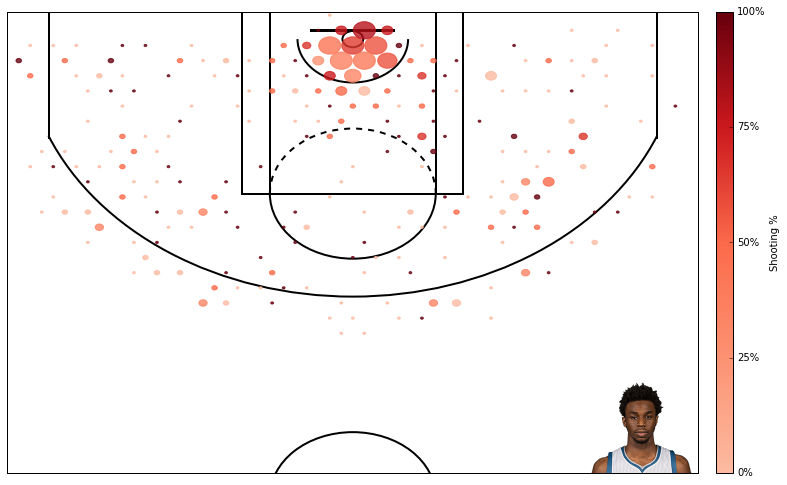
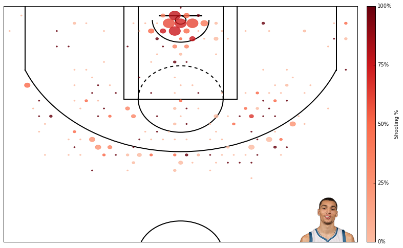
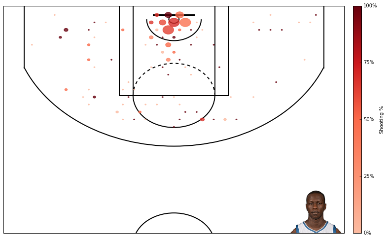
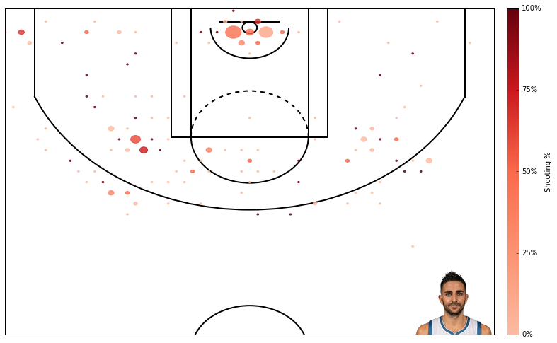
好了,大功告成!因为笔者是森林狼队的粉丝,在下面用几分钟跑出了森林狼队前六甲的得分图。
PlayerID = '203952' #andrew wiggins
shot_df = aqcuire_shootingData(PlayerID,'2015-16')
ax = shooting_plot(shot_df, plot_size=(12,8));
PlayerID = '1626157' #karl anthony towns
shot_df = aqcuire_shootingData(PlayerID,'2015-16')
ax = shooting_plot(shot_df, plot_size=(12,8));

PlayerID = '203897' #zach lavine
shot_df = aqcuire_shootingData(PlayerID,'2015-16')
ax = shooting_plot(shot_df, plot_size=(12,8));
PlayerID = '203476' #gorgui deing
shot_df = aqcuire_shootingData(PlayerID,'2015-16')
ax = shooting_plot(shot_df, plot_size=(12,8));
PlayerID = '2755' #kevin martin
shot_df = aqcuire_shootingData(PlayerID,'2015-16')
ax = shooting_plot(shot_df, plot_size=(12,8));

PlayerID = '201937' #ricky rubio
shot_df = aqcuire_shootingData(PlayerID,'2015-16')
ax = shooting_plot(shot_df, plot_size=(12,8));
使用 hexbin 函数也是有隐患的,第一它并没有解释由于三分线而导致的非线性特性(一些 hexbin 函数同时包括了2分和3分的投篮)。它很好的限定了一些窗口来进行3分投篮,但如果没有这个位置的硬编码就没有办法做到这一点。此外 hexbin 方法的一个优点与是可以很容易地改变窗口的数量,但不确定是否可以同样灵活的处理2分投篮和3分投篮。
另外一个隐患在于此图将所有投篮都一视同仁,这相当不公平。在禁区投篮命中40%和三分线后的投篮命中40%可是大不相同。Austin Clemens 的解决办法是将命中率与联赛平均分关联。也许过几天笔者也会实现与之类似的功能。
原文 Creating NBA Shot Charts 作者 Dan Vatterott ,本文由 OneAPM 工程师编译整理。
OneAPM 能够帮你查看 Python 应用程序的方方面面,不仅能够监控终端的用户体验,还能监控服务器性能,同时还支持追踪数据库、第三方 API 和 Web 服务器的各种问题。想阅读更多技术文章,请访问 OneAPM 官方技术博客。
本文转自 OneAPM 官方博客


