作者:屈希峰
来源:大数据DT(ID:bigdatadt)

01 概述
散点图(Scatter)又称散点分布图,是以一个变量为横坐标,另一个变量为纵坐标,利用散点(坐标点)的分布形态反映变量统计关系的一种图形。
特点是能直观表现出影响因素和预测对象之间的总体关系趋势。优点是能通过直观醒目的图形方式反映变量间关系的变化形态,以便决定用何种数学表达方式来模拟变量之间的关系。散点图不仅可传递变量间关系类型的信息,还能反映变量间关系的明确程度。
通过观察散点图数据点的分布情况,我们可以推断出变量间的相关性。如果变量之间不存在相互关系,那么在散点图上就会表现为随机分布的离散的点,如果存在某种相关性,那么大部分的数据点就会相对密集并以某种趋势呈现。
数据的相关关系大体上可以分为:正相关(两个变量值同时增长)、负相关(一个变量值增加,另一个变量值下降)、不相关、线性相关、指数相关等,表现在散点图上的大致分布如图1所示。那些离点集群较远的点我们称之为离群点或者异常点。
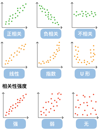
▲图1 散点数据的相关性
在Python体系中,可使用Scipy、Statsmodels或Sklearn等对离散点进行回归分析,归纳现有数据并进行预测分析。对于那些变量之间存在密切关系,但是这些关系又不像数学公式和物理公式那样能够精确表达的,散点图是一种很好的图形工具,可以进行直观展示,如图2所示。
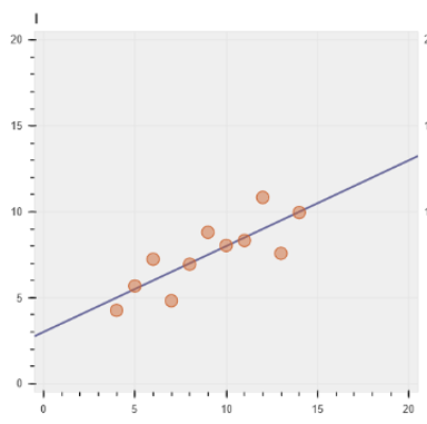
▲图2 散点数据拟合(线性)
但是在分析过程中需要注意,变量之间的相关性并不等同于确定的因果关系,仍需要考虑其他影响因素。
02 实例
散点图代码示例如下所示。
代码示例①
# 数据
x = [1, 2, 3, 4, 5]
y = [6, 7, 2, 4, 5]
# 画布:尺寸
p = figure(plot_width=400, plot_height=400)
# 画图
p.scatter(x, y,
size=20, # screen units 显示器像素单位
# radius=1, # data-space units 坐标轴单位
marker="circle", color="navy", alpha=0.5)
# p.circle(x, y, size=20, color="navy", alpha=0.5)
# 显示
show(p)
运行结果如图3所示。
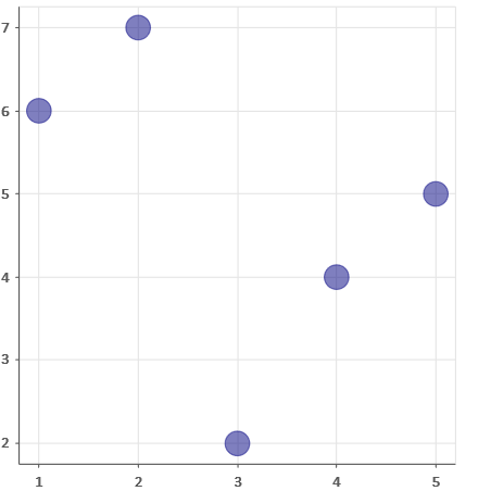
▲图3 代码示例①运行结果
代码示例①中第7行使用scatter方法进行散点图绘制;第11行采用circle方法进行散点图绘制(推荐)。关于这两个方法的参数说明如下。
p.circle(x, y, **kwargs)参数说明。
x (str or seq[float]) : 离散点的x坐标,列名或列表
y (str or seq[float]) : 离散点的y坐标
size (str or list[float]) : 离散点的大小,屏幕像素单位
marker (str, or list[str]) : 离散点标记类型名称或名称列表
color (color value, optional) : 填充及轮廓线的颜色
source (`~bokeh.models.sources.ColumnDataSource`) : Bokeh专属数据格式
**kwargs: 其他自定义属性;其中标记点类型marker默认值为:“marker="circle"”,可以用“radius”定义圆的半径大小(单位为坐标轴单位)。这在Web数据化中非常有用,不同的方式,在不同的设备上的展示效果会有些许差异。
p.scatter(x, y, **kwargs)参数说明。
x (:class:`~bokeh.core.properties.NumberSpec` ) : x坐标
y (:class:`~bokeh.core.properties.NumberSpec` ) : y坐标
angle (:class:`~bokeh.core.properties.AngleSpec` ) : 旋转角度
angle_units (:class:`~bokeh.core.enums.AngleUnits`) : (default: 'rad') 默认:弧度,也可以采用度('degree')
fill_alpha (:class:`~bokeh.core.properties.NumberSpec` ) : (default: 1.0) 填充透明度,默认:不透明
fill_color (:class:`~bokeh.core.properties.ColorSpec` ) : (default: 'gray') 填充颜色,默认:灰色
line_alpha (:class:`~bokeh.core.properties.NumberSpec` ) : (default: 1.0) 轮廓线透明度,默认:不透明
line_cap : (:class:`~bokeh.core.enums.LineCap` ) : (default: 'butt') 线端(帽)
line_color (:class:`~bokeh.core.properties.ColorSpec` ) : (default: 'black') 轮廓线颜色,默认:黑色
line_dash (:class:`~bokeh.core.properties.DashPattern` ) : (default: []) 虚线
line_dash_offset (:class:`~bokeh.core.properties.Int` ) : (default: 0) 虚线偏移
line_join (:class:`~bokeh.core.enums.LineJoin` ) : (default: 'bevel')
-
line_width (:class:`~bokeh.core.properties.NumberSpec` ) : (default: 1) 线宽,默认:1
另外,Bokeh中的一些属性,如`~bokeh.core.properties.NumberSpec `、`~bokeh.core.properties.ColorSpec`可以在Jupyter notebook中通过`import bokeh.core.properties.NumberSpec `导入该属性,然后再查看其详细的使用说明。
代码示例②
# 数据
N = 4000
x = np.random.random(size=N) * 100 # 随机点x坐标
y = np.random.random(size=N) * 100 # 随机点y坐标
radii = np.random.random(size=N) * 1.5 # 随机半径
# 工具条
TOOLS="hover,crosshair,pan,wheel_zoom,box_zoom,reset,tap,save,box_select,poly_select,lasso_select"
# RGB颜色,画布1,绘图1
colors2 = ["#%02x%02x%02x" % (int(r), int(g), 150) for r, g in zip(50+2*x, 30+2*y)]
p1 = figure(width=300, height=300, tools=TOOLS)
p1.scatter(x,y, radius=radii, fill_color=colors2, fill_alpha=0.6, line_color=None
)
# RGB颜色,画布2,绘图2
colors2 = ["#%02x%02x%02x" % (150, int(g), int(b)) for g, b in zip(50+2*x, 30+2*y)]
p2 = figure(width=300, height=300, tools=TOOLS)
p2.scatter(x,y, radius=radii, fill_color=colors2, fill_alpha=0.6, line_color=None)
# 直接显示
# show(p1)
# show(p2)
# 网格显示
from bokeh.layouts import gridplot
grid = gridplot([[p1, p2]])
show(grid)
运行结果如图4所示。
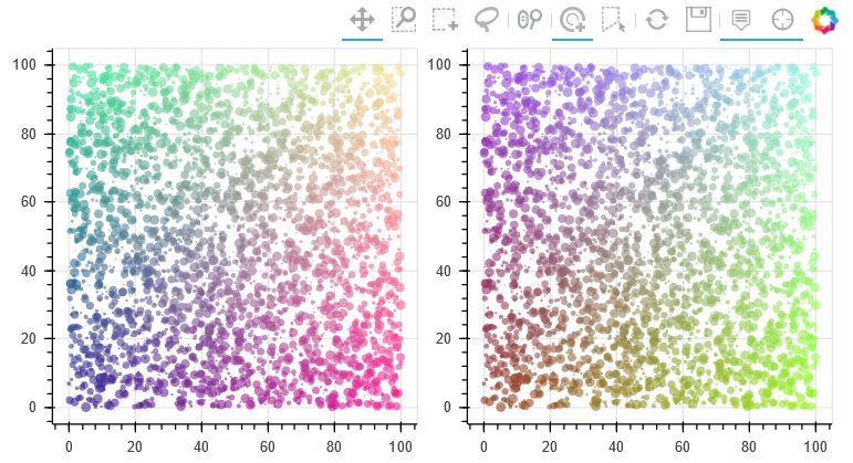
▲图4 代码示例②运行结果
代码示例②中第11行和第15行使用scatter方法进行散点图绘制。第7行工具条中的不同工具定义,第9行数据点的不同颜色定义,第20行和第21行采用网格显示图形,可以提前了解这些技巧,具体使用方法在下文中会专门进行介绍。
代码示例③
from bokeh.sampledata.iris import flowers
# 配色
colormap = {'setosa': 'red', 'versicolor': 'green', 'virginica': 'blue'}
colors = [colormap[x] for x in flowers['species']]
# 画布
p = figure(title = "Iris Morphology")
# 绘图
p.circle(flowers["petal_length"], flowers["petal_width"],
color=colors, fill_alpha=0.2, size=10)
# 其他
p.xaxis.axis_label = 'Petal Length'
p.yaxis.axis_label = 'Petal Width'
# 显示
show(p)
运行结果如图5所示。
代码示例③再次对前面提到的鸢尾花的数据集进行分析,图5中x轴为花瓣长度,y轴为花瓣宽度,据此可以将该散点数据聚类为3类。同时,该段代码展示了常规图形的绘制流程,含x、y轴的标签。
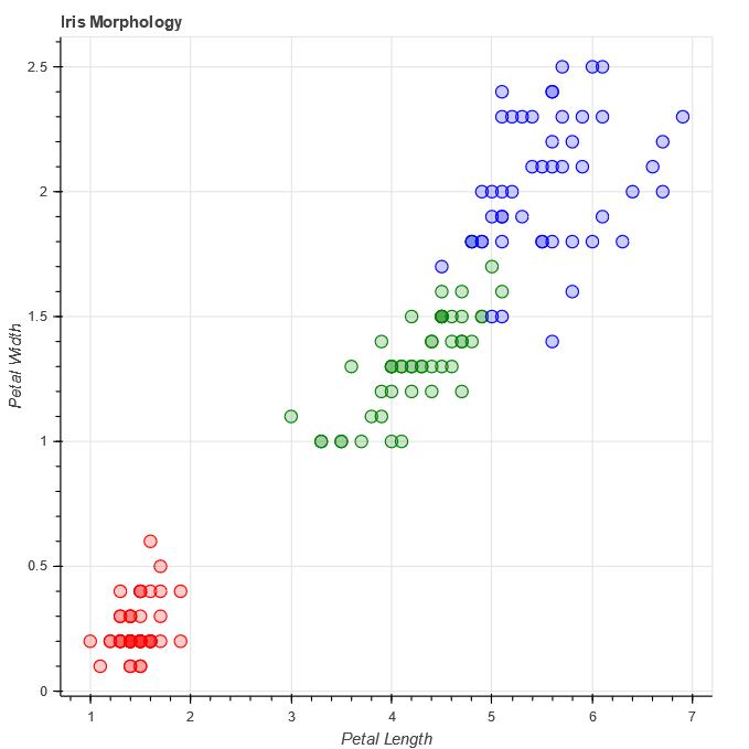
▲图5 代码示例③运行结果
代码示例④
from bokeh.layouts import column, gridplot
from bokeh.models import BoxSelectTool, Div
# 数据
x = np.linspace(0, 4*np.pi, 100)
y = np.sin(x)
# 工具条
TOOLS = "wheel_zoom,save,box_select,lasso_select,reset"
# HTML代码
div = Div(text="""
Bokeh中的画布可通过多种布局方式进行显示;
通过配置参数BoxSelectTool,在图中用鼠标选择数据,采用不同方式进行交互。
""") # HTML代码直接作为一个图层显示,也可以作为整个HTML文档
# 视图属性
opts = dict(tools=TOOLS, plot_width=350, plot_height=350)
# 绘图1
p1 = figure(title="selection on mouseup", **opts)
p1.circle(x, y, color="navy", size=6, alpha=0.6)
# 绘图2
p2 = figure(title="selection on mousemove", **opts)
p2.square(x, y, color="olive", size=6
, alpha=0.6)
p2.select_one(BoxSelectTool).select_every_mousemove = True
# 绘图3
p3 = figure(title="default highlight", **opts)
p3.circle(x, y, color="firebrick", alpha=0.5, size=6)
# 绘图4
p4 = figure(title="custom highlight", **opts)
p4.square(x, y, color="navy", size=6, alpha=0.6,
nonselection_color="orange", nonselection_alpha=0.6)
# 布局
layout = column(div,
gridplot([[p1, p2], [p3, p4]], toolbar_location="right"),
sizing_mode="scale_width") # sizing_mode 根据窗口宽度缩放图像
# 绘图
show(layout)
Bokeh中的画布可通过多种布局方式进行显示:通过配置视图参数,在视图中进行交互可视化。运行结果如图6所示。
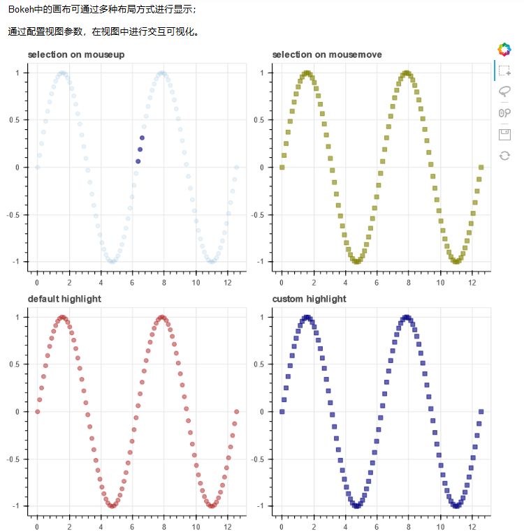
▲图6 代码示例④运行结果
代码示例④让读者感受一下Bokeh的交互效果,Div方法可以直接使用HTML标签,其作为一个独立的图层进行显示(第30行)。另外需要注意,可以通过`nonselection_`,`nonselection_alpha`或`nonselection_fill_alpha`设套索置选取数据时的散点的颜色、透明度等。
代码示例⑤
from bokeh.models import (
ColumnDataSource,
Range1d, DataRange1d,
LinearAxis, SingleIntervalTicker, FixedTicker,
Label, Arrow, NormalHead,
HoverTool, TapTool, CustomJS)
from bokeh.sampledata.sprint import sprint
abbrev_to_country = {
"USA": "United States",
"GBR": "Britain",
"JAM": "Jamaica",
"CAN": "Canada",
"TRI": "Trinidad and Tobago",
"AUS": "Australia",
"GER": "Germany",
"CUB": "Cuba",
"NAM": "Namibia",
"URS": "Soviet Union",
"BAR": "Barbados",
"BUL"
: "Bulgaria",
"HUN": "Hungary",
"NED": "Netherlands",
"NZL": "New Zealand",
"PAN": "Panama",
"POR": "Portugal",
"RSA": "South Africa",
"EUA": "United Team of Germany",
}
gold_fill = "#efcf6d"
gold_line = "#c8a850"
silver_fill = "#cccccc"
silver_line = "#b0b0b1"
bronze_fill = "#c59e8a"
bronze_line = "#98715d"
fill_color = { "gold": gold_fill, "silver": silver_fill, "bronze": bronze_fill }
line_color = { "gold": gold_line, "silver": silver_line, "bronze": bronze_line }
def selected_name(name, medal, year):
return
name if medal == "gold" and year in [1988, 1968, 1936, 1896] else ""
t0 = sprint.Time[0]
sprint["Abbrev"] = sprint.Country
sprint["Country"] = sprint.Abbrev.map(lambda abbr: abbrev_to_country[abbr])
sprint["Medal"] = sprint.Medal.map(lambda medal: medal.lower())
sprint["Speed"] = 100.0/sprint.Time
sprint["MetersBack"] = 100.0*(1.0 - t0/sprint.Time)
sprint["MedalFill"] = sprint.Medal.map(lambda medal: fill_color[medal])
sprint["MedalLine"] = sprint.Medal.map(lambda medal: line_color[medal])
sprint["SelectedName"] = sprint[["Name", "Medal", "Year"]].apply(tuple, axis=1).map(lambda args: selected_name(*args))
source = ColumnDataSource(sprint)
xdr = Range1d(start=sprint.MetersBack.max()+2, end=0
) # XXX: +2 is poor-man's padding (otherwise misses last tick)
ydr = DataRange1d(range_padding=4, range_padding_units="absolute")
plot = figure(
x_range=xdr, y_range=ydr,
plot_width=1000, plot_height=600,
toolbar_location=None,
outline_line_color=None, y_axis_type=None)
plot.title.text = "Usain Bolt vs. 116 years of Olympic sprinters"
plot.title.text_font_size = "14pt"
plot.xaxis.ticker = SingleIntervalTicker(interval=5, num_minor_ticks=0)
plot.xaxis.axis_line_color = None
plot.xaxis.major_tick_line_color = None
plot.xgrid.grid_line_dash = "dashed"
yticker = FixedTicker(ticks=[1900, 1912, 1924, 1936, 1952, 1964, 1976, 1988, 2000, 2012])
yaxis = LinearAxis(ticker=yticker, major_tick_in=-5, major_tick_out=10)
plot.add_layout(yaxis, "right")
medal = plot.circle(x="MetersBack", y="Year", radius=dict(value=
5, units="screen"),
fill_color="MedalFill", line_color="MedalLine", fill_alpha=0.5, source=source, level="overlay")
plot.text(x="MetersBack", y="Year", x_offset=10, y_offset=-5, text="SelectedName",
text_align="left", text_baseline="middle", text_font_size="9pt", source=source)
no_olympics_label = Label(
x=7.5, y=1942,
text="No Olympics in 1940 or 1944",
text_align="center", text_baseline="middle",
text_font_size="9pt", text_font_style="italic", text_color="silver")
no_olympics = plot.add_layout(no_olympics_label)
x = sprint[sprint.Year == 1900].MetersBack.min() - 0.5
arrow = Arrow(x_start=x, x_end=5, y_start=1900, y_end=1900, start=NormalHead(fill_color="black", size=6), end=None, line_width=1.5)
plot.add_layout(arrow)
meters_back = Label(
x=5, x_offset=10
, y=1900,
text="Meters behind 2012 Bolt",
text_align="left", text_baseline="middle",
text_font_size="10pt", text_font_style="bold")
plot.add_layout(meters_back)
disclaimer = Label(
x=0, y=0, x_units="screen", y_units="screen",
text="This chart includes medals for the United States and Australia in the \"Intermediary\" Games of 1906, which the I.O.C. does not formally recognize.",
text_font_size="8pt", text_color="silver")
plot.add_layout(disclaimer, "below")
tooltips = """
@Name
(@Abbrev)
@Time{0.00}
@Year
@{MetersBack}{0.00} meters behind
"""
plot.add_tools(HoverTool(tooltips=tooltips, renderers=[medal]))
open_url = CustomJS(args=dict(source=source), code="""
source.inspected._1d.indices.forEach(function(index) {
var name = source.data["Name"][index];
var url = "http://en.wikipedia.org/wiki/" + encodeURIComponent(name);
window.open(url);
});
""")
plot.add_tools(TapTool(callback=open_url, renderers=[medal], behavior="inspect"))
show(plot)
运行结果如图7所示。
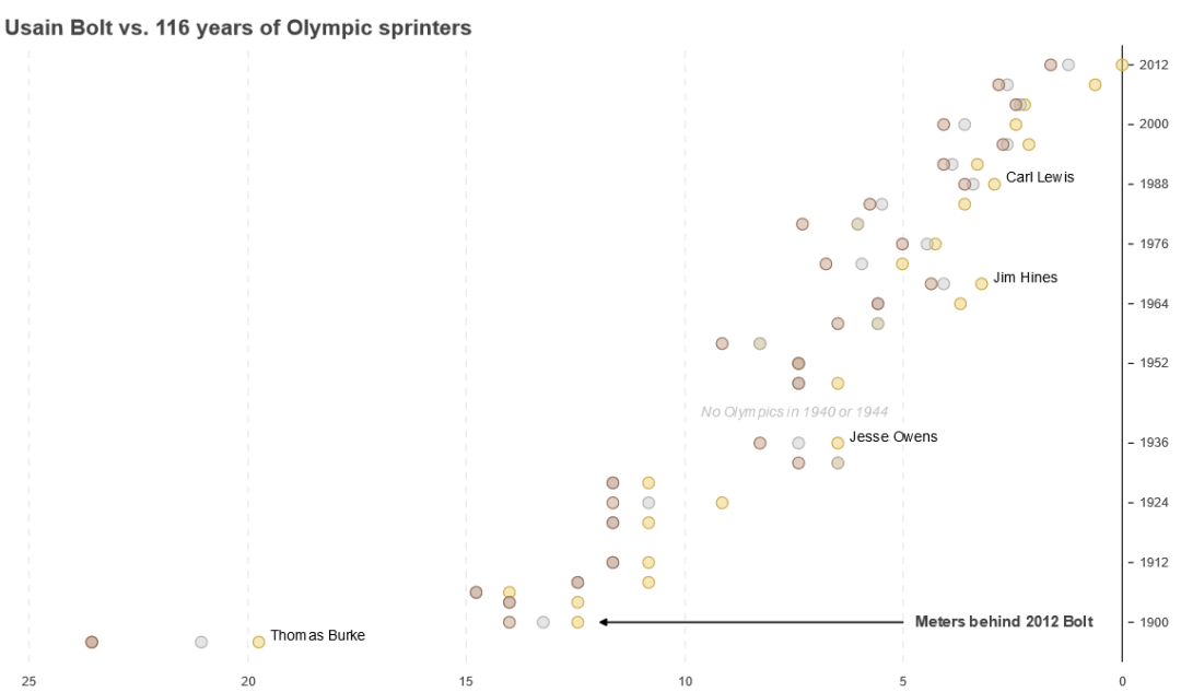
▲图7 代码示例⑤运行结果
代码示例⑤展示了短跑选手博尔特与116年来奥运会其他短跑选手成绩的对比情况。上述代码包含数据预处理、自定义绘图属性、数据标记、交互式显示等较为复杂的操作,不作为本文重点;读者仅需要知道通过哪些代码可以实现哪些可视化的效果即可。
本文通过5个代码示例展示了散点图的绘制技巧,绘制难度也逐渐增大,与此同时,展现的效果也越来越好。读者在学习过程中可以多思考,在这个示例中哪些数据需要交互式展示,采用哪种展示方式更好。


