一、数据可视化介绍
数据可视化是指将数据放在可视环境中、进一步理解数据的技术,可以通过它更加详细地了解隐藏在数据表面之下的
模式
、
趋势
和
相关性
。
Python提供了很多数据可视化的库:
二、matplotlib和pandas画图
1.matplotlib简介和简单使用
matplotlib是Python最著名的绘图库,它提供了一整套和Matlab相似的命令API,十分适合
https://matplotlib.org/gallery.html
中有大量的缩略图案例可以使用。
matplotlib画图的子库:
pyplot子库
pylab模块
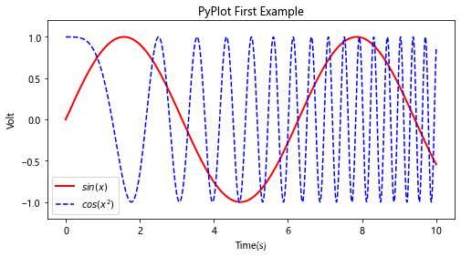
使用matplotlib快速绘图导入库和创建绘图对象如下:
import matplotlib. pyplot as plt
plt. figure( figsize= ( 8 , 4 ) )
创建绘图对象时,同时使它成为当前的绘图对象。
8 * 80 = 640
像素。
也可以不创建绘图对象直接调用plot方法绘图,matplotlib会自动创建一个绘图对象。
pyplot画图简单使用如下:
import numpy as np
import matplotlib. pyplot as plt
x = np. linspace( 0 , 10 , 1000 )
y = np. sin( x)
z = np. cos( x** 2 )
plt. figure( figsize= ( 8 , 4 ) )
plt. plot( x, y, label= "$sin(x)$" , color= "red" , linewidth= 2 )
plt. plot( x, z, "b--" , label= "$cos(x^2)$" )
plt. xlabel( "Time(s)" )
plt. ylabel( "Volt" )
plt. title( "PyPlot First Example" )
plt. ylim( - 1.2 , 1.2 )
plt. legend( )
plt. show( )
1 2 3 4 5 6 7 8 9 10 11 12 13 14 15 16 17 18 19 20
显示:
其中:
plt
plot( x, y, label= "$sin(x)$" , color= "red" , linewidth= 2 )
plt. plot( x, z, "b--" , label= "$cos(x^2)$" )
第一行将x、y数组传递给plot之后,用关键字参数指定各种属性:
label
$
符号,就会使用内置的latex引擎绘制数学公式。
color
#
字符开头的三个16进制数,例如
#ff0000
表示红色,或者用值在0到1范围之内的三个元素的元组表示,例如
(1.0, 0.0, 0.0)
也表示红色。
linewidth
lw
。
曲线样式
b--
指定曲线的颜色和线型,它通过一些易记的符号指定曲线的样式,其中b表示蓝色,–表示线型为虚线。
plt.plot?
可以查看格式化字符串以及各个参数的详细说明。
plt. xlabel( "Time(s)" )
plt. ylabel( "Volt" )
plt. title( "PyPlot First Example" )
plt. ylim( - 1.2 , 1.2 )
plt. legend( )
通过一系列函数设置当前Axes对象的各个属性:
xlabel、ylabel
title
xlim、ylim
legend
最后调用
plt.show()
显示出绘图窗口。
一个绘图对象(figure)可以包含多个轴(axis),在Matplotlib中用轴表示一个绘图区域,可以将其理解为子图。上面的第一个例子中,绘图对象只包括一个轴,因此只显示了一个轴(子图Axes)。可以使用
subplot
函数快速绘制有多个轴的图表。
subplot( numRows, numCols, plotNum)
subplot将整个绘图区域等分为numRows行和numCols列个子区域,然后按照从左到右、从上到下的顺序对每个子区域进行编号,左上的子区域的编号为1。
subplot(323)
和
subplot(3,2,3)
是相同的。
如下:
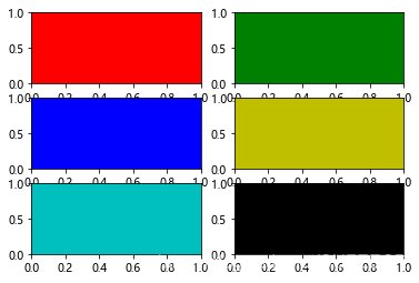
for idx, color in enumerate ( "rgbyck" ) :
plt. subplot( 320 + idx+ 1 , facecolor= color)
plt. show( )
显示:
可以看到:
facecolor
参数给每个轴设置不同的背景颜色。
如果希望某个轴占据整个行或者列的话,可以如下:
plt. subplot( 221 )
plt. subplot( 222 )
plt. subplot( 212 )
plt. show( )
显示:
再举一个创建子图的例子:
plt. figure( 1 )
plt. figure( 2 )
ax1 = plt. subplot( 211 )
ax2 = plt. subplot( 212 )
x = np. linspace( 0 , 3 , 100 )
for i in range (
5 ) :
plt. figure( 1 )
plt. plot( x, np. exp( i* x/ 3 ) )
plt. sca( ax1)
plt. plot( x, np. sin( i* x) )
plt. sca( ax2)
plt. plot( x, np. cos( i* x) )
plt. show( )
显示:
首先通过
figure()
创建了两个图表,它们的序号分别为1和2;
figure(1)
让图表1成为当前图表,并在其中绘图。
sca(ax1)
和
sca(ax2)
分别让子图ax1和ax2成为当前子图,并在其中绘图。
figure(2)
依次在图表1和图表2的两个子图之间切换,逐步在其中添加新的曲线即可。
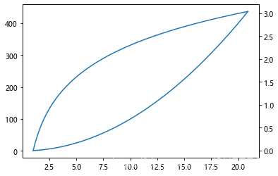
其中,
twinx()
可以为图增加纵坐标轴,使用如下:
x = np. arange( 1 , 21 , 0.1 )
y1 = x * x
y2 = np. log( x)
plt. plot( x, y1)
plt. twinx( )
plt. plot( x, y2)
plt. show( )
显示:
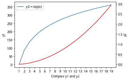
进一步使用如下:
import numpy as np
import matplotlib. pyplot as plt
x = np. arange( 1 , 20 , 1 )
y1 = x * x
y2 = np. log( x)
fig = plt. figure( )
ax1 = fig. add_subplot( 111 )
ax1. plot( x, y1, label = "$y1 = x * x$" , color = "r" )
ax1. legend( loc = 0 )
ax1. set_ylabel( "y1" )
ax1. set_xlabel( "Compare y1 and y2" )
ax = plt. gca( )
ax. locator_params( "x" , nbins = 20 )
ax2 = plt. twinx( )
ax2. set_ylabel( "y2" )
ax2. plot( x, y2, label = "$y2 = log(x)$" )
ax2. legend( loc = 0 )
plt. show(
)
1 2 3 4 5 6 7 8 9 10 11 12 13 14 15 16 17 18 19 20 21 22 23 24 25 26 27
显示:
2.matplotlib常见作图类型
画图在工作中在所难免,尤其在进行数据探索时显得尤其重要,matplotlib常见的一些作图种类如下:
先导入库和基础配置如下:
from __future__ import division
from numpy. random import randn
import numpy as np
import os
import matplotlib. pyplot as plt
np. random. seed( 12345 )
plt. rc( 'figure' , figsize= ( 10 , 6 ) )
from pandas import Series, DataFrame
import pandas as pd
np. set_printoptions( precision= 4 )
get_ipython( ) . magic( u'matplotlib inline' )
get_ipython( ) . magic( u'pwd' )
打印:
'XXX\\3_Visualization_Of_Data_Analysis\\basicuse'
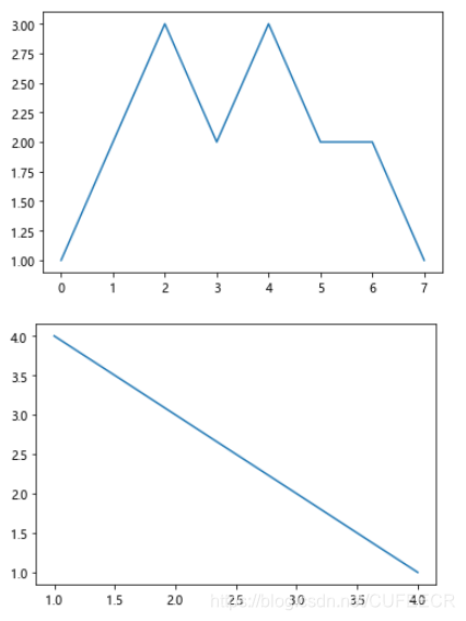
基础画图如下:
plt. plot( [ 1 , 2 , 3 , 2 , 3 , 2 , 2 , 1 ] )
plt. show( )
plt. plot( [ 4 , 3 , 2 , 1 ] , [ 1 , 2 , 3 , 4 ] )
plt. show( )
显示:
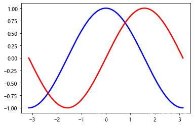
画三角函数曲线如下:
from pylab import *
x= np. linspace( - np. pi, np. pi, 256 , endpoint= True )
c, s= np. cos( x) , np. sin( x)
plot( x, c, color= "blue" , linewidth= 2.5 , linestyle= "-" , label
"cosine" )
plot( x, s, color= "red" , linewidth= 2.5 , linestyle= "-" , label= "sine" )
show( )
显示:
画散点图如下:
from pylab import *
n = 1024
X = np. random. normal( 0 , 1 , n)
Y = np. random. normal( 0 , 1 , n)
scatter( X, Y)
show( )
显示:
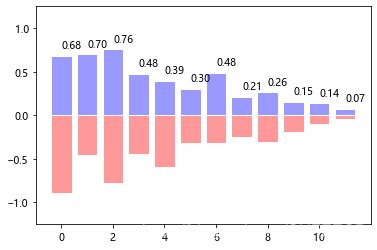
画条形图如下:
from pylab import *
n = 12
X = np. arange( n)
Y1 = ( 1 - X/ float ( n) ) * np. random. uniform( 0.5 , 1.0 , n)
Y2 = ( 1 - X/ float ( n) ) * np. random. uniform( 0.5 , 1.0 , n)
bar( X, + Y1, facecolor= '#9999ff' , edgecolor= 'white' )
bar( X, - Y2, facecolor= '#ff9999' , edgecolor= 'white' )
for x, y in zip ( X, Y1) :
text( x+ 0.4 , y+ 0.05 , '%.2f' % y, ha= 'center' , va= 'bottom' )
ylim( - 1.25 , + 1.25 )
show( )
显示:
饼图如下:
from pylab import *
n = 20
Z = np. random. uniform( 0 , 1 , n)
pie( Z)
show( )
显示:
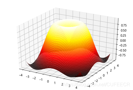
画立体图如下:
import numpy as np
from mpl_toolkits. mplot3d import Axes3D
from pylab import *
fig= figure( )
ax= Axes3D( fig)
x= np. arange( - 4 , 4 , 0.1 )
y= np. arange( - 4 , 4 , 0.1 )
x, y= np. meshgrid( x, y)
R= np. sqrt( x** 2 + y** 2 )
z= np. sin( R)
ax. plot_surface( x, y, z, rstride= 1 , cstride= 1 , cmap= 'hot' )
show( )
显示:
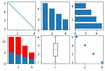
画其他简单图形如下:
x = [ 1 , 2 , 3 , 4 ]
y = [ 5 , 4 , 3 , 2 ]
plt. figure( )
plt. subplot( 2 , 3 , 1 )
plt. plot( x, y)
plt. subplot( 232 )
plt. bar( x, y)
plt. subplot( 233 )
plt. barh( x, y)
plt. subplot( 234 )
plt. bar( x, y)
y1 = [ 7 , 8 , 5 , 3 ]
plt. bar( x, y1, bottom= y, color = 'r' )
plt. subplot( 235 )
plt. boxplot( x)
plt. subplot( 236 )
plt. scatter( x, y)
plt. show( )
1 2 3 4 5 6 7 8 9 10 11 12 13 14 15 16 17 18 19 20 21 22 23 24 25 26
显示:
3.使用pandas画图
pandas中画图的主要类型包括:
先导入所需要的库:
from __future__ import division
from numpy. random import randn
import numpy as np
import os
import matplotlib. pyplot as plt
np. random. seed( 12345 )
from pandas import Series, DataFrame
import pandas as pd
% matplotlib inline
在pandas中,有行标签、列标签和分组信息等,如果使用matplotlib画图,可能需要一大堆的代码,现在调用Pandas的
plot()
方法即可简单实现。
画简单线图如下:
s = Series( np. random. randn( 10 ) . cumsum( ) , index= np. arange( 0 , 100 , 10 ) )
s. plot( )
plt. show( )
显示:
pandas.Series.plot()
的常见参数及说明如下:
参数
说明
参数
说明
label
用于图例的标签
ax
要在其上进行绘制的matplotlib subplot对象,如果没有设置,则使用当前matplotlib subplot
style
将要传给matplotlib的风格字符串,例如
'ko-'
alpha
图表的填充不透明(0-1)
kind
可以是
'line'
、
'bar'
、
'barh'
、
'kde'
logy
在Y轴上使用对数标尺
use_index
将对象的索引用作刻度标签
rot
旋转刻度标签(0-360)
xticks
用作X轴刻度的值
yticks
用作Y轴刻度的值
xlim
X轴的界限
ylim
Y轴的界限
grid
显示轴网格线
Pandas的大部分绘图方法都有一个可选的ax参数,它可以是一个matplotlib的subplot对象,从而能够在网络布局中更为灵活地处理subplot的位置。DataFrame的plot方法会在一个subplot中为各列绘制一条线,并自动创建图例。
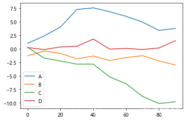
画多列线图如下:
df = DataFrame( np. random. randn( 10 , 4 ) . cumsum( 0 ) ,
columns= [ 'A' , 'B' , 'C' , 'D' ] ,
index= np. arange( 0 , 100 , 10 ) )
df. plot( )
plt. show( )
显示:
相对于Series,DataFrame还有一些用于对列进行灵活处理的选项,例如要将所有列都绘制到一个subplot中还是创建各自的subplot等,具体如下:
参数
说明
subplots
将各个DataFrame列绘制到单独的subplot中
sharex
如果subplots=True,则共用同一个X轴,包括刻度和界限
sharey
如果subplots=True,则共用同一个Y轴,包括刻度和界限
figsize
表示图像大小的元组
title
表示图像标题的字符串
legend
添加—个subplot图例(默认为True)
sort_columns
以字母表顺序绘制各列,默认使用前列顺序
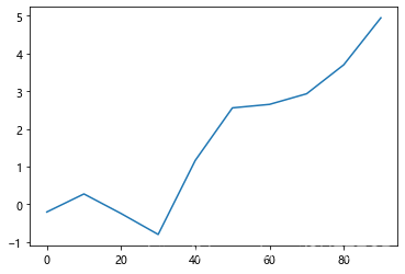
画简单累和图如下:
plt. close( 'all' )
s = Series( np. random. randn( 10 ) . cumsum( ) , index= np. arange( 0 , 100 , 10 ) )
s. plot( )
plt. show( )
显示:
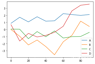
画多列的类和图如下:
df = DataFrame( np. random. randn( 10 , 4 ) . cumsum( 0 ) ,
columns= [ 'A' , 'B' , 'C' , 'D' ] ,
index= np. arange( 0 , 100 , 10 ) )
df. plot( )
plt. show( )
显示:
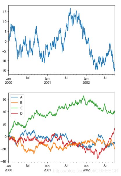
当提升了数据规模之后,累和图如下:
s = pd. Series( [ 2 , np. nan, 5 , - 1 , 0 ] )
print ( s)
print ( s. cumsum( ) )
ts= pd. Series( np. random. randn( 1000 ) , index= pd. date_range( '1/1/2000' , periods= 1000 ) )
ts= ts. cumsum( )
ts. plot( )
plt. show( )
df= pd. DataFrame( np. random. randn( 1000 , 4 ) , index= ts. index, columns= list ( 'ABCD' ) )
df= df. cumsum( )
df. plot( )
plt. show( )
打印:
0 2.0
1 NaN
2 5.0
3 - 1.0
4 0.0
dtype: float64
0 2.0
1 NaN
2 7.0
3 6.0
4 6.0
dtype: float64
显示:
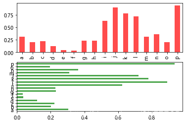
画Series柱状图如下:
fig, axes = plt. subplots( 2 , 1 )
data = Series( np. random. rand( 16 ) , index= list ( 'abcdefghijklmnop' ) )
data. plot( kind= 'bar' , ax= axes[ 0 ] , color= 'r' , alpha= 0.7 )
data. plot( kind= 'barh' , ax= axes[ 1 ] , color= 'g' , alpha= 0.7 )
plt. show( )
显示:
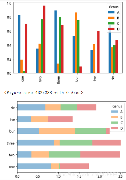
DataFrame画柱状图:
df = DataFrame( np. random. rand( 6 , 4 ) ,
index= [ 'one' , 'two' , 'three' , 'four' , 'five' , 'six' ] ,
columns= pd. Index( [ 'A' , 'B' , 'C' , 'D' ] , name= 'Genus' ) )
df. plot( kind= 'bar' )
plt. figure( )
df. plot( kind= 'barh' , stacked= True , alpha= 0.5 )
plt. show( )
显示:
可以看到:
stacked=True
即可为DataFrame生成堆积柱形图,这样每行的值就会被堆积在一起。
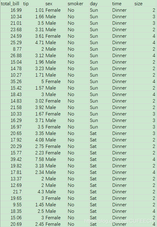
餐馆小费数据如下:
在群文件夹
Python数据分析实战
中下载即可。
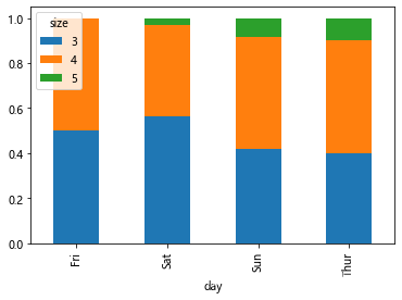
进行数据可视化如下:
tips = pd. read_csv( 'tips.csv' )
party_counts = pd. crosstab( tips. day, tips[ 'size' ] )
print ( party_counts)
party_counts = party_counts. iloc[ : , 2 : 5 ]
print ( party_counts)
party_pcts = party_counts. div( party_counts. sum ( 1 ) . astype( float ) , axis= 0 )
print ( party_pcts)
party_pcts. plot( kind= 'bar' , stacked= True )
plt. show( )
打印:
size  1   2   3   4  5  6
day
Fri   1  16   1   1  0  0
Sat   2  53  18  13  1  0
Sun   0  39  15  18  3  1
Thur  1  48   4   5  1  3
size   3   4  5
day
Fri    1   1  0
Sat   18  13  1
Sun   15  18  3
Thur   4   5  1
size         3        4         5
day
Fri   0.500000  0.50000  0.000000
Sat   0.562500  0.40625  0.031250
Sun   0.416667  0.50000  0.083333
Thur  0.400000  0.50000  0.100000
1 2 3 4 5 6 7 8 9 10 11 12 13 14 15 16 17 18
显示:
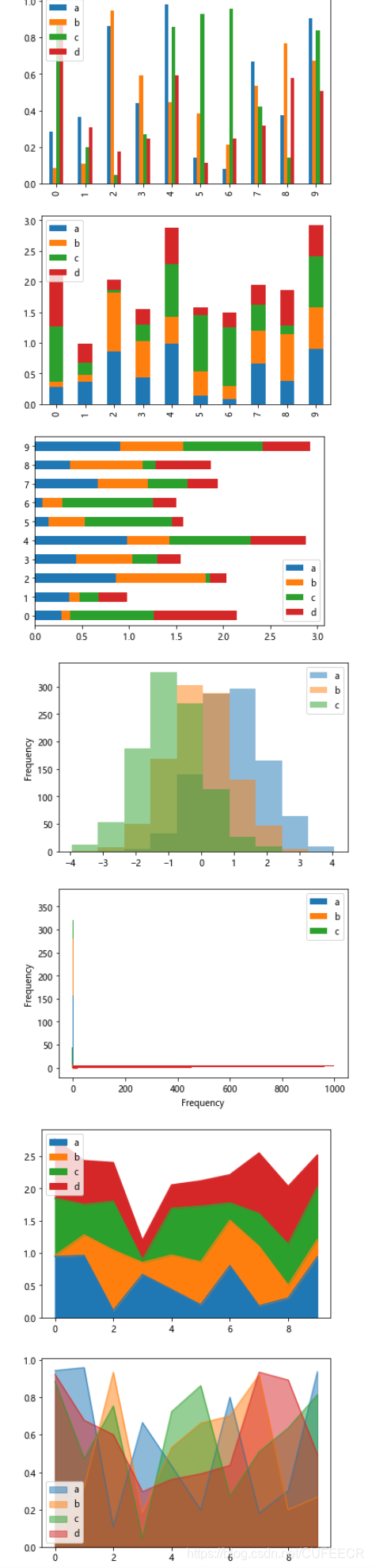
画较复杂的柱状图如下:
df2 = pd. DataFrame( np. random. rand( 10 , 4 ) , columns= [ 'a' , 'b' , 'c' , 'd' ] )
df2. plot( kind= 'bar' )
df2. plot( kind= 'bar' , stacked= True )
df2. plot( kind= 'barh' , stacked= True )
plt. show( )
df4= pd. DataFrame(
{ 'a' : np. random. randn( 1000 ) + 1 , 'b' : np. random. randn( 1000 ) , 'c' : np. random. randn( 1000 ) - 1 } , columns= list ( 'abc' ) )
df4. plot( kind= 'hist' , alpha= 0.5 )
df4. plot( kind= 'hist' , stacked= True , bins= 20 )
df4[ 'a' ] . plot( kind= 'hist' , orientation= 'horizontal' , cumulative= True )
plt. show( )
df = pd. DataFrame( np. random. rand( 10 , 4 ) , columns= [ 'a' , 'b' , 'c' , 'd' ] )
df. plot( kind= 'area' )
df. plot( kind= 'area' , stacked= False )
plt. show( )
显示:
直方图histogram:
Series.hist()
即可实现,在之后调用plot时加上参数
kind='kde'
即可生成一张密度图。
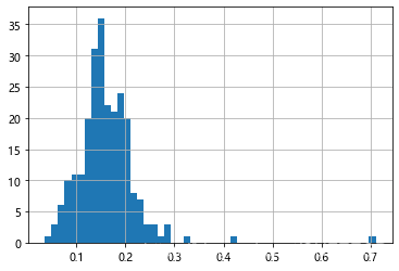
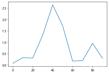
根据小费数据画直方图如下:
plt. figure( )
tips[ 'tip_pct' ] = tips[ 'tip' ] / tips[ 'total_bill' ]
tips[ 'tip_pct' ] . hist( bins= 50 )
plt. figure( )
显示:
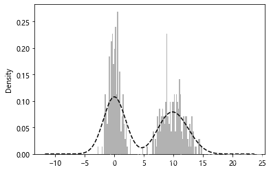
在统计学中,核密度估计(KDE)是一种估计随机变量概率密度函数(PDF)的非参数方法,利用高斯核生成核密度估计图如下:
comp1 = np. random. normal( 0 , 1 , size= 200 )
comp2 = np. random. normal( 10 , 2 , size= 200 )
values = Series( np. concatenate( [ comp1, comp2] ) )
values. hist( bins= 100 ,
= 0.3 , color= 'k' , density= True )
values. plot( kind= 'kde' , style= 'k--' )
显示:
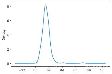
根据小费数据画密度图如下:
tips[ 'tip_pct' ] . plot( kind= 'kde' )
plt. figure( )
显示:
散点图scatter plot:
一维数据序列之间的关系
的有效手段,研究两个变量的关系,特别是是否有线性或曲线相关性。matplotlib的scatter方法是绘制散布图的主要方法。利用
plt.scatter()
即可轻松绘制一张简单的散布图。pandas也提供了能从DataFrame创建散步图矩阵的
scatter_matrix()
方法,还支持在对角线上放置变量的直方图或密度图。
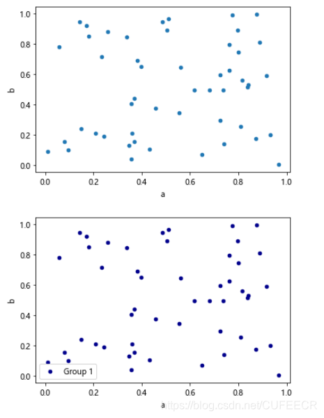
画简单散点图如下:
df = pd. DataFrame( np. random. rand( 50 , 4 ) , columns= [ 'a' , 'b' , 'c' , 'd' ] )
df. plot( kind= 'scatter' , x= 'a' , y= 'b' )
df. plot( kind= 'scatter' , x= 'a' , y= 'b' , color= 'DarkBlue' , label= 'Group 1' )
plt. show( )
显示:
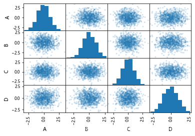
画散点矩阵图和直方图如下:
df = pd. DataFrame( np. random. randn( 1000 , 4 ) , columns= [ 'A' , 'B' , 'C' , 'D' ] )
pd. plotting. scatter_matrix( df, alpha= 0.2 )
显示:‘
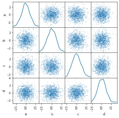
画三点矩阵图和密度图如下:
df = pd. DataFrame( np. random. randn( 1000 , 4 ) , columns= [ 'a' , 'b' , 'c' , 'd' ] )
pd. plotting. scatter_matrix( df, alpha= 0.2 , figsize= ( 6 , 6 ) , diagonal= 'kde' )
plt. show( )
显示:
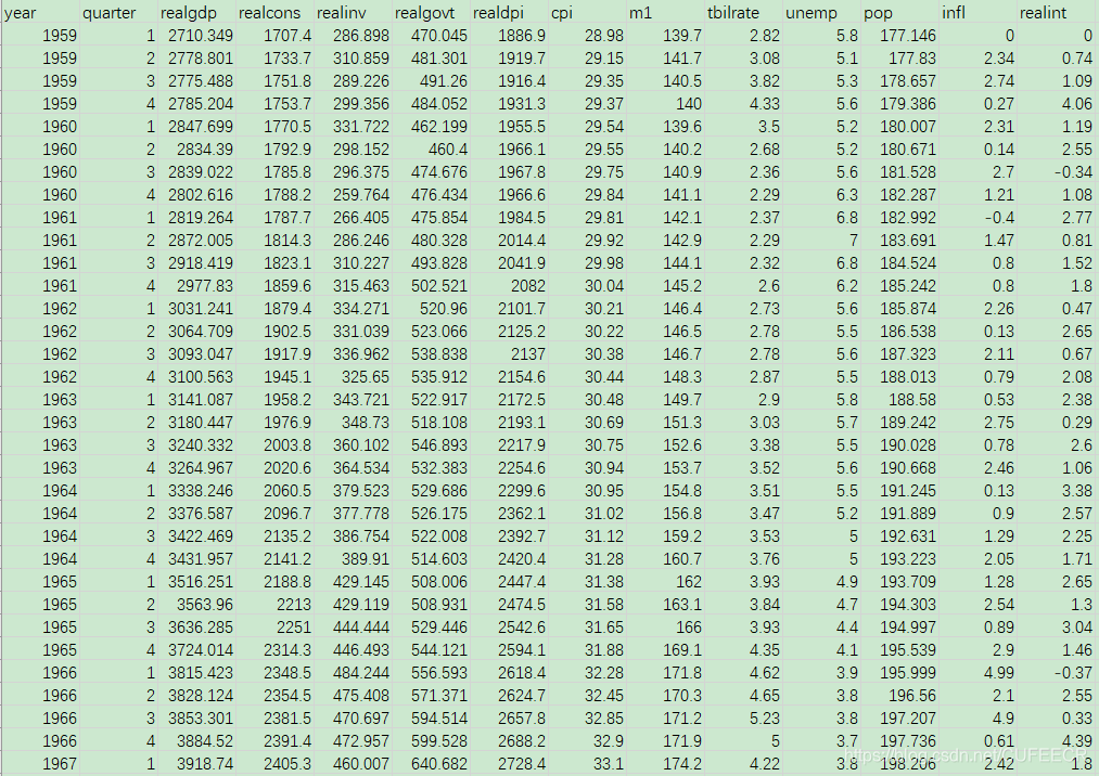
宏观经济数据macrodata.csv如下:
在群文件夹
Python数据分析实战
中下载即可。
读取和选取数据如下:
macro = pd. read_csv( "macrodata.csv" )
data = macro[ [ 'cpi' , 'm1' , 'tbilrate' , 'unemp' ] ]
trans_data = np. log( data) . diff( ) . dropna( )
trans_data[ - 5 : ]
print ( trans_data[ - 5 : ] )
plt. figure( )
打印:
cpi m1 tbilrate unemp
198 - 0.007904 0.045361 - 0.396881 0.105361
199 - 0.021979 0.066753 - 2.277267 0.139762
200 0.002340 0.010286 0.606136 0.160343
201 0.008419 0.037461 - 0.200671 0.127339
202 0.008894 0.012202 - 0.405465 0.042560
< Figure size 432x288 with 0 Axes>
< Figure size 432x288 with 0 Axes>
画散点图和散点矩阵图如下:
plt. scatter( trans_data[ 'm1' ] , trans_data[ 'unemp' ] )
plt. title( 'Changes in log %s vs. log %s' % ( 'm1' , 'unemp' ) )
pd. plotting. scatter_matrix( trans_data, diagonal= 'kde' , color= 'k' , alpha= 0.3 )
plt. show( )
显示:
可以简单看出各经济变量之间是否存在关系。
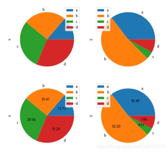
画饼图示意如下:
df = pd. DataFrame( 3 * np. random. rand( 4 , 2 ) , index= [ 'a' , 'b' , 'c' , 'd' ] , columns= [ 'x' , 'y' ] )
df. plot( kind= 'pie' , subplots= True , figsize=
( 8 , 4 ) )
df. plot( kind= 'pie' , subplots= True , autopct= '%.2f' , figsize= ( 8 , 4 ) )
plt. show( )
显示:
4.pandas中绘图与matplotlib结合使用
有时候想方便地集成的绘图方式,比如
df.plot()
,但是又想加上matplotlib的很多操
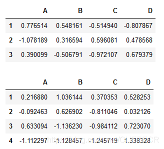
构造数据如下:
df= pd. DataFrame( np. random. randn( 3 , 4 ) , index= list ( '123' ) , columns= list ( 'ABCD' ) )
df2= pd. DataFrame( np. random. randn( 4 , 4 ) , index= list ( '1234' ) , columns= list ( 'ABCD' ) )
display( df, df2)
显示:
可视化如下:
fig, axes = plt. subplots( 2 , 1 )
df. plot( ax= axes[ 0 ] )
df2. plot( ax= axes[ 1 ] )
axes[ 0 ] . set_title( '3points' )
axes[ 1 ] . set_title( '4points' )
显示:
三、订单数据分析展示
主要作图包括订单与GMV趋势、商家趋势、订单来源分布、类目占比,涉及折线图、饼图、堆积柱形图、组合图等类型,目标是综合使用pandas和matplotlib。
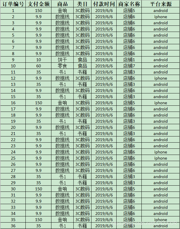
订单数据.csv如下:
在群文件夹
Python数据分析实战
中下载即可。
导库和读取数据如下:
import pandas as pd
import matplotlib. pyplot as plt
orders = pd. read_excel( "订单数据.xlsx" )
orders[ '付款时间' ] = orders[ '付款时间' ] . astype( 'str' )
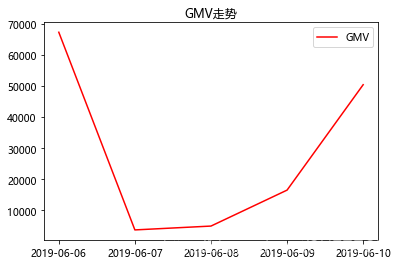
data1 = orders. groupby( '付款时间' ) [ '支付金额' ] . sum ( )
x = data1. index
y = data1. values
plt. title( 'GMV走势' )
plt. plot( x, y, label= 'GMV' , color= 'red' )
plt. legend( loc= 1 )
plt. show( )
显示:
可以看出不同时间订单金额的变化趋势,找出哪些天订单金额较高、哪些天较低。
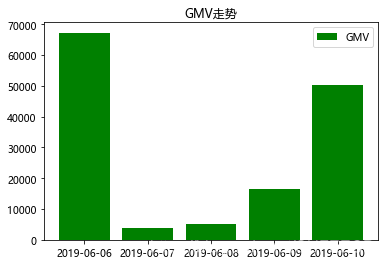
还可以用柱状图显示:
data1 = orders. groupby( '付款时间' ) [ '支付金额' ] . sum ( )
x = data1. index
y = data1. values
plt. title( 'GMV走势' )
plt. bar( x, y, label= 'GMV' , color= 'green' )
plt. legend( loc= 1 )
plt. show( )
显示:
还可以用饼图直观看出各天所占的比例:
data1 = orders. groupby( '付款时间' ) [ '支付金额' ] . sum ( )
x = data1. index
y = data1. values
plt. title( 'GMV饼图' )
plt. axis( 'equal' )
plt. pie( y, labels= x, autopct= '%1.1f%%' , \
colors= [ 'green' , 'red' , 'skyblue' , 'blue' ] )
plt. show( )
显示:
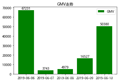
还可以为柱形图添加数据标签,如下:
data1 = orders. groupby( '付款时间' ) [ '支付金额' ] . sum (
)
x = data1. index
y = data1. values
plt. title( 'GMV走势' )
plt. bar( x, y, label= 'GMV' , color= 'green' )
plt. legend( loc= 1 )
for a, b in zip ( x, y) :
plt. text( a, b, '%d' % b, ha= 'center' , va= 'bottom' )
plt. show( )
显示:
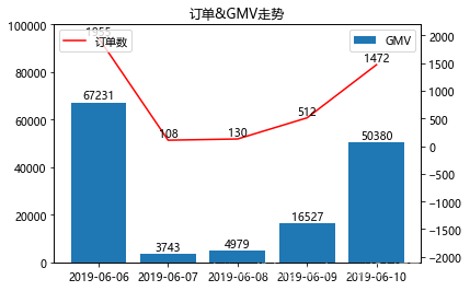
工作中很常见柱形图与折线图的
组合图形
,但是两个指标的数量级往往不一致,如果只用一个纵坐标,可能数量级小的那个会看不到图,所以要用到主次坐标轴,如下:
data1 = orders. groupby( '付款时间' ) [ [ '支付金额' , '订单编号' ] ] . agg( { '支付金额' : 'sum' , '订单编号' : 'count' } )
x = data1. index
y1 = data1[ '支付金额' ]
y2 = data1[ '订单编号' ]
plt. title( '订单&GMV走势' )
plt. bar( x, y1, label= 'GMV' )
plt. ylim( 0 , 100000 )
for a, b in zip ( x, y1) :
plt. text( a, b+ 0.1 , '%d' % b, ha= 'center' , va= 'bottom' )
plt. legend( loc= 1 )
plt. twinx( )
plt. plot( x, y2, label= '订单数' , color= 'red' )
plt. ylim( - 2100 , 2200 )
for a, b in zip ( x, y2) :
plt. text( a, b+ 0.2 , '%d' % b, ha= 'center' , va= 'bottom' )
plt. legend( loc= 2 )
1 2 3 4 5
6 7 8 9 10 11 12 13 14 15 16 17 18 19 20
显示:
需要注意:
text(x,y)
的y位置,就都是次纵坐标了。
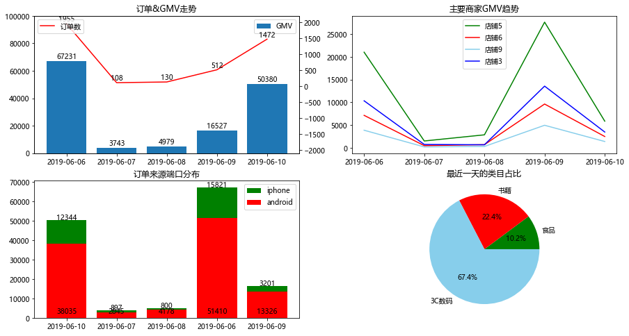
制作简单的数据仪表盘如下:
plt. figure( figsize= ( 15 , 8 ) )
data1 = orders. groupby( '付款时间' ) [ [ '支付金额' , '订单编号' ] ] . agg( { '支付金额' : 'sum' , '订单编号' : 'count' } )
x = data1. index
y1 = data1[ '支付金额' ]
y2 = data1[ '订单编号' ]
plt. subplot( 2 , 2 , 1 )
plt. title( '订单&GMV走势' )
plt. bar( x, y1, label= 'GMV' )
plt. ylim( 0 , 100000 )
for a, b in zip ( x, y1) :
plt. text( a, b+ 0.1 , '%d' % b, ha= 'center' , va= 'bottom' )
plt. legend( loc= 1 )
plt. twinx( )
plt. plot( x, y2, label= '订单数' , color= 'red' )
plt. ylim( - 2100 , 2200 )
for a, b in zip ( x, y2) :
plt. text( a, b+ 0.2 , '%d' % b, ha= 'center' , va= 'bottom' )
plt. legend( loc= 2 )
data2 = pd. DataFrame( orders[ orders[ '商家名称' ] . isin( [ '店铺3' , '店铺5' , '店铺6' , '店铺9' ] ) ] . groupby( [ '商家名称' , '付款时间' ] ) [ '支付金额' ] . sum ( ) )
data2_tmp =
. DataFrame( index= set ( data2. index. get_level_values( 0 ) ) , columns= set ( data2. index. get_level_values( 1 ) ) )
for ind in data2_tmp. index:
for col in data2_tmp. columns:
data2_tmp. loc[ ind, col] = data2. loc[ ind, : ] . loc[ col, '支付金额' ]
plt. subplot( 2 , 2 , 2 )
plt. title( '主要商家GMV趋势' )
colors = [ 'green' , 'red' , 'skyblue' , 'blue' ]
x = sorted ( data2_tmp. columns)
for i in range ( len ( data2_tmp. index) ) :
plt. plot( x, data2_tmp. loc[ data2_tmp. index[ i] , : ] , label= data2_tmp. index[ i] , color= colors[ i] )
plt. legend( )
data3_tmp = pd. DataFrame( orders. groupby( [ '平台来源' , '付款时间' ] ) [ '支付金额' ] . sum ( ) )
data3 = pd. DataFrame( index= set ( data3_tmp. index. get_level_values( 0 ) ) , columns= set ( data3_tmp. index. get_level_values( 1 ) ) )
for ind in data3. index:
print ( ind)
for col in data3. columns:
data3. loc[ ind, col] = data3_tmp. loc[ ind, : ] . loc[ col, '支付金额' ]
barx = data3. columns
bary1 = data3. loc[ 'android' , : ]
bary2 = data3. loc[ 'iphone' , : ]
plt. subplot( 2 , 2 , 3 )
plt. title( '订单来源端口分布' )
plt. bar( barx, bary1+ bary2, label= 'iphone' , color= 'green' )
plt. bar( barx, bary1, label= 'android' , color= 'red' )
plt. legend(
)
for a, b, c in zip ( barx, bary1, bary2) :
plt. text( a, 1000 , '%d' % b, ha= 'center' , va= 'bottom' )
plt. text( a, b+ c- 1000 , '%d' % c, ha= 'center' , va= 'bottom' )
data4 = orders[ orders[ '付款时间' ] == max ( orders[ '付款时间' ] ) ] . groupby( '类目' ) [ '支付金额' ] . sum ( ) . sort_values( )
plt. subplot( 2 , 2 , 4 )
plt. title( '最近一天的类目占比' )
plt. axis( 'equal' )
plt. pie( data4. values, labels= data4. index, autopct= '%1.1f%%' , \
colors= [ 'green' , 'red' , 'skyblue' , 'blue' ] )
plt. show( )
1 2 3 4 5 6 7 8 9 10 11 12 13 14 15 16 17 18 19 20 21 22 23 24 25 26 27 28 29 30 31 32 33 34 35 36 37 38 39 40 41 42 43 44 45 46 47 48 49 50 51 52 53 54 55 56 57 58 59 60 61 62 63 64 65 66 67 68 69 70 71 72 73 74 75 76 77 78 79 80 81 82
显示:
过程稍复杂,需慢慢理解。
四、Titanic灾难数据分析显示
主要过程如下:
导入必要的库
导入数据
设置为索引
绘制展示男女乘客比例的扇形图
绘制展示船票Fare与乘客年龄和性别的散点图
生还人数
绘制展示船票价格的直方图
数据titanicdata.csv如下:
在群文件夹
Python数据分析实战
中下载即可。
导库和读取数据如下:
import pandas as pd
import matplotlib. pyplot as plt
import seaborn as sns
import numpy as np
% matplotlib inline
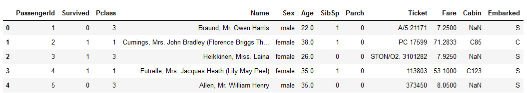
titanic = pd. read_csv( "titanicdata.csv" )
titanic. head( )
显示:
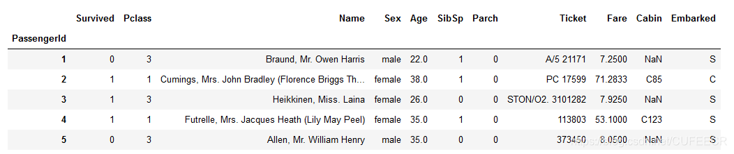
设置索引如下:
titanic. set_index( 'PassengerId' ) . head( )
显示:
创建一个饼图,展示男性/女性的比例:
males = ( titanic[ 'Sex' ] == 'male' ) . sum ( )
females = ( titanic[ 'Sex' ] == 'female' ) . sum ( )
proportions = [ males, females]
plt. pie(
proportions,
labels = [ 'Males' , 'Females' ] ,
shadow = False ,
colors = [ 'blue' , 'red' ] ,
explode = ( 0.15 , 0 ) ,
startangle = 90 ,
autopct = '%1.1f%%'
)
plt. axis( 'equal' )
plt. title( "Sex Proportion" )
plt. tight_layout( )
plt. show( )
1 2 3 4 5 6 7 8 9 10 11 12 13 14 15 16 17 18 19 20 21 22 23 24 25 26 27 28 29 30 31 32 33 34 35 36 37 38 39 40
显示:
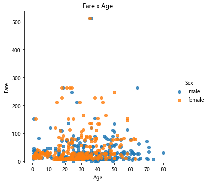
用所付费用和年龄创建散点图,按性别区分图的颜色:
lm = sns. lmplot( x = 'Age' ,
= 'Fare' , data = titanic, hue = 'Sex' , fit_reg= False )
lm. set ( title = 'Fare x Age' )
axes = lm. axes
axes[ 0 , 0 ] . set_ylim( - 5 , )
axes[ 0 , 0 ] . set_xlim( - 5 , 85 )
显示:
查看幸存人数:
titanic. Survived. sum ( )
打印:
342
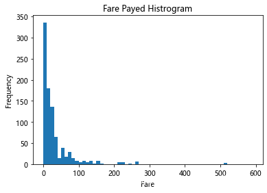
创建一个柱状图,显示已付车费:
df = titanic. Fare. sort_values( ascending = False )
binsVal = np. arange( 0 , 600 , 10 )
binsVal
plt. hist( df, bins = binsVal)
plt. xlabel( 'Fare' )
plt. ylabel( 'Frequency' )
plt. title( 'Fare Payed Histrogram' )
plt. show( )
1 2 3 4 5 6 7 8 9 10 11 12 13 14 15 16 17
显示:


 963624318