日常天气预报业务和科研工作,都离不开高空环流分析,尤其是一些比较重要的天气过程,都需要我们绘制850hPa、700hPa、500hPa等常见等压面的高度场、温度场、风场、湿度场等一个要素或多个要素的叠加图,来分析天气形势。
我比较喜欢把绘图代码以类class()的形式写出来,后面如果有要修改升级的,就可以直接通过类的继承来写新的代码。这样,原先的代码也会继续保存,有需要时也能挖出来顶一顶
import matplotlib.pyplot as pltimport xarray as xr import numpy as npimport osimport cartopy.crs as ccrs import cartopy.feature as cfeat from cartopy.io.shapereader import Reader from cartopy.mpl.ticker import LongitudeFormatter,LatitudeFormatter import metevaimport meteva.base as mebimport meteva.product as mpdfrom meteva.base.tool.plot_tools import add_china_map_2basemapfrom cal_time import delta_time, cal_time_targetimport cmapsimport metpy.calc as mpcalcplt.rcParams['font.sans-serif']=['SimHei'] plt.rcParams['axes.unicode_minus']=False
class draw_plevel(object): def __init__(self,level='500',save_path='./高空天气图',title='高空天气图',\ lon = np.linspace(0.0,359.75,1440), lat = np.linspace(-90.0,90.0,721),\
z=None, rh=None, t=None, u=None, v=None,map_extend=None,add_minmap='right',dpi=300): ''' z: 位势高度 rh: 相对湿度 t: 温度 u: 纬向风 v: 经向风 map_extend: 绘图区域,[lon_min, lon_max, lat_min, lat_max] add_minmap: 是否绘制南海小图。False: 不画; 'right': 画在右下角,'left': 画在左下角 ''' self.level = level self.save_path = save_path self.title = title self.lon = lon self.lat = lat self.z = z self.rh = rh self.t = t self.u = u self.v = v self.map_extend = map_extend self.add_minmap = add_minmap self.dpi = dpi
def draw_circulation(self): lons, lats = np.meshgrid(self.lon,self.lat) proj = ccrs.PlateCarree() hight = 5.6 title_hight = 0.3 legend_hight = 0.6 left_plots_width = 0 right_plots_width = 0 width = (hight - title_hight - legend_hight) * len(self.lon) / len(self.lat) + left_plots_width + right_plots_width map_width = width - left_plots_width - right_plots_width
fig = plt.figure(figsize=(width, hight),dpi=self.dpi) rect = [left_plots_width / width, 0.05, (width - right_plots_width - left_plots_width) / width, 0.95] 高
ax = fig.subplots(1, 1, subplot_kw={'projection':proj}) if self.map_extend is None: ax.set_extent(self.map_extend, proj)
country_shp = Reader('./shp/CHN_adm1.shp') pro_shp = Reader('./shp/provinces.shp') fea_country = cfeat.ShapelyFeature(country_shp.geometries(), proj, edgecolor='darkolivegreen', facecolor='ivory')
ax.add_feature(fea_country, linewidth=0.2, alpha=0.2) fea_pro = cfeat.ShapelyFeature(pro_shp.geometries(), proj, edgecolor='darkolivegreen', facecolor='none') ax.add_feature(fea_pro, linewidth=0.3, alpha=0.5) ax.add_feature(cfeat.OCEAN, alpha=0.5)
ax.add_feature(cfeat.BORDERS.with_scale('50m'), linewidth=0.8, zorder=1) ax.add_feature(cfeat.COASTLINE.with_scale('50m'), linewidth=0.6, zorder=1) ax.add_feature(cfeat.RIVERS.with_scale('50m'), zorder=1)
ax.add_feature(cfeat.LAKES.with_scale('50m'), zorder=1)
ax.add_geometries(Reader('./shp/CHN_adm1.shp').geometries(), ccrs.PlateCarree(), \ facecolor = 'none', edgecolor = 'gray', linewidth = 0.8)
ax.axis('on')
ax.set_xticks([80,90,100,110,120,130]) ax.set_yticks([10,20,30,40,50]) ax.xaxis.set_major_formatter(LongitudeFormatter()) ax.yaxis.set_major_formatter(LatitudeFormatter())
下面,就开始绘制等高线、等温线、风向杆、湿度填色图啦。其中,等高线除了588线用红色并加粗表示外,其他都为蓝色曲线:
z_levels = np.arange(0, 2000+10, 4) z_levels = np.delete(z_levels, np.where(z_levels==588))
ac = ax.contour(lons[lat_id1:lat_id2,lon_id1:lon_id2], lats[lat_id1:lat_id2,lon_id1:lon_id2],\ self.z[lat_id1:lat_id2,lon_id1:lon_id2], levels=z_levels, extent='both', colors='mediumblue', linewidths=0.8) plt.clabel(ac, inline=True, fontsize=8, fmt='%.0f') ac588 = ax.contour(lons[lat_id1:lat_id2,lon_id1:lon_id2], lats[lat_id1:lat_id2,lon_id1:lon_id2],\ self.z[lat_id1:lat_id2,lon_id1:lon_id2], levels=np.arange(588,590,4), extent='both', colors='red', linewidths=0.9) plt.clabel(ac588, inline=True, fontsize=9, fmt='%.0f')
t_levels = np.arange(-40, 30, 4) at = ax.contour(lons[lat_id1:lat_id2,lon_id1:lon_id2], lats[lat_id1:lat_id2,lon_id1:lon_id2],\ self.t[lat_id1:lat_id2,lon_id1:lon_id2], levels=t_levels, extent='both', colors='red', linewidths=0.5, linestyle=np.where(self.t>=0,'-','--')) plt.clabel(at, inline=True, fontsize=5, fmt='%.0f')
ax.barbs(lons[lat_id1:lat_id2:12,lon_id1:lon_id2:12], lats[lat_id1:lat_id2:12,lon_id1:lon_id2:12], self.u[lat_id1:lat_id2:12,lon_id1:lon_id2:12],self.v[lat_id1:lat_id2:12,lon_id1:lon_id2:12], barb_increments={'half':2,'full':4,'flag':20}, zorder=5, length=5, linewidth=0.2)
ax.set_title(self.title,fontsize=12)
rh_levels = (60,70,80,90,95,100) aq = ax.contourf(lons[lat_id1:lat_id2,lon_id1:lon_id2], lats[lat_id1:lat_id2,lon_id1:lon_id2],\ self.rh[lat_id1:lat_id2,lon_id1:lon_id2],levels=rh_levels,transform=ccrs.PlateCarree(), cmap=cmaps.CBR_wet[:-2]) cbar = fig.colorbar(aq,shrink=0.8) cbar.ax.set_title('%') cbar.set_ticks((60,70
,80,90,95,100)) plt.clabel(ac, inline=True, fontsize=8, fmt='%.0f')
绘图区域如果涵盖了南海九段线覆盖区域,则需要绘制南海小图。这里,绘图函数最早计算的图形相关参数就都用上了,用以保证南海小图在整个图片的右下角:
if self.add_minmap is not False: draw_minmap(self.add_minmap, rect, hight, width)
fig.savefig(self.title+'.png',dpi=self.dpi) fig.show()
这里贴一下绘制南海小图的函数,绘图的时候直接调用就可以:def draw_minmap(add_minmap,rect1, height, width): minmap_lon_lat = [103, 123, 0, 25] minmap_height_rate = 0.27 height_bigmap = rect1[3] height_minmap = height_bigmap * minmap_height_rate width_minmap = height_minmap * (minmap_lon_lat[1] - minmap_lon_lat[0]) * height / ( minmap_lon_lat[3] - minmap_lon_lat[2]) / width
width_between_two_map = height_bigmap * 0.01
width_minmap = 0.2 width_between_two_map = 0.1 sy_minmap = width_between_two_map + rect1[1] if add_minmap == "left": sx_minmap = rect1[0] + width_between_two_map else: sx_minmap = rect1[0] + rect1[2] - width_minmap - width_between_two_map rect_min = [sx_minmap, sy_minmap, width_minmap, height_minmap] rect_min = [0.63, 0.112, 0.1, 0.13] ax_min = plt.axes(rect_min) plt.xticks([]) plt.yticks([]) ax_min.set_xlim((minmap_lon_lat[0], minmap_lon_lat[1])) ax_min.set_ylim((minmap_lon_lat[2], minmap_lon_lat[3])) ax_min.spines["top"].set_linewidth(0.3) ax_min.spines["bottom"].set_linewidth(0.3) ax_min.spines["right"].set_linewidth(0.3) ax_min.spines["left"].set_linewidth(0.3) add_china_map_2basemap(ax_min, name="world", edgecolor='k', lw=0.2, encoding='gbk', grid0=None) add_china_map_2basemap(ax_min, name="nation", edgecolor='k', lw=0.2, encoding='gbk', grid0=None)
这样,就实现了高空环流图的绘制。我们可以根据需要注释掉部分绘图模块,比如注释掉温度场,只留高度场、风场和湿度场的叠加。以500hPa为例,绘图效果如下: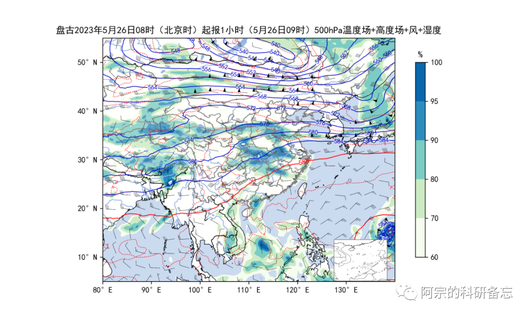

声明:欢迎转载、转发本号原创内容,可留言区留言或者后台联系小编(微信:gavin7675)进行授权。气象学家公众号转载信息旨在传播交流,其内容由作者负责,不代表本号观点。文中部分图片来源于网络,如涉及作品内容、版权和其他问题,请后台联系小编处理。