最近,有同学在咨询各种的paper问题,包括可视化配图、配色。
今天咱们把最最常用的极坐标图的画法,给大家进行一个总结。
有几位同学用了这个配图,顺利的用在自己的科研场景中,效果非常完美~
代码都是完整的,大家可以根据自己的实际情况,直接拿去,并且定制化修改~
首先说,极坐标图作为一种特殊的数据展示形式,在周期性数据、方向性数据和对称性数据的可视化中具有独特优势。
在这里,会详细介绍如何使用Python创建专业、美观的极坐标图,后面并提供多种高级定制方案。
# 第一步,基础设置
首先,导入必要的库,并设置全局绘图参数以确保图形质量符合大家科研论文要求。
import numpy as np
import matplotlib.pyplot as plt
import pandas as pd
from scipy import stats
import matplotlib as mpl
from matplotlib.colors import LinearSegmentedColormap
# 配色方案
custom_colors = ["#DB0E0E", "#00FFEE", "#13CAF4", "#07F787", "#F8C313",
"#EA22EA", "#22F4BF", "#F4C509", "#B917FE", "#129AF5"]
custom_cmap = LinearSegmentedColormap.from_list('custom_cmap', ["#F32D2D", "#0CF4E5", "#15C9F1"])
# 示例数据
def generate_sample_data():
"""生成用于演示的示例数据"""
np.random.seed(42)
# 角度数据 (0 到 2π)
theta = np.linspace(0, 2*np.pi, 360)
# 生成三种不同的径向数据模式
# 模式1: 正弦波叠加
r1 = 5 + 3*np.sin(3*theta) + 1.5*np.sin(7*theta) + np.random.normal(0, 0.3, len(theta))
# 模式2: 指数衰减余弦波
r2 = 8 * np.exp(-0.5*theta) * np.cos(4*theta) + np.random.normal(0, 0.2, len(theta))
# 模式3: 多峰分布
r3 = 4 + 2*np.sin(5*theta) + 1.5*np.cos(2*theta) + np.random.normal(0, 0.25, len(theta))
return theta, r1, r2, r3
theta, r1, r2, r3 = generate_sample_data()
# 样式一:多变量极坐标线图
这种样式适合展示多个相关变量在极坐标系中的变化规律,常常用于对比分析。
def polar_line_plot(theta, r1, r2, r3):
"""
创建多变量极坐标线图
参数:
theta: 角度数组
r1, r2, r3: 不同变量的径向值数组
"""
fig = plt.figure(figsize=(10, 8))
ax = fig.add_subplot(111, projection='polar')
# 绘制三条曲线,使用鲜艳配色
line1 = ax.plot(theta, r1, color=custom_colors[0], linewidth=2.5,
label='模式 A', alpha=0.9, marker='o', markersize=3)
line2 = ax.plot(theta, r2, color=custom_colors[1], linewidth=2.5,
label='模式 B', alpha=0.9, marker='s', markersize=3)
line3 = ax.plot(theta, r3, color=custom_colors[
2], linewidth=2.5,
label='模式 C', alpha=0.9, marker='^', markersize=3)
# 极坐标图参数优化
ax.set_theta_offset(np.pi/2) # 设置0度在顶部
ax.set_theta_direction(-1) # 顺时针方向
# 网格和刻度优化
ax.grid(True, alpha=0.3, linestyle='--', linewidth=0.8)
ax.set_rgrids([2, 4, 6, 8, 10], angle=0, fontsize=10)
# 设置角度刻度标签
ax.set_xticks(np.linspace(0, 2*np.pi, 8, endpoint=False))
ax.set_xticklabels(['0°', '45°', '90°', '135°', '180°', '225°', '270°', '315°'])
# 设置标题和标签
ax.set_title('多变量极坐标分析图', fontsize=16, fontweight='bold', pad=20)
ax.set_xlabel('角度方向', fontsize=12, labelpad=10)
ax.set_ylabel('径向距离', fontsize=12, labelpad=20)
# 图例优化
legend = ax.legend(loc='upper right', bbox_to_anchor=(1.15, 1.0),
frameon=True, fancybox=True, shadow=True,
ncol=1, fontsize=12)
legend.get_frame().set_facecolor('#F5F5F5')
legend.get_frame().set_alpha(0.9)
# 数据分析:计算统计指标
stats_text = f'''统计摘要:
模式 A: μ={np.mean(r1):.2f}, σ={np.std(r1):.2f}
模式 B: μ={np.mean(r2):.2f}, σ={np.std(r2):.2f}
模式 C: μ={np.mean(r3):
.2f}, σ={np.std(r3):.2f}'''
# 添加统计信息文本框
ax.text(0.05, 0.05, stats_text, transform=ax.transAxes, fontsize=10,
bbox=dict(boxstyle="round,pad=0.5", facecolor='lightgray', alpha=0.7),
verticalalignment='bottom')
# 添加极值标注
max_r1_idx = np.argmax(r1)
ax.annotate(f'最大值: {r1[max_r1_idx]:.2f}',
xy=(theta[max_r1_idx], r1[max_r1_idx]),
xytext=(theta[max_r1_idx]+0.3, r1[max_r1_idx]+1),
arrowprops=dict(arrowstyle='->', color=custom_colors[0], lw=1.5),
fontsize=9, color=custom_colors[0])
plt.tight_layout()
return fig, ax
fig1, ax1 = polar_line_plot(theta, r1, r2, r3)
plt.show()

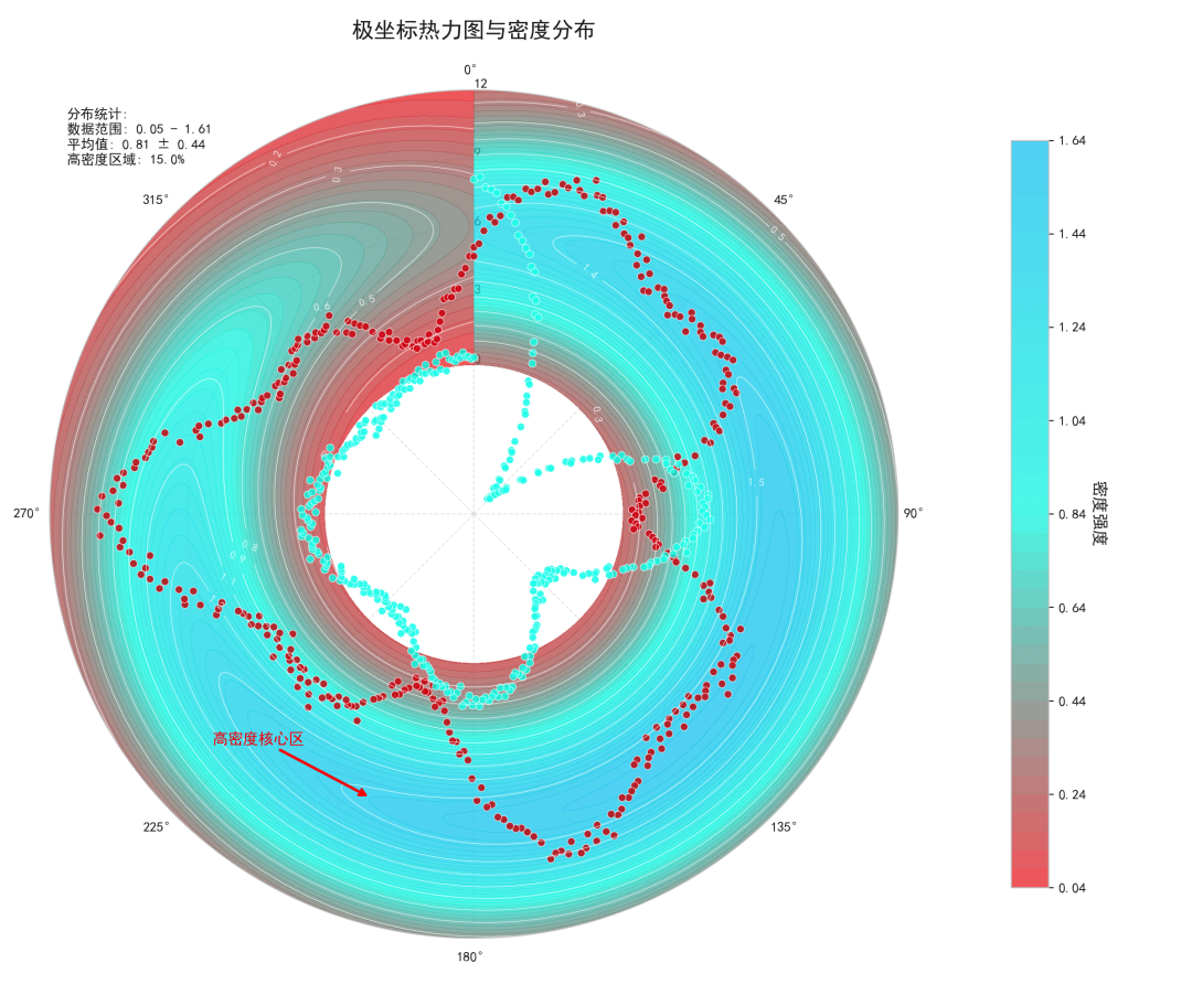
# 样式二:极坐标热力图与等高线组合图
这种样式结合了热力图和等高线,适合展示二维密度分布和梯度变化。
def polar_heatmap_contour_plot(theta, r1, r2, r3):
"""
创建极坐标热力图与等高线组合图
参数:
theta: 角度数组
r1, r2, r3: 不同变量的径向值数组
"""
# 创建网格数据用于热力图
theta_grid = np.linspace(0, 2*np.pi, 100)
r_grid = np.linspace(0, 12, 100)
Theta, R = np.meshgrid(theta_grid, r_grid)
# 创建模拟的二维分布数据
Z = np.zeros_like(Theta)
for i, (t, r_val) in enumerate(zip([r1, r2, r3], [5, 8, 6])):
# 为每个模式创建高斯分布
center_theta = i * 2*np.pi/3
center_r = r_val
# 二维高斯分布
dist = np.sqrt((Theta - center_theta)**2 + (R - center_r)**2/4)
Z += np.exp(-dist**2/(2*1.5**2))
fig = plt.figure(figsize=(12, 10))
ax = fig.add_subplot(111, projection='polar')
# 绘制热力图
heatmap = ax.contourf(Theta, R, Z, levels=50, cmap=custom_cmap, alpha=0.7)
# 添加等高线
contour = ax.contour(Theta, R, Z, levels=10, colors='white', linewidths=0.5, alpha=0.8)
ax.clabel(contour, inline=True, fontsize=8, fmt='%.1f')
# 叠加原始数据点
scatter1 = ax.scatter(theta, r1, c=custom_colors[0], s=30, alpha=0.8,
edgecolors='white', linewidth=0.5, label='数据点 A')
scatter2 = ax.scatter(theta, r2, c=custom_colors[1], s=30, alpha=0.8,
edgecolors='white', linewidth=0.5, label='数据点 B')
# 极坐标参数设置
ax.set_theta_offset(np.pi/2)
ax.set_theta_direction(-1)
ax.grid(True, alpha=0.4, linestyle='--')
# 设置径向网格
ax.set_rgrids([0, 3, 6, 9, 12], angle=0, fontsize=10)
# 颜色条
cbar = plt.colorbar(heatmap, ax=ax, pad=0.1, shrink=0.8)
cbar.set_label('密度强度', fontsize=12, rotation=270, labelpad=15)
cbar.ax.tick_params(labelsize=10)
# 标题和图例
ax.set_title('极坐标热力图与密度分布', fontsize=16, fontweight='bold', pad=20)
# 数据分析:识别高密度区域
high_density_threshold = np.percentile(Z, 85)
high_density_mask = Z > high_density_threshold
if np.any(high_density_mask):
high_density_points = np.argwhere(high_density_mask)
representative_idx = high_density_points[len(high_density_points)//2]
rep_theta = Theta[representative_idx[0], representative_idx[1]]
rep_r = R[representative_idx[0], representative_idx[1]]
ax.annotate('高密度核心区',
xy=(rep_theta, rep_r),
xytext=(rep_theta+0.5, rep_r+2),
arrowprops=dict(arrowstyle='->', color='red', lw=2),
fontsize=11, color='red', fontweight='bold')
# 添加统计信息
stats_info = f'''分布统计:
数据范围: {Z.min():.2f} - {Z.max():.2f}
平均值: {Z.mean():.2f} ± {Z.std():.2f}
高密度区域: {np.sum(high_density_mask)/high_density_mask.size*100:.1f}%'''
ax.text(0.02, 0.98, stats_info, transform=ax.transAxes, fontsize=10,
bbox=dict(boxstyle="round,pad=0.5", facecolor='white', alpha=0.9),
verticalalignment='top')
plt.tight_layout()
return fig, ax
# 生成图形
fig2, ax2 = polar_heatmap_contour_plot(theta, r1, r2, r3)
plt.show()
# 样式三:极坐标面积图与统计分析
这种样式使用堆叠面积图,适合展示构成分析和累积效应。
def polar_area_statistical_plot(theta, r1, r2, r3):
"""
创建极坐标面积图与统计分析
参数:
theta: 角度数组
r1, r2, r3: 不同变量的径向值数组
"""
fig = plt.figure(figsize=(11, 9))
ax = fig.add_subplot(
111, projection='polar')
# 数据预处理:平滑处理
from scipy.ndimage import gaussian_filter1d
r1_smooth = gaussian_filter1d(r1, sigma=3)
r2_smooth = gaussian_filter1d(r2, sigma=3)
r3_smooth = gaussian_filter1d(r3, sigma=3)
# 绘制堆叠面积图
ax.fill_between(theta, 0, r1_smooth, color=custom_colors[0], alpha=0.7,
label='基础层', edgecolor='white', linewidth=0.5)
ax.fill_between(theta, r1_smooth, r1_smooth + r2_smooth, color=custom_colors[1],
alpha=0.7, label='中间层', edgecolor='white', linewidth=0.5)
ax.fill_between(theta, r1_smooth + r2_smooth, r1_smooth + r2_smooth + r3_smooth,
color=custom_colors[2], alpha=0.7, label='顶层',
edgecolor='white', linewidth=0.5)
# 极坐标参数优化
ax.set_theta_offset(np.pi/2)
ax.set_theta_direction(-1)
ax.grid(True, alpha=0.4, linestyle='-', linewidth=0.8)
# 设置径向限制和网格
ax.set_ylim(0, 15)
ax.set_rgrids([0, 5, 10, 15], angle=0, fontsize=11)
# 角度刻度
ax.set_xticks(np.linspace(0, 2*np.pi, 12, endpoint=False))
ax.set_xticklabels(['0°', '30°', '60°', '90°', '120°', '150°',
'180°', '210°', '240°', '270°', '300°', '330°'])
# 标题和图例
ax.set_title('极坐标堆叠面积分析图', fontsize=16, fontweight='bold', pad=20)
# 高级图例
legend = ax.legend(loc='upper left', bbox_to_anchor=(
-0.2, 1.0),
frameon=True, fancybox=True, shadow=True,
ncol=1, fontsize=12, title='数据层次')
legend.get_frame().set_facecolor('#F8F8F8')
legend.get_frame().set_alpha(0.9)
legend.get_title().set_fontweight('bold')
# 高级统计分析
total_data = r1_smooth + r2_smooth + r3_smooth
# 计算各扇区统计量
sector_stats = []
sector_angles = np.linspace(0, 2*np.pi, 7) # 6个扇区
for i in range(len(sector_angles)-1):
mask = (theta >= sector_angles[i]) & (theta < sector_angles[i+1])
if np.any(mask):
sector_mean = np.mean(total_data[mask])
sector_std = np.std(total_data[mask])
sector_stats.append((sector_angles[i], sector_mean, sector_std))
# 标注扇区统计信息
for angle, mean_val, std_val in sector_stats:
ax.annotate(f'μ={mean_val:.1f}\nσ={std_val:.1f}',
xy=(angle + np.pi/6, mean_val),
xytext=(angle + np.pi/6, mean_val + 2),
arrowprops=dict(arrowstyle='->', color='black', lw=1, alpha=0.7),
fontsize=9, ha='center', va='bottom',
bbox=dict(boxstyle="round,pad=0.3", facecolor='yellow', alpha=0.7))
# 相关性分析
correlations = []
data_pairs = [(r1_smooth, r2_smooth, 'A-B'),
(r1_smooth, r3_smooth, 'A-C'),
(r2_smooth, r3_smooth, 'B-C')]
for data1, data2, label in data_pairs:
corr = np.corrcoef(data1, data2)[0, 1]
correlations.append((label, corr))
# 显示相关性矩阵
corr_text = "相关性分析:\n" + "\n".join([f"{label}: r = {corr:.3f}"
for label, corr
in correlations])
ax.text(0.02, 0.02, corr_text, transform=ax.transAxes, fontsize=10,
bbox=dict(boxstyle="round,pad=0.5", facecolor='lightblue', alpha=0.8),
verticalalignment='bottom')
# 趋势线
from scipy import interpolate
if len(total_data) > 10:
spline = interpolate.UnivariateSpline(theta, total_data, s=len(theta)*0.1)
theta_dense = np.linspace(0, 2*np.pi, 200)
total_smooth = spline(theta_dense)
ax.plot(theta_dense, total_smooth, 'k--', linewidth=2, alpha=0.8,
label='趋势线')
plt.tight_layout()
return fig, ax
fig3, ax3 = polar_area_statistical_plot(theta, r1, r2, r3)
plt.show()

# 高级分析与参数优化技巧
颜色优化策略
def create_advanced_colormaps():
# 从过去论文总计的,专业配色方案
cmap1 = LinearSegmentedColormap.from_list('scientific_blue',
['#1a2a6c', '#b21f1f', '#fdbb2d'])
cmap2 = LinearSegmentedColormap.from_list('viridis_enhanced',
['#440154', '#31688e', '#35b779'
, '#fde725'])
cmap3 = LinearSegmentedColormap.from_list('warm_cool',
['#003f5c', '#58508d', '#bc5090', '#ff6361', '#ffa600'])
return cmap1, cmap2, cmap3
# 测试不同配色方案
cmap1, cmap2, cmap3 = create_advanced_colormaps()
性能优化与输出设置
def optimize_plot_performance():
    """绘图性能优化设置"""
    # 对于大数据集,使用优化设置
    mpl.rcParams['path.simplify'] = True
    mpl.rcParams['path.simplify_threshold'] = 0.1
    mpl.rcParams['agg.path.chunksize'] = 10000

    # 输出设置
    savefig_params = {
        'dpi': 300,
        'bbox_inches': 'tight',
        'pad_inches': 0.1,
        'transparent': False,
        'facecolor': 'white'
    }

    return savefig_params

# 获取优化参数
savefig_params = optimize_plot_performance()
数据统计与分析功能
def comprehensive_data_analysis(theta, r_data_list, labels):
"""
综合数据分析函数
参数:
theta: 角度数组
r_data_list: 径向数据列表
labels: 数据标签列表
"""
analysis_results = {}
for i, (r_data, label) in enumerate(zip(r_data_list, labels)):
stats_dict = {
'mean': np.mean(r_data),
'std': np.std(r_data),
'max': np.max(r_data),
'min': np.min(r_data),
'range': np.ptp(r_data),
'variance': np.var(r_data),
'skewness': stats.skew(r_data),
'kurtosis': stats.kurtosis(r_data),
'dominant_freq': None,
'periodicity_strength': None
}
# 频域分析
from scipy.fft import fft, fftfreq
yf = fft(r_data - np.mean(r_data))
xf = fftfreq(len(theta), (theta[1] - theta[0]))
# 找到主导频率(排除直流分量)
idx = np.argmax(np.abs(yf[1:len(theta)//2])) + 1
stats_dict['dominant_freq'] = xf[idx]
stats_dict['periodicity_strength'] = np.abs(yf[idx]) / len(theta)
analysis_results[label] = stats_dict
return analysis_results
# 执行数据分析
data_labels = ['模式A', '模式B', '模式C']
r_data = [r1, r2, r3]
analysis_results = comprehensive_data_analysis(theta, r_data, data_labels)
# 打印分析结果
for label, results in analysis_results.items():
print(f"\n{label}分析结果:")
for key, value in results.items():
if value isnotNone:
print(f" {key}: {value:.4f}")
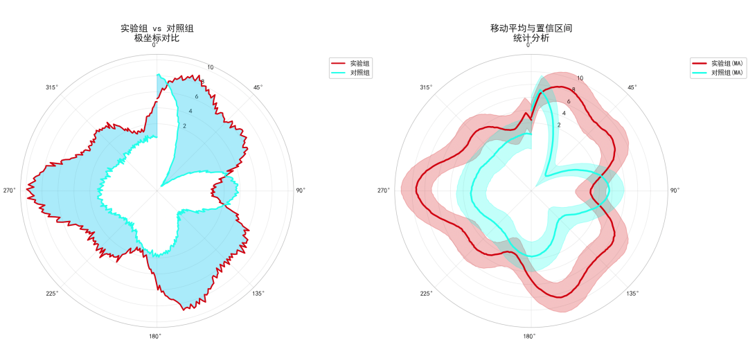
# 一个完整案例
def create_publication_ready_plot():
"""可直接用于科研的极坐标图"""
# 创建图形和极坐标轴
fig, (ax1, ax2) = plt.subplots(1, 2, figsize=(16, 8),
subplot_kw=dict(projection='polar'))
# 左侧子图:多变量对比
ax1.plot(theta, r1, color=custom_colors[0], linewidth=2, label='实验组')
ax1.plot(theta, r2, color=custom_colors[1], linewidth=2, label='对照组')
ax1.fill_between(theta, r1, r2, alpha=0.3, color=custom_colors[2])
ax1.set_title('实验组 vs 对照组\n极坐标对比', fontsize=14, fontweight='bold', pad=20)
ax1.legend(loc='upper right', bbox_to_anchor=(1.3, 1.0))
ax1.grid(True, alpha=0.3)
# 右侧子图:统计分析
# 计算移动平均
window_size = 10
r1_ma = np.convolve(r1, np.ones(window_size)/window_size, mode='same')
r2_ma = np.convolve(r2, np.ones(window_size)/window_size, mode='same')
ax2.plot(theta, r1_ma, color=custom_colors[0], linewidth=2.5, label='实验组(MA)')
ax2.plot(theta, r2_ma, color=custom_colors[1], linewidth=2.5, label='对照组(MA)')
# 填充置信区间
std_r1 = np.std(r1)
std_r2 = np.std(r2)
ax2.fill_between(theta, r1_ma - std_r1, r1_ma + std_r1,
alpha=0.2, color=custom_colors[0])
ax2.fill_between(theta, r2_ma - std_r2, r2_ma + std_r2,
alpha=0.2, color=custom_colors[1])
ax2.set_title('移动平均与置信区间\n统计分析', fontsize=14, fontweight='bold', pad=20)
ax2.legend(loc='upper right', bbox_to_anchor=(1.3, 1.0))
ax2.grid(True, alpha=0.3)
# 为两个子图设置一致的极坐标参数
for ax in [ax1, ax2]:
ax.set_theta_offset(np.pi/2)
ax.set_theta_direction(
-1)
ax.set_rgrids([2, 4, 6, 8, 10], fontsize=10)
return fig, (ax1, ax2)
final_fig, final_axes = create_publication_ready_plot()
plt.show()
总结
本文,给大家介绍了三种不同的极坐标图绘制方法,每种方法都针对特定的科研需求。
- 极坐标热力图与等高线组合图:适合展示二维密度分布和梯度变化
- 极坐标面积图与统计分析:适合构成分析和累积效应展示
大家在后面的使用中,一定要选择对比度明显的配色,比如说在黑白打印时仍可区分。
参数调优放,合理设置线宽、透明度、标记大小等视觉参数。
另外,设置高DPI和合适的输出格式,满足特定期刊要求。


