本文中介绍的是如何制作桑基图,使用的可视化库是强大的 Pyecharts (版本1.7.1,版本一致很重要)。文章将从如下几个方面进行介绍:
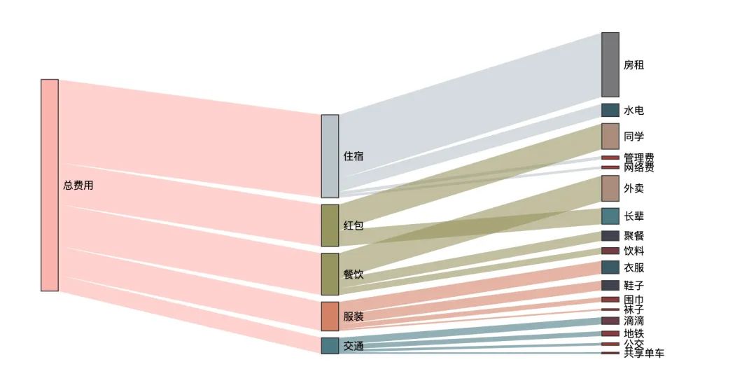
在开始之前,我们先来看看通过本文制作的最终效果图:
什么是桑基图?
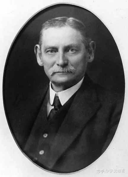
桑基图(桑葚图),也叫桑基能量分流图或者桑基能量平衡图,里面的桑基其实是一个人名,全名是 马修·亨利·菲尼亚斯·里尔·桑基(Matthew Henry Phineas Riall Sankey) ,是一名爱尔兰裔工程师,也是英国皇家陆军工兵的上尉[1]。
早在 1898 年的时候,他就使用这种图形来表示蒸汽机的能源效率:

桑基之后,桑基图逐渐成为科学和工程领域,代表平衡、能量流、物质流的标准模型,在一些产品的生命周期评估中也常被使用,通常应用于能源、材料成分、金融等数据的可视化分析。主要特点是:
- 图形由边、流量和支点组成。边代表了流动的数据,流量代表了流动数据的具体数值,节点代表了不同分类
- 始末端的分支宽度总和相等,即所有主支宽度的总和应与所有分出去的分支宽度的总和相等,保持能量的平衡。
官网demo
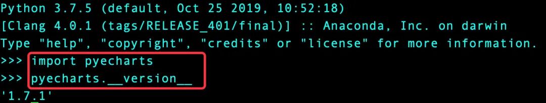
本文中使用的Pyecharts版本是1.7.1,版本的一致非常重要。
import pyecharts
pyecharts.__version__
demo_1
首先我们看看官网的第一个demo:
from pyecharts import options as opts
from pyecharts.charts import Sankey
nodes = [ # 所有节点名称
{"name": "category1"},
{"name": "category2"},
{"name": "category3"},
{"name": "category4"},
{"name": "category5"},
{"name": "category6"},
]
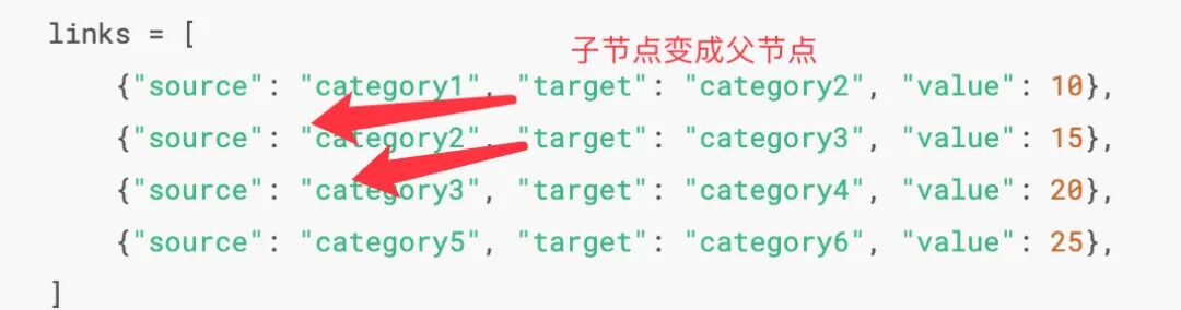
links = [ # 每一条链路的数据,包含:父节点source + 子节点target + 数据值value
{"source": "category1", "target": "category2", "value": 10},
{"source": "category2", "target": "category3", "value": 15},
{"source": "category3", "target": "category4", "value": 20},
{"source": "category5", "target": "category6", "value": 25},
]
c = (
Sankey()
.add(
"sankey",
nodes,
links,
linestyle_opt=opts.LineStyleOpts(opacity=0.2, curve=0.5, color="source"),
label_opts=opts.LabelOpts(position="right"),
)
.set_global_opts(title_opts=opts.TitleOpts(title="Sankey-基本示例"))
# .render("sankey_base.html") 生成HTML文件
)
c.render_notebook() # jupyter notebook中在线显示
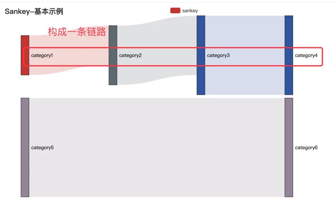
在上面的代码中,nodes部分表示的是所有的节点名称,不管是父节点还是最小的子节点都要列出来;links部分表示的是每条链路的数据,包含:父节点source + 子节点target + 数据值value。根据links的数据,我们可以发现:category1——-category2———category3———category4构成了一条完整的链路,category5—category6构成了另一条链路。
下面是最终的图形:
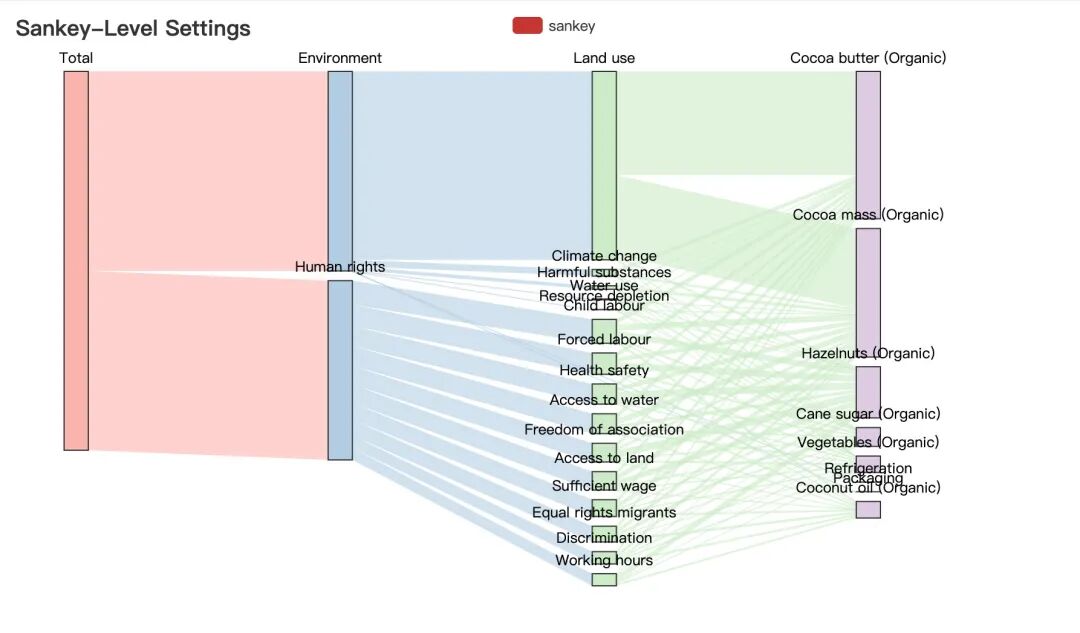
demo_2
接下来我们看看官网的第二个demo:
import json
from pyecharts import options as opts
from pyecharts.charts import Sankey
with open("product.json", "r", encoding="utf-8") as f: # 导入json数据
j = json.load(f) # json数据转成字典数据
c = (
Sankey()
.add(
"sankey",
nodes=j["nodes"], # 取出json数据的节点和链路数据
links=j["links"],
pos_top="10%",
focus_node_adjacency=True,
levels=[
opts.SankeyLevelsOpts(
depth=0,
itemstyle_opts=opts.ItemStyleOpts(color="#fbb4ae"),
linestyle_opts=opts.LineStyleOpts(color="source", opacity=0.6),
),
opts.SankeyLevelsOpts(
depth=1,
itemstyle_opts=opts.ItemStyleOpts(color="#b3cde3"),
linestyle_opts=opts.LineStyleOpts(color="source", opacity=0.6),
),
opts.SankeyLevelsOpts(
depth=2,
itemstyle_opts=opts.ItemStyleOpts(color="#ccebc5"),
linestyle_opts=opts.LineStyleOpts(color="source", opacity=0.6),
),
opts.SankeyLevelsOpts(
depth=3,
itemstyle_opts=opts.ItemStyleOpts(color="#decbe4"),
linestyle_opts=opts.LineStyleOpts(color="source", opacity=0.6),
),
],
linestyle_opt=opts.LineStyleOpts(curve=0.5),
)
.set_global_opts(
title_opts=opts.TitleOpts(title="Sankey-Level Settings"),
tooltip_opts=opts.TooltipOpts(trigger="item", trigger_on="mousemove"),
)
# .render("sankey_with_level_setting.html")
)
c.render_notebook() # 在线显示
- 读取本地的
json数据,通过josn.load()读取转成Python字典
桑基图绘制实践
原始数据整理
通过上面官网的例子我们明白了绘制桑基图需要的两个数据:节点数据+链路数据,下面👇通过一个实际的案例来讲解如何生成绘制桑基图需要的数据
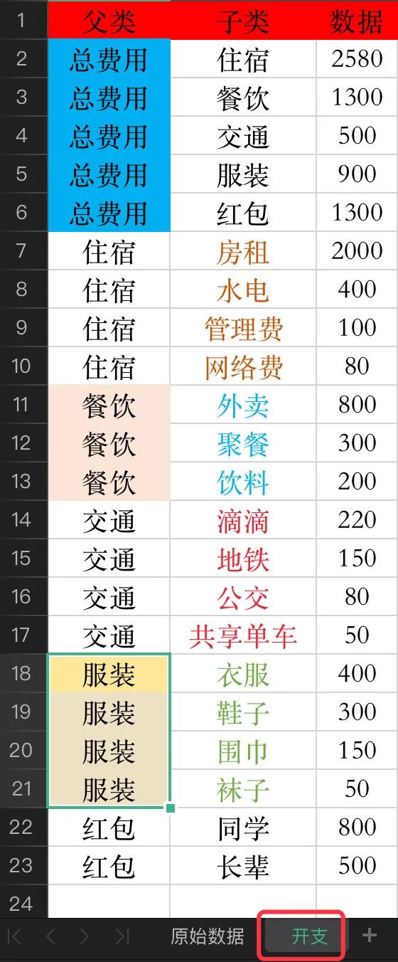
认识原始数据
Peter同学一个人在深圳搬砖,辛辛苦苦地搬了一个月,产生很多的开销😭,这些开支主要分成5大块:
每个部分又分别有不同的去向,所以这些数据就自然构成了一条条的链路,比如:总费用—住宿—房租(2000),总费用—交通—滴滴(220)等,我们只考虑两个节点之间的关系
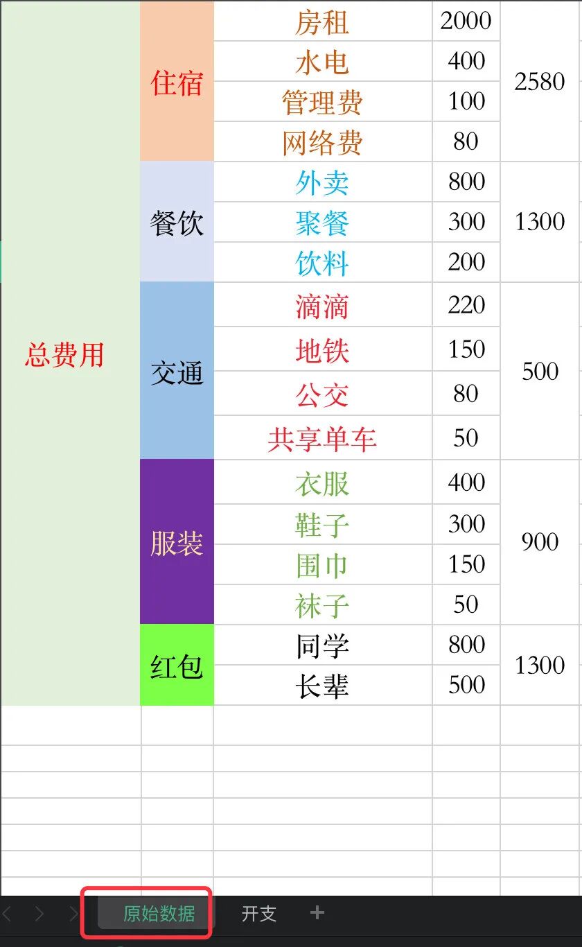
分层级整理数据
1、接下来我们分不同的层级来整理原始数据,首先是第一层:总费用到5个子版块。算出每个子版块的总和
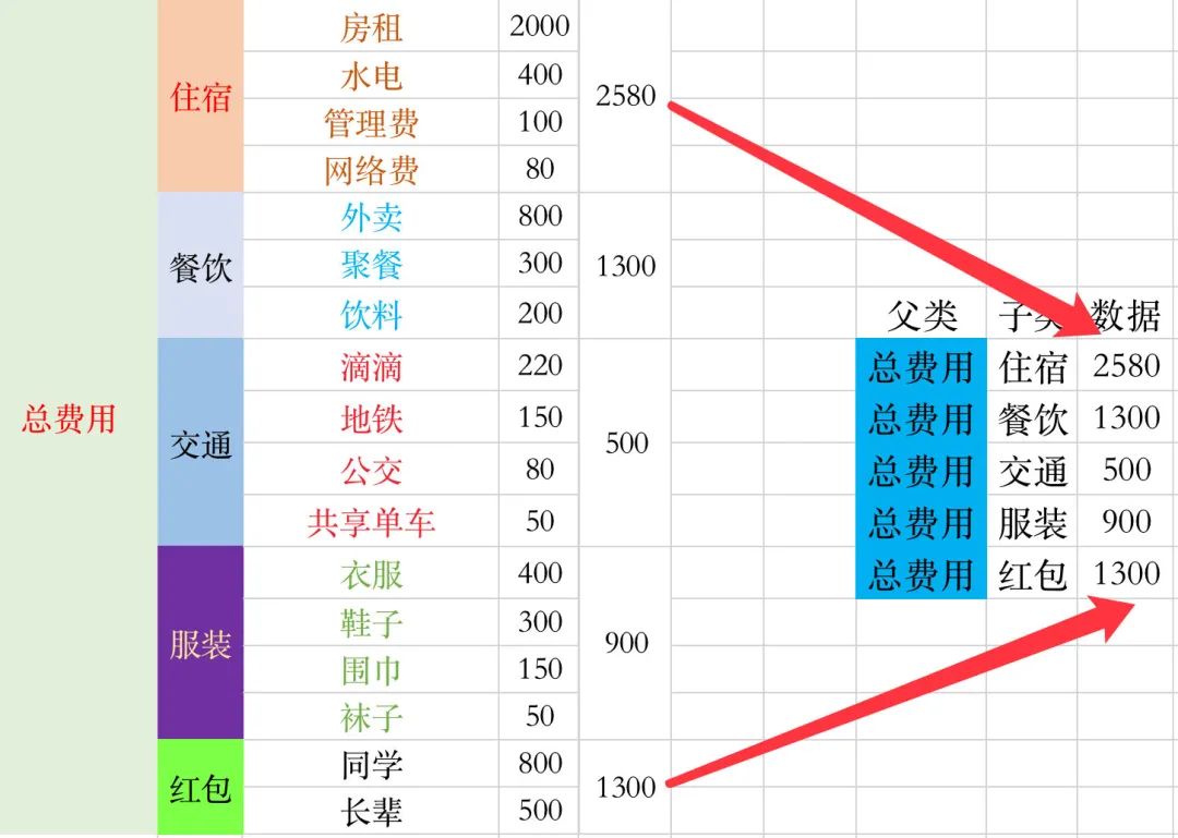
2、整理5个子版块的数据
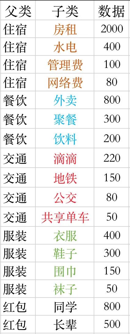
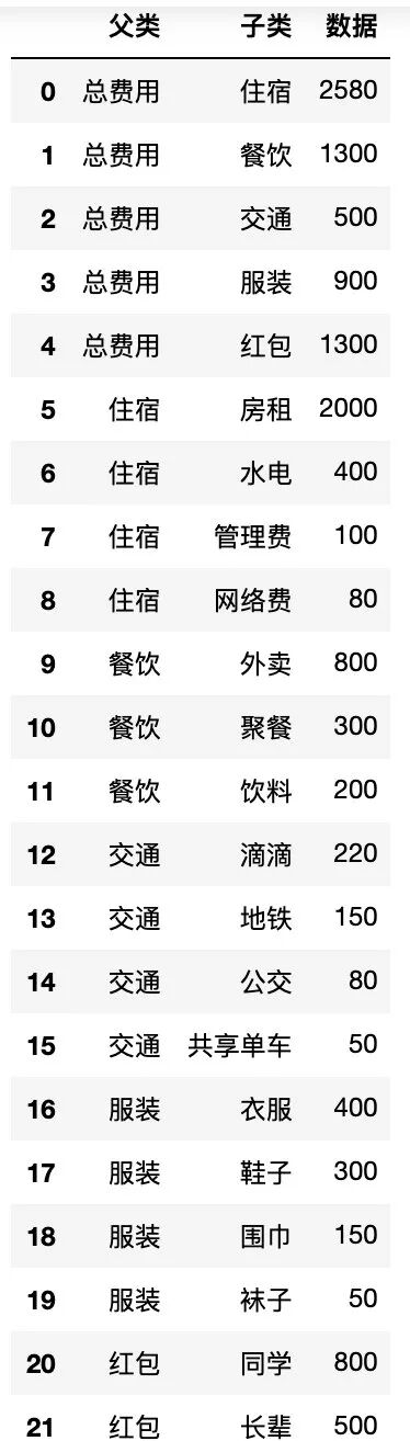
3、我们将上面两个步骤得到的数据放入一个sheet中,命名为开支:
桑基图数据生成
读取数据
首先我们将上面制作好的开支这份数据读到pandas中:
import pandas as pd
import numpy as np
import json

# 等价于:data = pd.read_excel("life.xlsx",sheet_name=1)  1表示sheet_name的索引位置,索引从0开始
df = pd.read_excel("life.xlsx",sheet_name="开支")  # 直接写名字
df.head()
注意两点:
- 当一个表格中存在多个
sheet的时候,我们需要指定sheet_name的名字
确定全部节点nodes
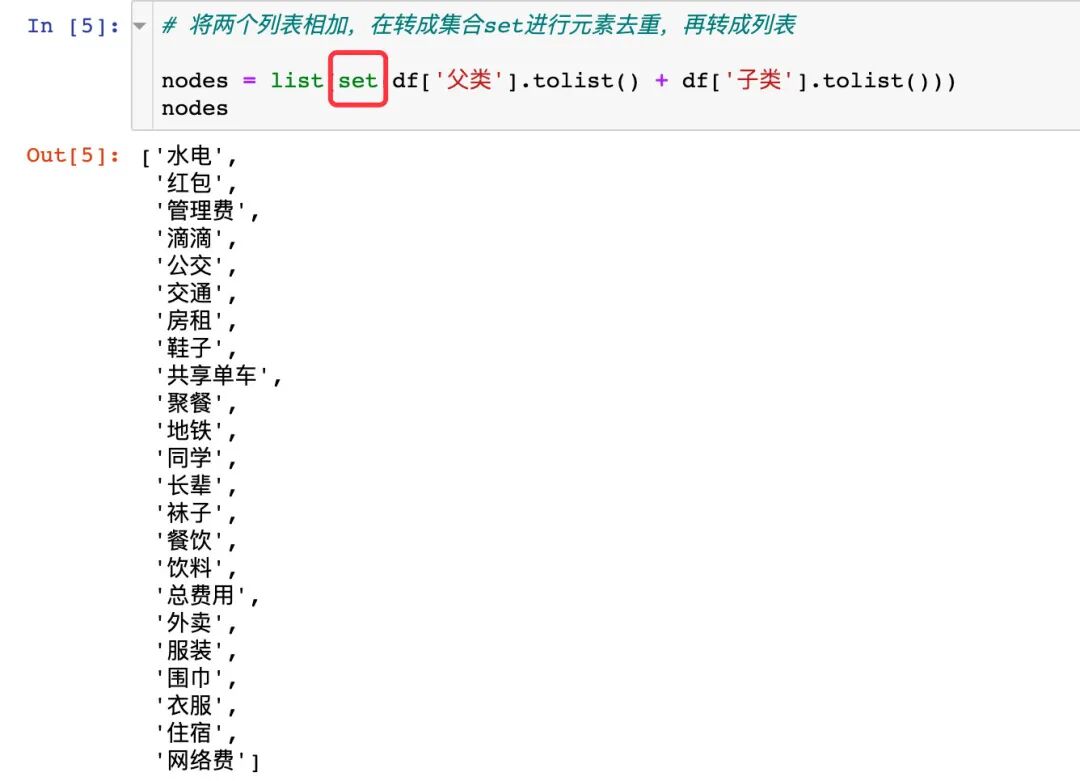
1、先找出全部的节点
所有的节点数据就是上面的父类和子类中去重后的元素,我们使用集合set进行去重,再转成列表
# 父类+子类中的数据,需要去重

df['父类'].tolist()
df['子类'].tolist()
将上面的数据相加并且去重:
# 将两个列表相加,在转成集合set进行元素去重,再转成列表

nodes = list(set(df['父类'].tolist() + df['子类'].tolist()))
nodes
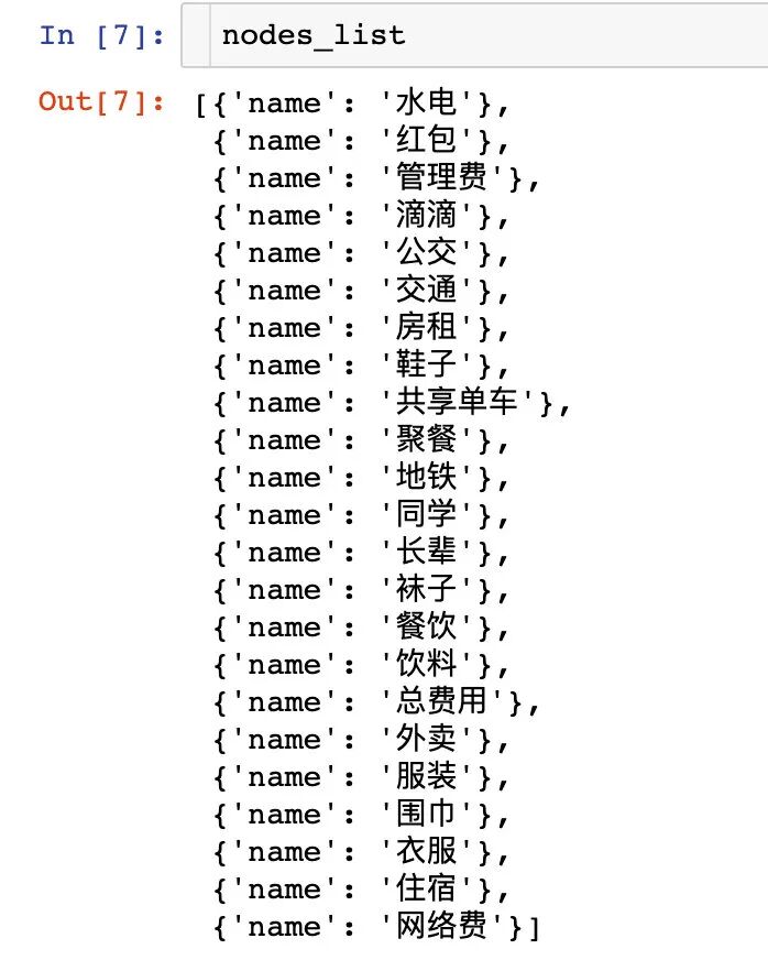
2、生成节点数据
# 节点列表数据: nodes_list

nodes_list = []
for i in nodes:
    dic = {}
    dic["name"] = i
    nodes_list.append(dic)
nodes_list
生成链路数据
我们将导入的数据生成链路数据:每一行记录都是一个链路数据:
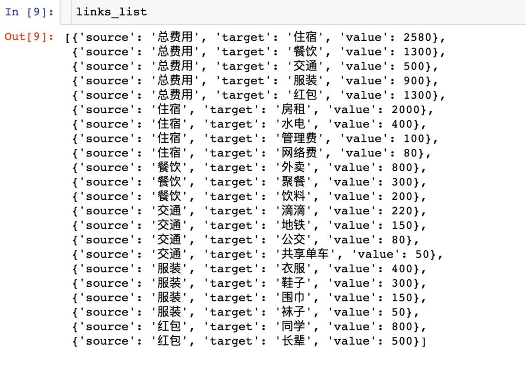
links_list = []

for i in range(len(df)):
    dic = {}
    dic['source'] = df.iloc[i,0]  # 父类
    dic['target'] = df.iloc[i,1]  # 子类
    dic['value'] = int(df.iloc[i,2])   # 数据值 : 使用int函数直接强制转换,防止json.dump()报错
    links_list.append(dic)
Attention⚠️:导入的数据部分需要强制转换成int类型,防止后面的数据处理报错。
到此为止,我们已经完成了桑葚图中节点数据和链路数据的生成,下面开始绘图。
绘制桑基图
我们通过官网的2种不同方式来绘制桑基图
方式1
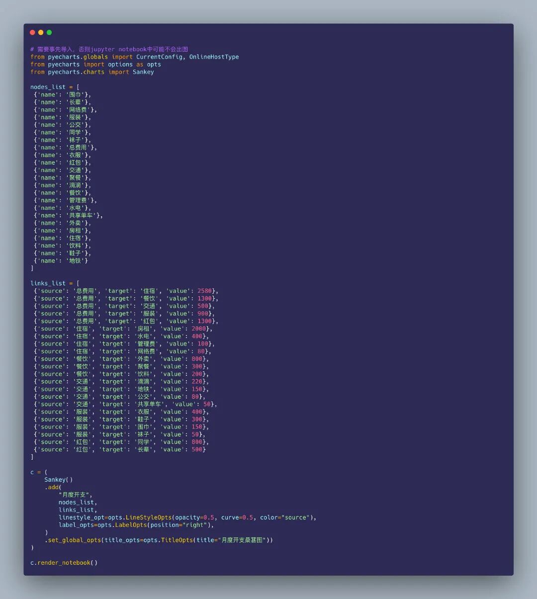
这种方式比较简单:直接将上面得到的nodes_list和links_list整体放入绘图的代码中:
# 需要事先导入,否则jupyter notebook中可能不会出图
from pyecharts.globals import CurrentConfig, OnlineHostType
from pyecharts import options as opts # 图形设置
from pyecharts.charts import Sankey # 导入桑基图型的类
nodes_list = [
{'name': '围巾'},
{'name': '长辈'},
{'name': '网络费'},
{'name': '服装'},
{'name': '公交'},
{'name': '同学'},
{'name': '袜子'},
{'name': '总费用'},
{'name': '衣服'},
{'name': '红包'},
{'name': '交通'},
{'name': '聚餐'},
{'name': '滴滴'},
{'name': '餐饮'},
{'name': '管理费'},
{'name': '水电'},
{'name': '共享单车'},
{'name': '外卖'},
{'name': '房租'},
{'name': '住宿'},
{'name': '饮料'},
{'name': '鞋子'},
{'name': '地铁'}
]
links_list = [
{'source': '总费用', 'target': '住宿', 'value': 2580},
{'source': '总费用', 'target': '餐饮', 'value': 1300},
{'source': '总费用', 'target': '交通', 'value': 500},
{'source': '总费用', 'target': '服装', 'value': 900},
{'source': '总费用', 'target': '红包', 'value': 1300},
{'source': '住宿', 'target': '房租', 'value': 2000},
{'source': '住宿', 'target': '水电', 'value': 400},
{'source': '住宿', 'target': '管理费', 'value': 100},
{'source': '住宿', 'target': '网络费', 'value': 80},
{'source': '餐饮', 'target': '外卖', 'value': 800},
{'source': '餐饮', 'target': '聚餐', 'value': 300},
{'source': '餐饮', 'target': '饮料', 'value': 200},
{'source': '交通', 'target': '滴滴', 'value': 220},
{'source': '交通', 'target': '地铁', 'value': 150},
{'source': '交通', 'target': '公交', 'value': 80},
{'source': '交通', 'target': '共享单车', 'value': 50},
{'source': '服装', 'target': '衣服', 'value': 400},
{'source': '服装', 'target': '鞋子', 'value': 300},
{'source': '服装', 'target': '围巾', 'value': 150},
{'source': '服装', 'target': '袜子', 'value': 50},
{'source': '红包', 'target': '同学', 'value': 800},
{'source': '红包', 'target': '长辈', 'value': 500}
]
c = (
Sankey()
.add(
"月度开支",
nodes_list,
links_list,
linestyle_opt=opts.LineStyleOpts(opacity=0.5, curve=0.5, color="source"),
label_opts=opts.LabelOpts(position="right"),
)
.set_global_opts(title_opts=opts.TitleOpts(title="月度开支桑葚图"))
)
c.render_notebook()
得到的桑基图在notebook中是动态的图形:
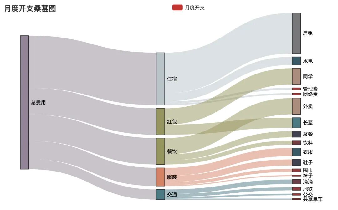
动态视频效果如下:
方式2
如果数据比较少,将nodes_list和links_list放入绘图的代码中不会占据过多的空间;但是如果数据量大,不同链路种类多,全部放在整个绘图代码中,就会显得整个代码很臃肿。
于是产生了方式2:先将上面得到的nodes_list和links_list生成一个json文件,再将json文件通过with方法读进来进行绘图。下面讲解如何通过得到的nodes_list和links_list数据生成我们绘图需要的json数据。
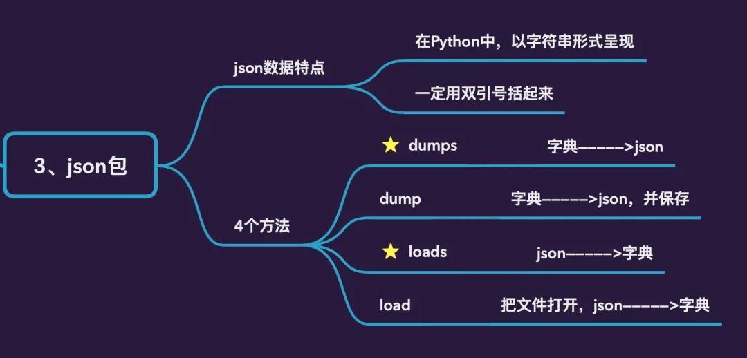
json格式的数据,在python中以字符串的形式呈现,一定要用双引号括起来。json模块中提供的4个功能:
dumps:python字典数据类型转成json数据类型的字符串load:把文件打开,并且从字符串转换成字典数据类型
1、先生成字典数据
data_dic = {}

data_dic["nodes"] = nodes_list
data_dic["links"] = links_list
得到的字典data_dic数据分为节点数据和链路数据,具体如下:
{'nodes': [{'name': '围巾'}, # 节点部分数据
{'name': '长辈'},
{'name': '网络费'},
{'name': '服装'},
{'name': '公交'},
{'name': '同学'},
{'name': '袜子'},
{'name': '总费用'},
{'name': '衣服'},
{'name': '红包'},
{'name': '交通'},
{'name': '聚餐'},
{'name': '滴滴'},
{'name': '餐饮'},
{'name': '管理费'},
{'name': '水电'},
{'name': '共享单车'},
{'name': '外卖'},
{'name': '房租'},
{'name': '住宿'},
{'name': '饮料'},
{'name': '鞋子'},
{'name': '地铁'}],
'links': [{'source': '总费用', 'target': '住宿', 'value': 2580}, # 链路部分数据
{'source': '总费用', 'target': '餐饮', 'value': 1300},
{'source': '总费用', 'target': '交通', 'value': 500},
{'source': '总费用', 'target': '服装', 'value': 900},
{'source': '总费用', 'target': '红包', 'value': 1300},
{'source': '住宿', 'target': '房租', 'value': 2000},
{'source': '住宿', 'target': '水电', 'value': 400},
{'source': '住宿', 'target': '管理费', 'value': 100},
{'source': '住宿', 'target': '网络费', 'value': 80},
{'source': '餐饮', 'target': '外卖', 'value': 800},
{'source': '餐饮', 'target': '聚餐', 'value': 300},
{'source': '餐饮', 'target': '饮料', 'value': 200},
{'source': '交通', 'target': '滴滴', 'value': 220},
{'source': '交通', 'target': '地铁', 'value': 150},
{'source': '交通', 'target': '公交', 'value': 80},
{'source': '交通', 'target': '共享单车', 'value': 50},
{'source': '服装', 'target': '衣服', 'value': 400},
{'source': '服装', 'target': '鞋子', 'value': 300},
{'source': '服装', 'target': '围巾', 'value': 150},
{'source': '服装', 'target': '袜子', 'value':
50},
{'source': '红包', 'target': '同学', 'value': 800},
{'source': '红包', 'target': '长辈', 'value': 500}]}
2、将生成的字典数据转成json数据,并保存到本地
通过json.dump方法将上面生成的字典类型数据转成json数据,并保存到本地:
with open("sankey.json","w",encoding="utf-8") as f:   # 数据保存到了本地
    # json.dump(data_dic, f)   写入一行数据
    json.dump(data_dic, f, indent=2, sort_keys=True, ensure_ascii=False)  # 写入多行数据
3、读取json数据进行绘图
import json

from pyecharts import options as opts
from pyecharts.charts import Sankey

with open("sankey.json", "r", encoding="utf-8") as f:   # 1、打开保存的文件
    j = json.load(f)   # 2、json字符串转成字典类型数据
c = (
    Sankey()
    .add(
        "月度开支",
        nodes=j["nodes"],   # 3、通过键值对的映射关系来读取数据
        links=j["links"],
        pos_top="20%",
        focus_node_adjacency=True,
        levels=[
            opts.SankeyLevelsOpts(
                depth=0,
#                 itemstyle_opts=opts.ItemStyleOpts(color="#fbb4ae"),  4、属性的设置部分
                linestyle_opts=opts.LineStyleOpts(color="source", opacity=0.6),
            ),
            opts.SankeyLevelsOpts(
                depth=1,
#                 itemstyle_opts=opts.ItemStyleOpts(color="#b3cde3"),
                linestyle_opts=opts.LineStyleOpts(color="source", opacity=0.6),
            ),
            opts.SankeyLevelsOpts(
                depth=2,
#                 itemstyle_opts=opts.ItemStyleOpts(color="#ccebc5"),
                linestyle_opts=opts.LineStyleOpts(color="source", opacity=0.6),
            ),
        ],
        linestyle_opt=opts.LineStyleOpts(curve=0.5,color="source",opacity=0.6,type_="dotted"),
        label_opts=opts.LabelOpts(position="right")
    )
    .set_global_opts(
        title_opts=opts.TitleOpts(title="月度开支桑葚图"),
        tooltip_opts=opts.TooltipOpts(trigger="item", trigger_on="mousemove|click",is_show=True),
    )
)

c.render_notebook()

看看实际的动态化效果:
考拉收集了 21 张 Python 代码速查表,每一张都是国外的大师总结的,非常实用 ~
还有 2 张高清的 PyCharm 快捷键一览图,一张 Windows ,一张 Mac,放在桌面上,需要的时候打开一查,非常方便。。
怎么获取呢?
关注编程派公众号,回复关键词「f」获取
题图:pexels,CC0 授权


