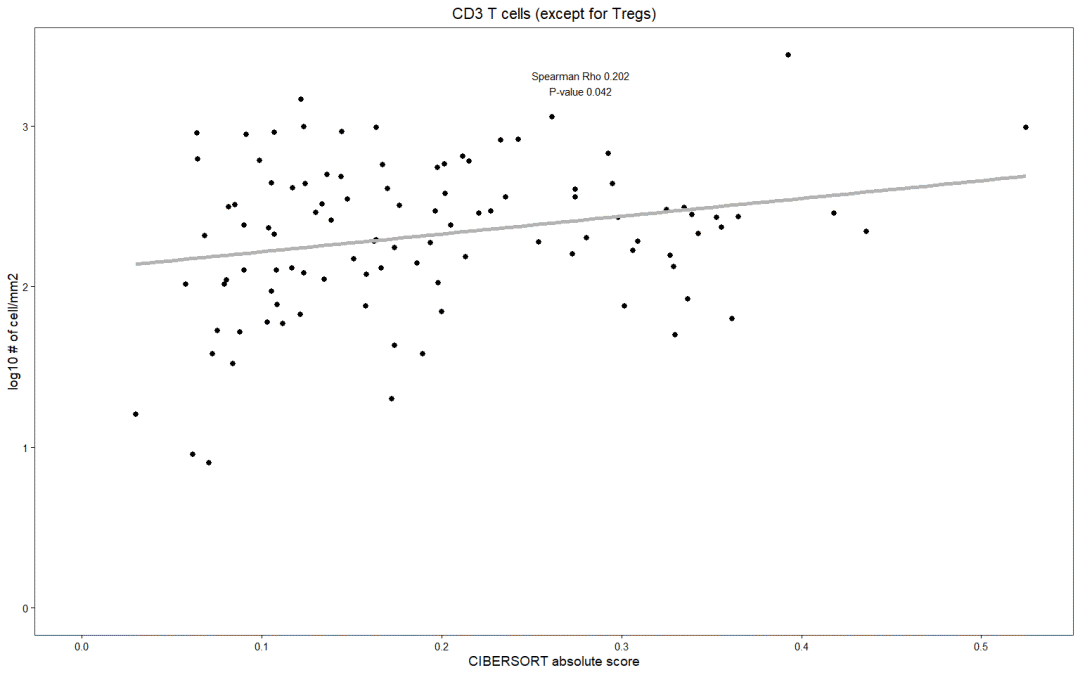
下面来实现Fig.2b的散点图
一、数据载入
rm(list = ls())
library(reshape2)
library(ggplot2)
library(RColorBrewer)
data head(data)
idx celltypes                'Macrophages', 'Macrophages M2', 'Plasma cells', 'Neutrophils')

celltypes
二、相关性分析
发现规律
一个个进行相关性分析太麻烦了,这些数据信息是否有规律呢?
果真如此!
一共七个细胞,CIBERSORT absolute score位于idx的七列中(设为i+1)
而IHC cell count就位于前一列(设为i列)
接下来就可以写个for循环做相关性分析了
idx data[1,idx]
data[1,idx+1]
相关性分析
# 准备数据
i=1
tmpdata head(tmpdata)

colnames(tmpdata) tmpdata$log10IHC tmpdata head(tmpdata)
相关系数(correlation coefficient)用于描述两个变量之间的相关程度。一般在[-1, 1]之间。包括:
pearson相关系数:适用于连续性变量,且变量服从正态分布的情况,为参数性的相关系数。
spearman等相关系数:适用于连续性及分类型变量,为非参数性的相关系数。
这里用了cor.test()函数,格式如下:
cor.test(x, y,
         alternative = c("two.sided", "less", "greater"),
         method = c("pearson", "kendall", "spearman"),
         exact = NULL, conf.level = 0.95, continuity = FALSE, ...)
# 其中x,y是供检验的样本;alternative指定是双侧检验还是单侧检验;method为检验的方法;conf.level为检验的置信水平
# 参考:http://www.sthda.com/english/wiki/correlation-test-between-two-variables-in-r
实际运用:
spearman str(spearman)

pval coef coef coef coef
# 设置标签,paste连接字符,collapse设置分隔符
text text
三、绘图
关键函数geom_point就可以绘制散点图,其他都是层层叠加设置拟合线,标题等等
参考:http://www.sthda.com/english/wiki/ggplot2-point-shapes
plt     geom_point(size=1) + # 改变shape形状, color线条颜色, fill填充颜色, size填充大小,stroke线条粗细
    geom_smooth(method = 'lm', se = FALSE, col = 'grey70') + # 拟合线,method:统计算法(lm\glm\gam\loess\rlm等),se:误差范围(就是围绕着拟合直线的颜色带),col:颜色
    labs(title=celltypes[i], y = 'log10 # of cell/mm2', x = 'CIBERSORT absolute score') + # 大标题,xy轴标签
    theme_bw(base_size = 7) + # 黑白主题:白色背景,灰色网格线;base_size控制字体大小
    theme(axis.text = element_text(colour = 'black'), # 轴刻度值
          axis.ticks = element_line(colour = 'black'), # 轴刻度线
          plot.title = element_text(hjust = 0.5), # 标题 hjust介于0,1之间,调节标题的横向位置
          panel.grid = element_blank()) + # 空白背景
    annotate("text", x = (max(tmpdata$CIBERSORT)+min(tmpdata$CIBERSORT))/2,
             y = max(tmpdata$log10IHC)*0.95, label = text, size=2) + # 添加注释,"text":指文本;xy 指定标签的位置;label:内容;size:大小
    xlim(0,max(tmpdata$CIBERSORT)) + ylim(0,max(tmpdata$log10IHC)) # xlim,ylim设置xy轴范围
plt
 四、划重点了!
直接上面绘图的代码代入,构建for循环
library(ggplot2)
data colnames(data)
idx celltypes                'Macrophages', 'Macrophages M2', 'Plasma cells', 'Neutrophils')

celltypes
for (i in c(1:length(idx))) {
  tmpdata   head(tmpdata)
  colnames(tmpdata)   tmpdata$log10IHC   tmpdata   head(tmpdata)

  spearman   pval   coef   coef   coef   text   text

  plt     geom_point(size=1) +
    geom_smooth(method = 'lm', se = FALSE, col = 'grey70') +
    labs(title=celltypes[i], y = 'log10 # of cell/mm2', x = 'CIBERSORT absolute score') +
    theme_bw(base_size = 7) +
    theme(axis.text = element_text(colour = 'black'),
          axis.ticks = element_line(colour = 'black'),
          plot.title = element_text(hjust = 0.5),
          panel.grid = element_blank()) +
    annotate("text", x = (max(tmpdata$CIBERSORT)+min(tmpdata$CIBERSORT))/2,
             y = max(tmpdata$log10IHC)*0.95, label = text, size=2) +
    xlim(0,max(tmpdata$CIBERSORT)) + ylim(0,max(tmpdata$log10IHC)); plt

  outputPdf                        '.small.log10trans.pdf'), collapse = '')
  ggsave(outputPdf, plt, units = 'cm', height = 5, width = 4.5)
}
五、扩展区
关于散点图还有很多内容可以调整,例如点的形状(shape):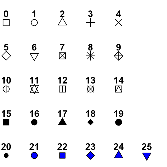
先模拟个数据集:
df df$cyl head(df)
library(ggplot2)
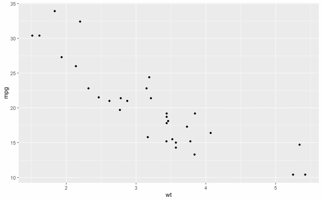
# Basic scatter plot
ggplot(df, aes(x=wt, y=mpg)) +
geom_point()
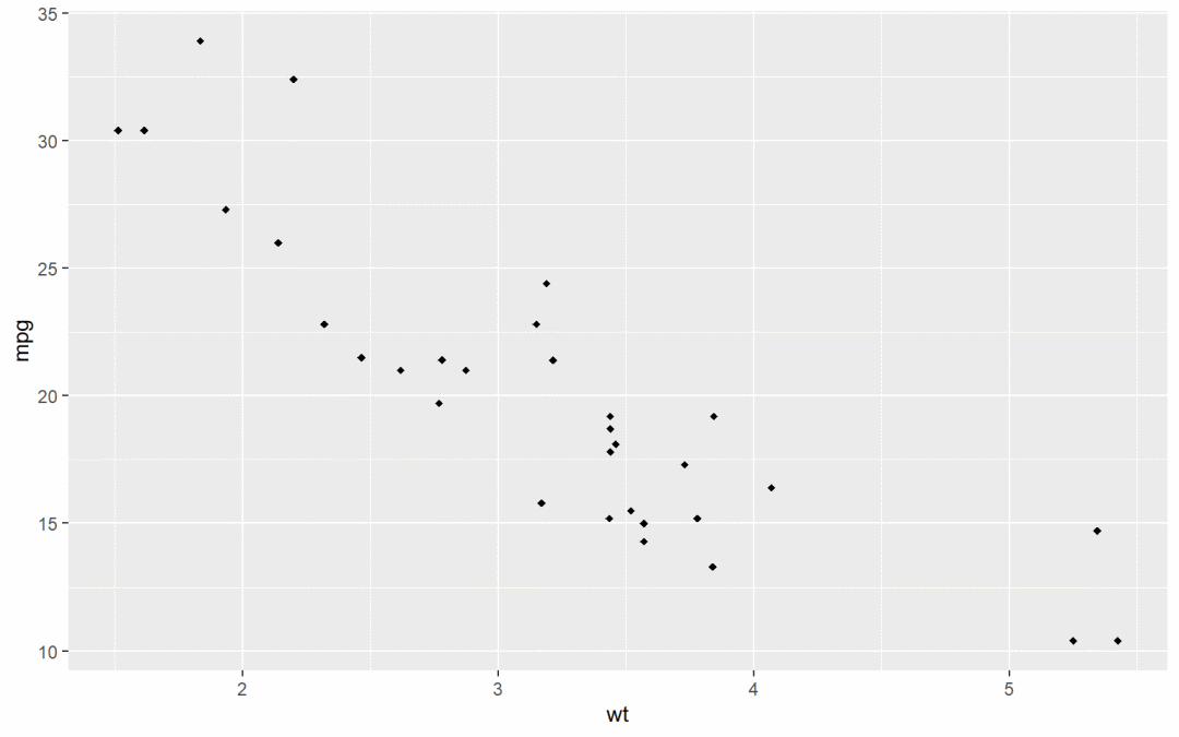
# Change the point shape
ggplot(df, aes(x=wt, y=mpg)) +
geom_point(shape=18)
# change shape, color, fill, size
ggplot(df, aes(x=wt, y=mpg)) +
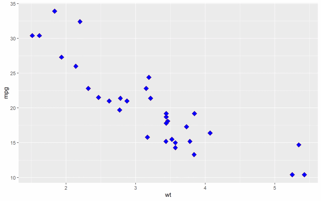
geom_point(shape=23, fill="blue", color="darkred", size=3)
 多分组时,直接映射
library(ggplot2)
# Scatter plot with multiple groups
# shape depends on cyl
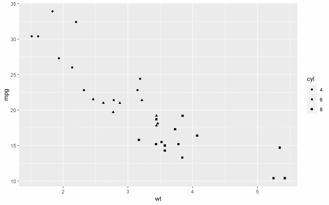
ggplot(df, aes(x=wt, y=mpg, group=cyl)) +
geom_point(aes(shape=cyl))
# Change point shapes and colors
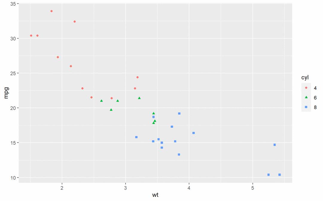
ggplot(df, aes(x=wt, y=mpg, group=cyl)) +
geom_point(aes(shape=cyl, color=cyl))
# change point shapes, colors and sizes
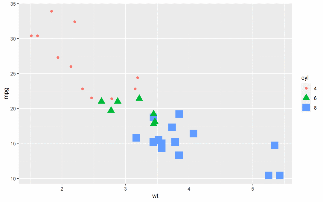
ggplot(df, aes(x=wt, y=mpg, group=cyl)) +
geom_point(aes(shape=cyl, color=cyl, size=cyl))
 上面的形状颜色大小还是自动修改的,当想手动设置时,需要添加不同的参数:
scale_shape_manual() : 改变点的形状scale_color_manual() : 改变点的颜色scale_size_manual() : 改变点的大小
# Change colors and shapes manually
ggplot(df, aes(x=wt, y=mpg, group=cyl)) +
  geom_point(aes(shape=cyl, color=cyl), size=2)+
  scale_shape_manual(values=c(3, 16, 17))+
  scale_color_manual(values=c('#999999','#E69F00', '#56B4E9'))+
  theme(legend.position="top") # 注释位置
# Change the point size manually
ggplot(df, aes(x=wt, y=mpg, group=cyl)) +
  geom_point(aes(shape=cyl, color=cyl, size=cyl))+
  scale_shape_manual(values=c(3, 16, 17))+
  scale_color_manual(values=c('#999999','#E69F00', '#56B4E9'))+
  scale_size_manual(values=c(2,3,4))+
  theme(legend.position="top")