关于数据集
数据集来自kaggle -- Machine Hack。
先进电子商务的用户数量激增,而包括买家浏览电子商务商店而花费大量时间等信息被,店主们还计划利用各种算法来吸引顾客,试图研究和利用顾客行为模式来增加营收。
跟踪客户活动也是了解客户行为并找出如何更好地为他们服务的好方法。机器学习和人工智能已经在设计各种推荐引擎方面发挥了重要作用,通过预测顾客的购买模式来吸引他们。
属性说明
- device_details - 客户端设备详细信息
- purchased - 是否完成任何购买的二分类值
- added_in_cart - 是否加入购物车的二分类值
- checked_out - 是否成功结账离开的二分类值
- time_spent - 以秒为单位的总时间 (目标列)
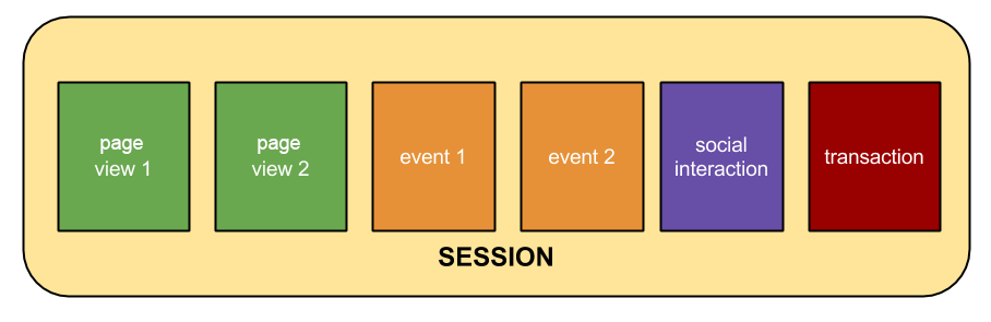
会话是指用户在一定的时间段内与您的网站进行的一组互动。例如,一次会话可以包含多个网页浏览、事件、社交互动和电子商务交易。
会话就相当于一个容器,其中包含了用户在网站上执行的操作。
加载必要的包
import pandas as pd
import numpy as np
import seaborn as sns
import matplotlib.pyplot as plt
import matplotlib.colors as mcolors
import calplot
这里使用了常规的数据处理库,pandas、numpy、seabron、matplotlib,同时为了加强昨天介绍的日历热图,使用calplot库在实际问题中的应用。
导入训练集与测试集
train = pd.read_csv("../ParticipantData_BTPC/Train.csv")
test = pd.read_csv("../ParticipantData_BTPC/Test.csv")
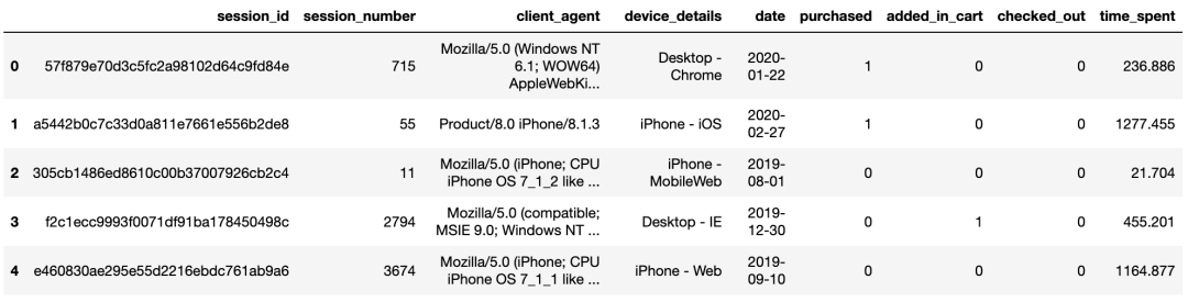
查看训练集与测试集的数据结构
train.info()
RangeIndex: 5429 entries, 0 to 5428
Data columns (total 9 columns):
 #   Column          Non-Null Count  Dtype
---  ------          --------------  -----
 0   session_id      5429 non-null   object
 1   session_number  5429 non-null   int64
 2   client_agent    5269 non-null   object
 3   device_details  5429 non-null   object
 4   date            5429 non-null   object
 5   purchased       5429 non-null   int64
 6   added_in_cart   5429 non-null   int64
 7   checked_out     5429 non-null   int64
 8   time_spent      5429 non-null   float64
dtypes: float64(1), int64(4), object(4)
memory usage: 297.0+ KB
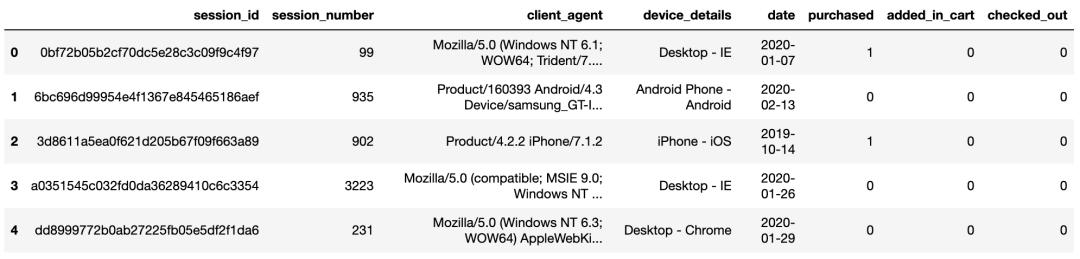
test.info()
RangeIndex: 2327 entries, 0 to 2326
Data columns (total 8 columns):
# Column Non-Null Count Dtype
--- ------ -------------- -----
0 session_id 2327 non-null object
1 session_number 2327 non-null int64
2 client_agent 2268 non-null object
3 device_details 2327 non-null object
4 date 2327 non-null object
5 purchased 2327 non-null int64
6 added_in_cart 2327 non-null int64
7 checked_out 2327 non-null int64
dtypes: int64(4), object(4)
memory usage: 109.1+ KB
查看训练集与测试集部分样本
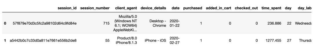
train.head()
test.head()
探索性数据分析
目标变量(time_spent)
首先查看目标变量的分布状况。
plt.figure(figsize=(10,8))
sns.despine(left=True, bottom=True)
sns.set_theme(style="ticks")
sns.set(font_scale=1.4)
ax=sns.histplot(train["time_spent"],
                log_scale=10,
                kde=True,
                color="green")
plt.title("Time Spent distribution")
ax.set(ylabel='')
ax.set(xticklabels='')
ax.set(yticklabels="")
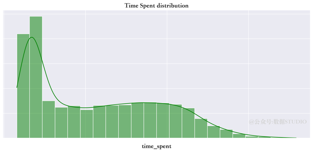
上面目标变量所花的时间分布是高度右偏的。值得注意的是,为了更好的可视化,绘图时使用了log刻度。
使用箱限图查看目标变量分布
sns.boxplot(data=train,
            x="time_spent",
            color="green")
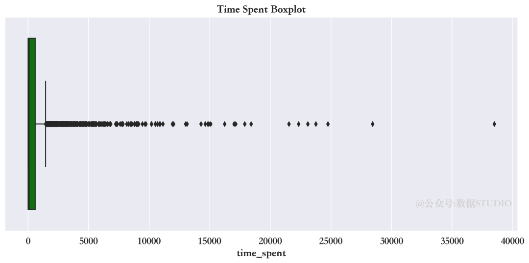
从上面箱限图中显示,在 Quartile-3 之上有许多离散异常点。如果在后续分析中,需要额外注意。
目标变量的描述性统计
train["time_spent"].describe()
count     5429.000000
mean       663.194292
std       1713.671664
min         14.400000
25%         22.699000
50%         98.312000
75%        600.463000
max      38494.025000
Name: time_spent, dtype: float64
会话类型(session_number)
会话类型描述性统计
train["session_number"].describe()
count    5429.000000
mean     1072.835329
std      1436.351474
min        11.000000
25%       121.000000
50%       517.000000
75%      1397.000000
max      7722.000000
Name: session_number, dtype: float64
直方图看会话类型的分布
sns.histplot(train["session_number"])
全年中具有最多前10的会话类型
train["session_number"].value_counts().head(10)
11     437
22     192
33     132
44     101
55      93
66      92
77      79
110     73
88      70
99      66
Name: session_number, dtype: int64
客户端信息(device_details)
访问网站的都有哪些设备和应用程序
sns.countplot(y="device_details",
             data=train,
             order= train["device_details"].value_counts().index)
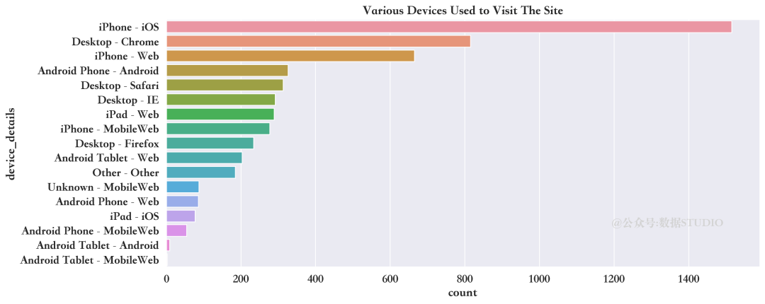
train["device_details"].value_counts()
iPhone - iOS                  1515
Desktop - Chrome               815
iPhone - Web                   665
Android Phone - Android        326
Desktop - Safari               313
Desktop - IE                   292
iPad - Web                     289
iPhone - MobileWeb             277
Desktop - Firefox              234
Android Tablet - Web           203
Other - Other                  185
Unknown - MobileWeb             87
Android Phone - Web             86
iPad - iOS                      77
Android Phone - MobileWeb       54
Android Tablet - Android         9
Android Tablet - MobileWeb       2
Name: device_details, dtype: int64
上面的图表显示,iphone用户占据大多数。
客户在网站上时长与不同设备之间的关系
device_timespent = sns.violinplot(
    data=train, inner="point",
    y="device_details",
    x="time_spent",scale="width")
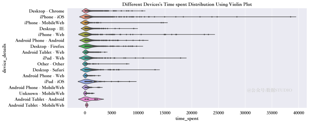
小提琴图清晰展示了使用苹果设备的用户花在网站上的时间比其他人更多。
会话的时间(date)
date属性是日期格式,所以需要将日期分成日、月、年,探索客户在网站上花的时长是如何随着时间变化的。
日期格式转换
在拆分日期之前,应使用pandas.to_datetime()函数将日期转换为datetime格式。
train['date'] = pd.to_datetime(
    train['date'], errors='coerce')
拆分年月日
train['day'] = train['date'].dt.day
train['day_label'] = train['date'].dt.day_name()
train['day_number'] = train['date'].dt.dayofweek
train['month_number'] = train['date'].dt.month
train['month_label'] = train['date'].dt.strftime('%b')
train['year_quarter'] = train['date'].dt.quarter
train['week_of_year'] = train['date'].dt.week
train['year'] = train['date'].dt.year
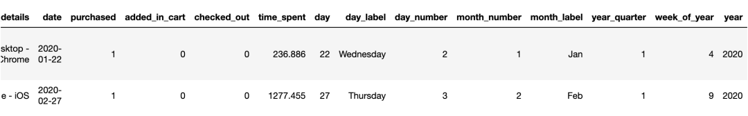
train.head(2)
重新排列年月日列
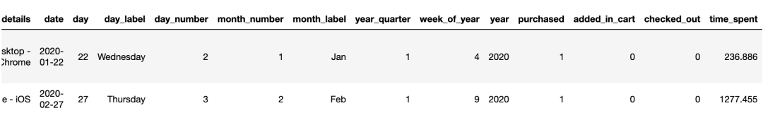
train=train.iloc[:,np.r_[0:5,9:17,5:9]]
train.head(2)
min(train["date"]),max(train["date"])
(Timestamp('2019-05-06 00:00:00'),
 Timestamp('2020-04-23 00:00:00'))
从2019年5月6日到2020年4月23日在网站上花费的时间可视化
time_spent_year = sns.lineplot(
              x="date",
              y="time_spent",
             data=train)
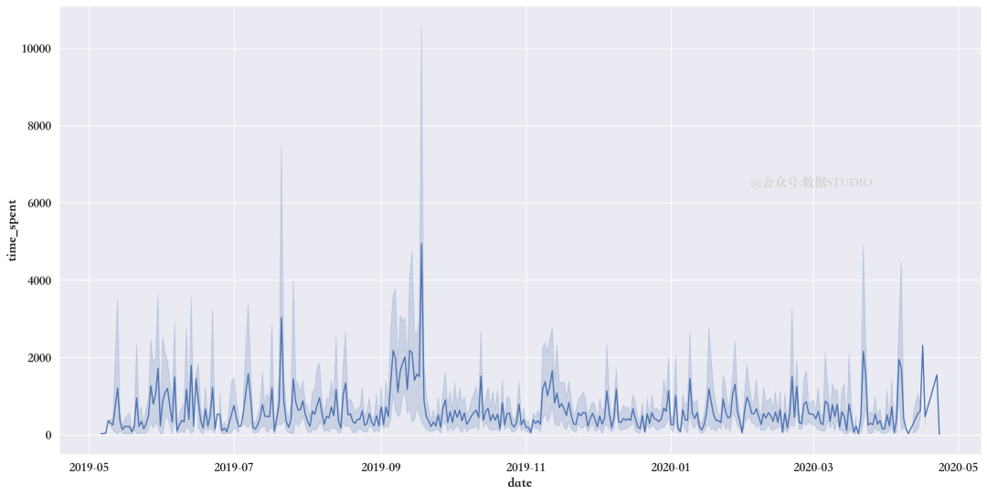
有图可知,2019年7月和9月是客户花费时间最多的月份。
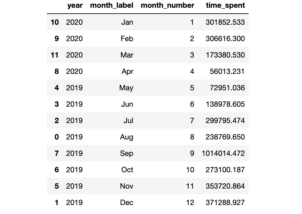
2019年和2020年每个月客户在网站上花费的时间总和
在2019年,只有5月至12月的记录。
在2020年,只有1月到4月的记录。
创建按年月统计的时间花费数据框架,并使用使用折线图可视化其变化趋势。
month_year_spent = train.groupby(
                ["year","month_label",'month_number']
                ).agg({'time_spent':["sum"]})
month_year_spent.columns = ['time_spent']
month_year_spent= month_year_spent.reset_index()
month_year_spent=month_year_spent.sort_values("month_number", ascending=True)
month_year_spent
time_spent_year = sns.FacetGrid(month_year_spent,
despine=True, row="year",
hue="year",sharey=True,
sharex=False, height=15,
aspect = 2)
time_spent_year.map(sns.lineplot,
"month_label",
"time_spent",
linewidth = 6,sort=True
)
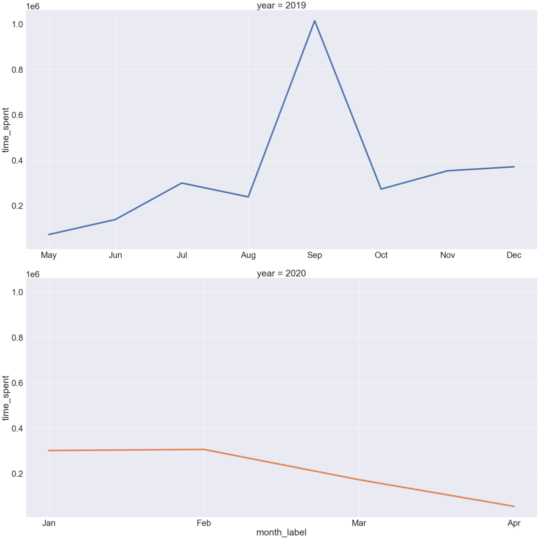
上图显示,2019年9月是该网站客户活跃度最高的月份。
在2020年,最高的客户活动记录出现在1月和2月。2月份以后,顾客活动逐渐减少。
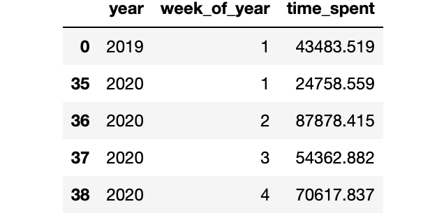
在2019年和2020年内哪一周的客户活动记录最高
week_year_spent = train.groupby(["year",'week_of_year']
                               ).agg({'time_spent':["sum"]})
week_year_spent.columns = ['time_spent']
week_year_spent= week_year_spent.reset_index()
week_year_spent=week_year_spent.sort_values("week_of_year", ascending=True)
week_year_spent.head()
plt.figure(figsize=(15,10))
time_spent_week_year = sns.FacetGrid(week_year_spent,
                                     despine=True,
                                     row="year", hue="year",
                                     sharey=True, sharex=False,
                                     height=15, aspect = 2)
time_spent_week_year.map(sns.lineplot,
                         "week_of_year",
                         "time_spent",
                         linewidth = 6)
time_spent_week_year.set(xticks=(np.arange(1,52,3)))
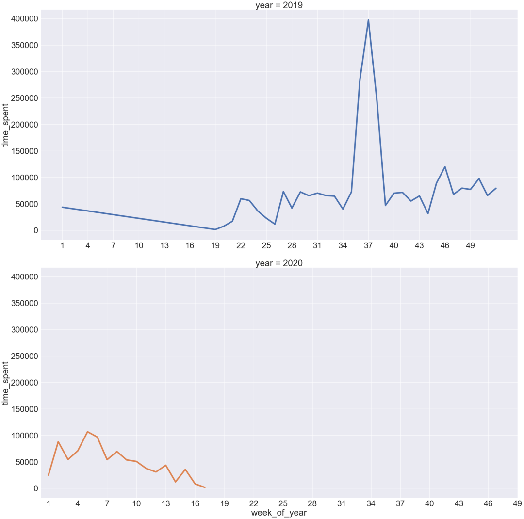
上图显示,在2019年,客户活动量最高记录在37周。2020年,第2周、第4周、第5周的客户活跃度最高。
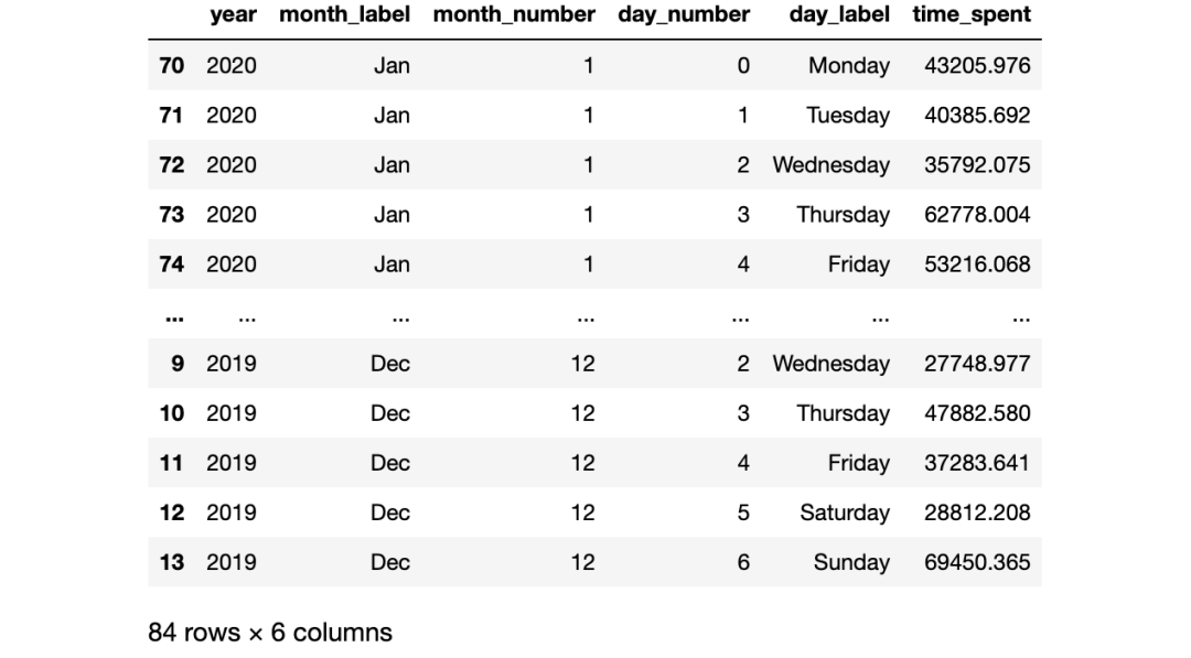
在2019年和2020年的每个月,每周的哪一天客户活动最多
day_week_spent = train.groupby(["year",'month_label','month_number','day_number','day_label']
                              ).agg({'time_spent':["sum"]})
day_week_spent.columns = ['time_spent']
day_week_spent= day_week_spent.reset_index()
day_week_spent=day_week_spent.sort_values(["month_number","day_number"]
                                          , ascending=True)
day_week_spent
time_spent_dayweek = sns.FacetGrid(day_week_spent,
                                   despine=True,
                                   row="year",
                                   hue="day_label",
                                   sharey=True,
                                   sharex=False,
                                   height=15,
                                   aspect = 2)
time_spent_dayweek.map(sns.lineplot,"month_label",
                       "time_spent",linewidth = 6
                      ).set(yscale = 'log')
time_spent_dayweek.add_legend()
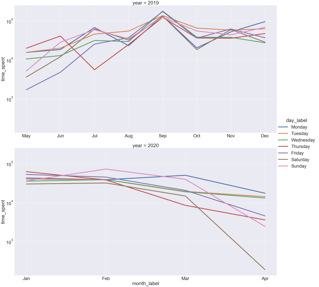
上图显示,在2019年,9月每周的每一天都有最高的客户活动量记录。在2020年,4月周六的客户活动记录最低,2月周日的客户活动记录最高。
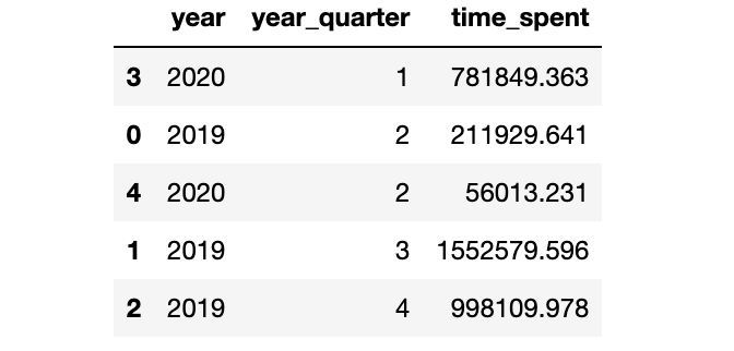
一年中哪个季度的客户活动记录最高
quart_year_spent = train.groupby(["year",'year_quarter']
                                ).agg({'time_spent':["sum"]})
quart_year_spent.columns = ['time_spent']
quart_year_spent= quart_year_spent.reset_index()
quart_year_spent=quart_year_spent.sort_values(
            "year_quarter", ascending=True)
quart_year_spent
quarter_spent = sns.FacetGrid(quart_year_spent,
                              despine=True, row="year",
                              hue="year",sharey=True,
                              sharex=False, height=15, aspect = 2)
quarter_spent.map(sns.lineplot,
                 "year_quarter",
                 "time_spent",
                 linewidth = 6
                 ).set(yscale = 'log')
quarter_spent.set(xticks=(np.arange(1,4,1)))
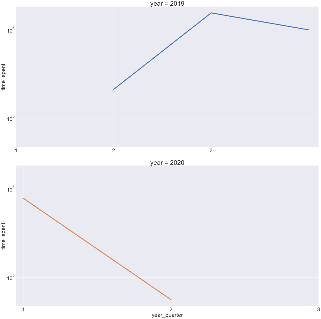
上图中说明,2019年第三季度客户活动有所增加。2020年,第二季度的客户网站活动比2019年第二季度最低。
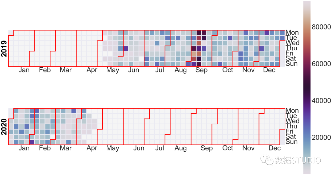
创建一个日历图,看看客户在网站上花了多长时间。
events = pd.Series(train["time_spent"].values, index=train["date"])
events
date
2020-01-22     236.886
2020-02-27    1277.455
2019-08-01      21.704
2019-12-30     455.201
2019-09-10    1164.877
                ...
Length: 5429, dtype: float64
通过日历图来看看客户在网站上花费的时间
cal_plot=calplot.calplot(events,edgecolor="red",
                         yearcolor="black",
                         cmap='twilight',
                         linewidth=5,
                         yearlabel_kws = {"fontsize":"medium"},
                         figsize=(40,20))
消费行为
与消费行为相关的三个属性,purchase、added_in_cart和checked_out,结下来探索这三个非重复排列组合,一共有多少组情况。
train.groupby(["purchased",
               "added_in_cart",
               "checked_out"],
               as_index=False).size()
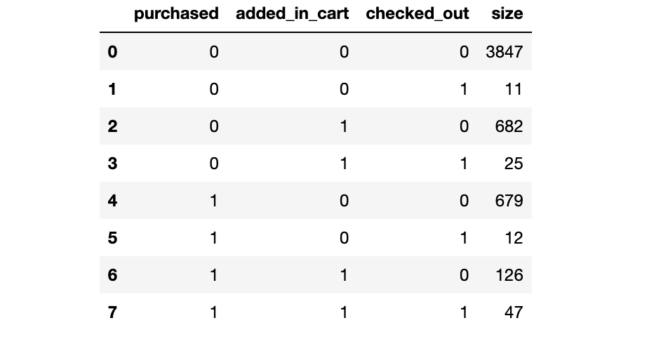
从结果看,一共有8种不同的组合。
根据组合创建一个category列
conditions= [(train["purchased"]==0) & (train["added_in_cart"]==0) &(train["checked_out"]==0),
(train["purchased"]==0
) & (train["added_in_cart"]==0) &(train["checked_out"]==1),
(train["purchased"]==0) & (train["added_in_cart"]==1) &(train["checked_out"]==0),
(train["purchased"]==0) & (train["added_in_cart"]==1) &(train["checked_out"]==1),
(train["purchased"]==1) & (train["added_in_cart"]==0) &(train["checked_out"]==0),
(train["purchased"]==1) & (train["added_in_cart"]==0) &(train["checked_out"]==1),
(train["purchased"]==1) & (train["added_in_cart"]==1) &(train["checked_out"]==0),
(train["purchased"]==1) & (train["added_in_cart"]==1) &(train["checked_out"]==1)]
values = ['no_activity', 'chk', 'add', 'add_chk','purc','purc_chk','purc_add','purc_add_chk']
使用numpy选择函数创建一个类别列
train['customer_activity'] = np.select(conditions, values)
客户行为分类
客户的活动在网站上是如何分类的
cust_activity = sns.countplot(y="customer_activity",
             data=train,
             order= train["customer_activity"].value_counts().index)
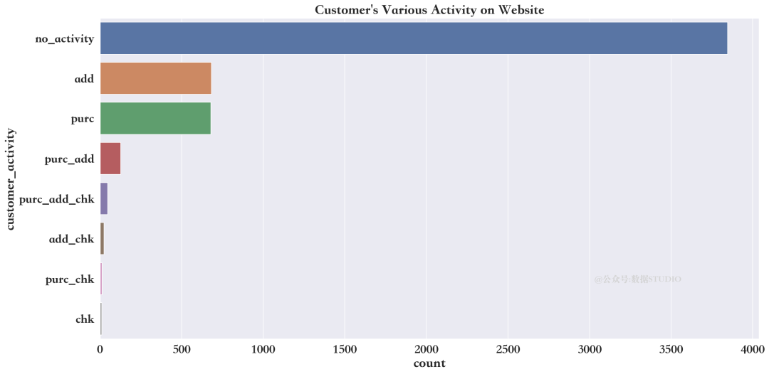
train['customer_activity'].value_counts()
no_activity     3847
add              682
purc             679
purc_add         126
purc_add_chk      47
add_chk           25
purc_chk          12
chk               11
Name: customer_activity, dtype: int64
上述结果说明,大多数客户只是浏览网站,并无实际消费行为。
客户在网站上花的时间,及其在各种活动中的变化
device_timespent = sns.violinplot(
    data=train, inner="point",
    y="customer_activity",
    x="time_spent",scale="width"
)
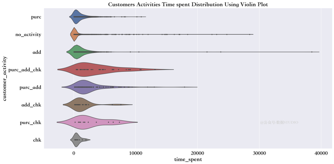
上面的情节解释了客户花费更多的时间仅仅是为了将产品添加到他们的购物车中,仅仅是为了访问站点。
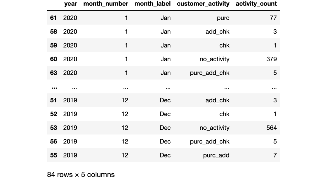
客户的活动是如何随时间变化的
cust_activity_my=train.groupby(["year",'month_number','month_label','customer_activity']).agg({'customer_activity':['count']})
cust_activity_my.columns = ['activity_count']
cust_activity_my= cust_activity_my.reset_index()
cust_activity_my=cust_activity_my.sort_values("month_number", ascending=True)
cust_activity_my
cust_activity_my_plot = sns.FacetGrid(cust_activity_my, despine=True,
                                      row="year", hue="customer_activity",
                                      sharey=True, sharex=False,
                                      height=15, aspect = 2)

cust_activity_my_plot.map(
             sns.lineplot,
            "month_label",
            "activity_count",
            linewidth = 6)
cust_activity_my_plot.add_legend()
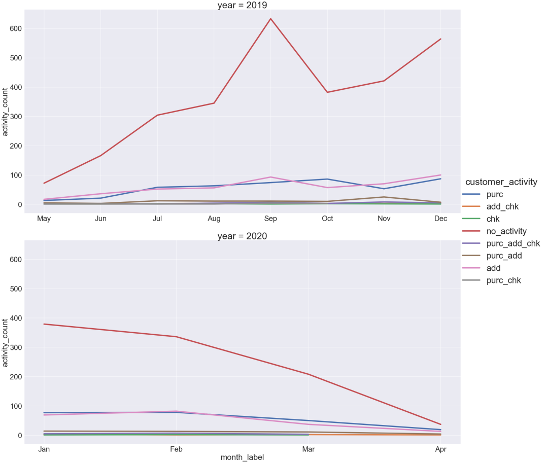
此前曾看到,客户活动最高的是2019年9月。他们中的大多数人只是访问网站。2020年的1月和2月也是如此。
2020年4月,各类客户活动数量下降至100以下。
客户端设备信息(device_details)
各种客户端设备上的客户活动
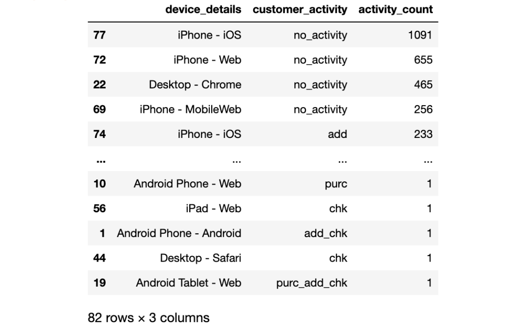
cust_activity_device=train.groupby(['device_details','customer_activity']).agg({'customer_activity':['count']})
cust_activity_device.columns = ['activity_count']
cust_activity_device= cust_activity_device.reset_index()
cust_activity_device=cust_activity_device.sort_values("activity_count", ascending=False)
cust_activity_device
cust_activity_dev = sns.FacetGrid(
            cust_activity_device,
            despine=True,
            col="customer_activity",
            hue="customer_activity",
            sharey=False, sharex=False,
            height=15, col_wrap = 2)
cust_activity_dev.map(sns.barplot,
          "activity_count",
          "device_details")
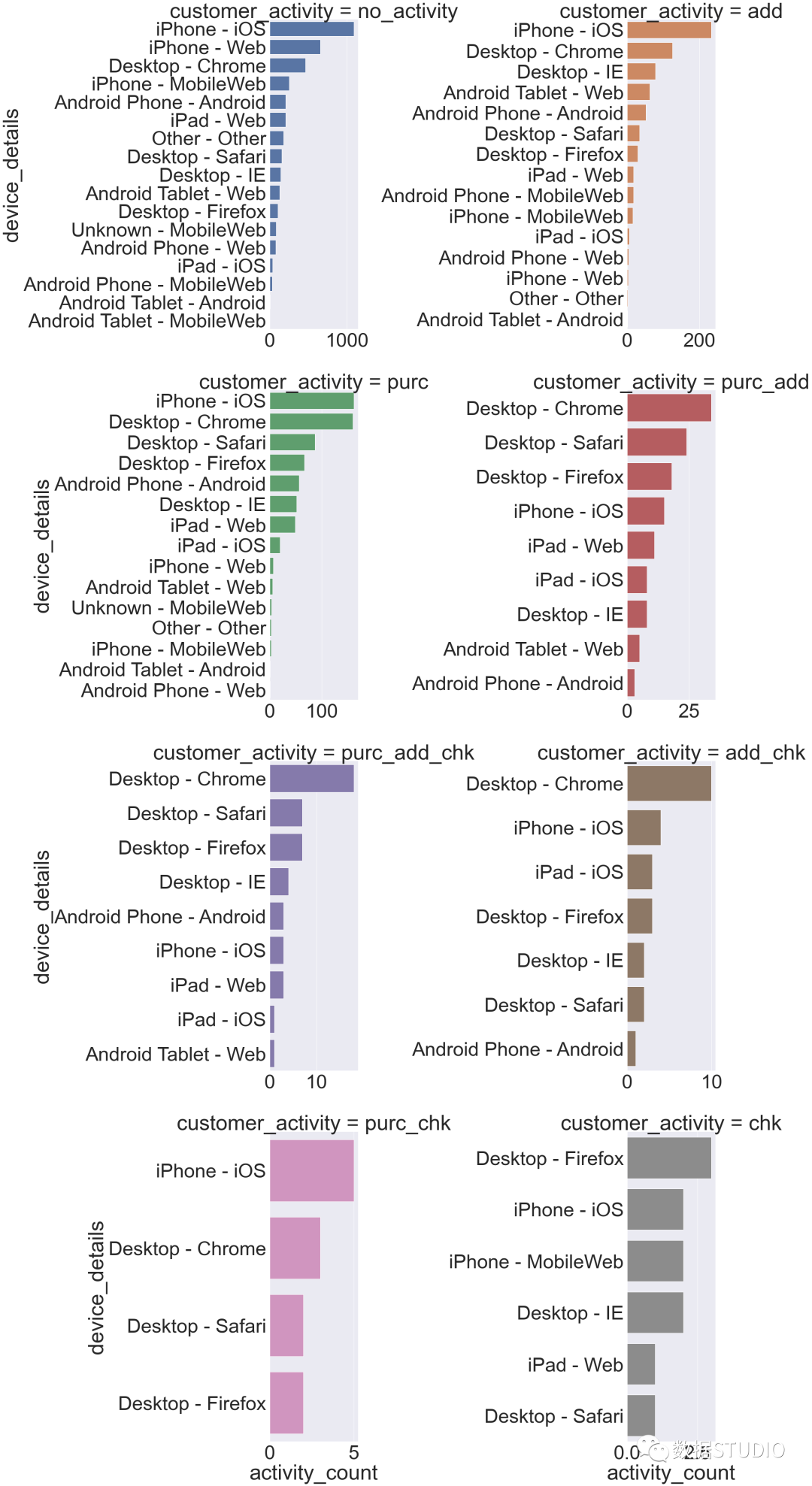
上面的图表说明购买最多的是iPhone用户。
写在最后
至此,本次数据可视化分析也告一段落,对于本次数据集,当然还有很多工作可以做,如对用户花费时间进行时间序列分析和预测等。