点击 机器学习算
法与Python学习 ,选择
加星标
精彩内容不迷路
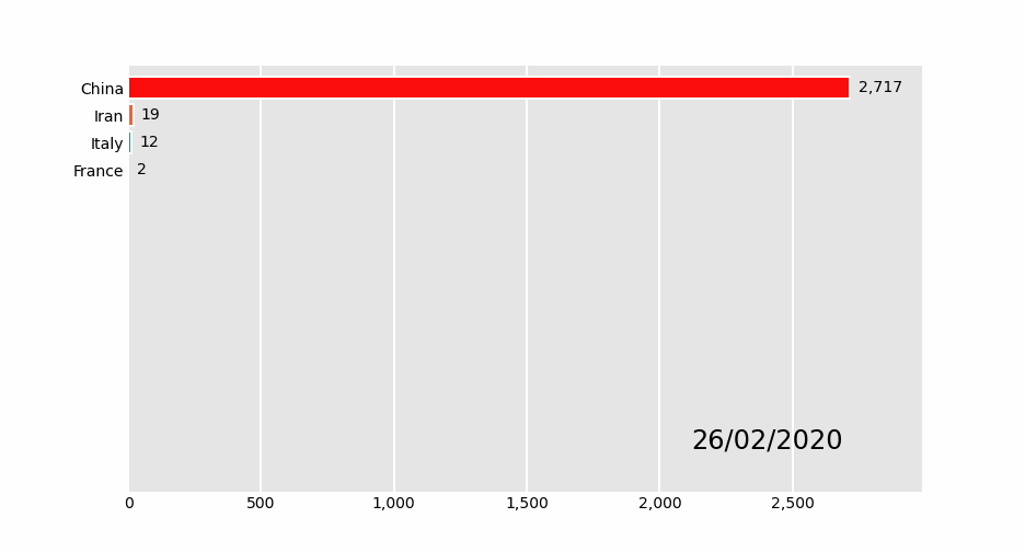
关于动态条形图,以前推荐过「Bar Chart Race」这个库。三行代码就能实现动态条形图的绘制。
有些同学在使用的时候,会出现一些错误。一个是加载文件报错,另一个是生成GIF的时候报错。
这是因为作者的示例是网络加载数据,会读取不到。通过读取本地文件,就不会出错。
GIF生成失败一般是需要安装imagemagick(图片处理工具)。
最近小F又发现一个可视化图库「Pandas_Alive」,不仅包含动态条形图,还可以绘制动态曲线图、气泡图、饼状图、地图等。
同样也是几行代码就能完成动态图表的绘制。
GitHub地址:
https://github.com/JackMcKew/pandas_alive
使用文档:https://jackmckew.github.io/pandas_alive/
安装版本建议是0.2.3,matplotlib版本是3.2.1。
同时需自行安装tqdm(显示进度条)和descartes(绘制地图相关库)。
要不然会出现报错,估计是作者的requestment.txt没包含这两个库。
好了,成功安装后就可以引入这个第三方库,直接选择加载本地文件。
import pandas_alive
import pandas as pd

covid_df = pd.read_csv( data/covid19.csv , index_col=0, parse_dates=[0])
covid_df.plot_animated(filename= examples/example-barh-chart.gif , n_visible=15)
生成了一个GIF图,具体如下。
刚开始学习这个库的时候,大家可以减少数据,这样生成GIF的时间就会快一些。
比如小F在接下来的实践中,基本都只选取了20天左右的数据。
对于其他图表,我们可以查看官方文档的API说明,得以了解。
下面我们就来看看其他动态图表的绘制方法吧!
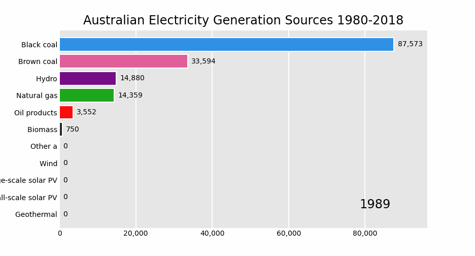
01 动态条形图
elec_df = pd.read_csv("data/Aus_Elec_Gen_1980_2018.csv", index_col=0, parse_dates=[0], thousands= , )
elec_df = elec_df.iloc[:20, :]
elec_df.fillna(0).plot_animated( examples/example-electricity-generated-australia.gif , period_fmt="%Y",
                                title= Australian Electricity Generation Sources 1980-2018 )
02 动态柱状图
covid_df = pd.read_csv( data/covid19.csv , index_col=0, parse_dates=[0])
covid_df.plot_animated(filename= examples/example-barv-chart.gif , orientation= v
, n_visible=15)
03 动态曲线图
covid_df = pd.read_csv( data/covid19.csv , index_col=0, parse_dates=[0])
covid_df.diff().fillna(0).plot_animated(filename= examples/example-line-chart.gif , kind= line , period_label={ x : 0.25,  y : 0.9})
04 动态面积图
covid_df = pd.read_csv( data/covid19.csv , index_col=0, parse_dates=[0])
covid_df.sum(axis=1).fillna(0).plot_animated(filename= examples/example-bar-chart.gif , kind= bar ,
        period_label={ x : 0.1,  y : 0.9},
        enable_progress_bar=True, steps_per_period=2, interpolate_period=True, period_length=200
)
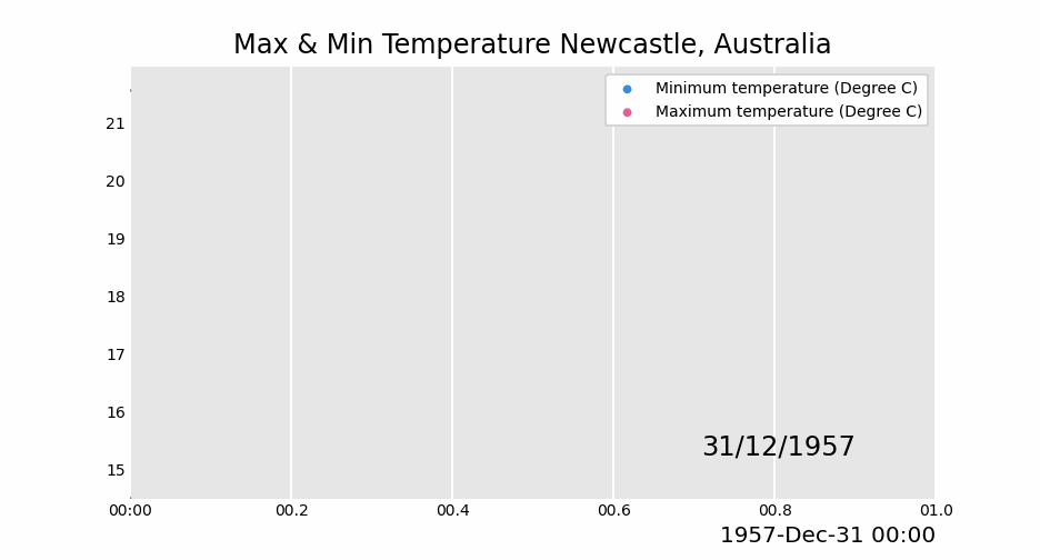
05 动态散点图
max_temp_df = pd.read_csv(
    "data/Newcastle_Australia_Max_Temps.csv",
    parse_dates={"Timestamp": ["Year", "Month", "Day"]},
)
min_temp_df = pd.read_csv(
    "data/Newcastle_Australia_Min_Temps.csv",
    parse_dates={"Timestamp": ["Year", "Month", "Day"]},
)

max_temp_df = max_temp_df.iloc[:5000, :]
min_temp_df = min_temp_df.iloc[:5000, :]

merged_temp_df = pd.merge_asof(max_temp_df, min_temp_df, on="Timestamp")
merged_temp_df.index = pd.to_datetime(merged_temp_df["Timestamp"].dt.strftime( %Y/%m/%d ))

keep_columns = ["Minimum temperature (Degree C)", "Maximum temperature (Degree C)"]
merged_temp_df[keep_columns].resample("Y").mean().plot_animated(filename= examples/example-scatter-chart.gif , kind="scatter",
                                                                title= Max & Min Temperature Newcastle, Australia )
06 动态饼状图
covid_df = pd.read_csv( data/covid19.csv , index_col=0, parse_dates=[0])
covid_df.plot_animated(filename= examples/example-pie-chart.gif , kind="pie",
                       rotatelabels=True, period_label={ x : 0,  y : 0})
07 动态气泡图
multi_index_df = pd.read_csv("data/multi.csv", header=[0, 1], index_col=0)
multi_index_df.index = pd.to_datetime(multi_index_df.index, dayfirst=True)

map_chart = multi_index_df.plot_animated(
    kind="bubble",
    filename="examples/example-bubble-chart.gif",
    x_data_label="Longitude",
    y_data_label="Latitude",
    size_data_label="Cases",
    color_data_label="Cases",
    vmax=5, steps_per_period=3, interpolate_period=True, period_length=500,
    dpi=100
)
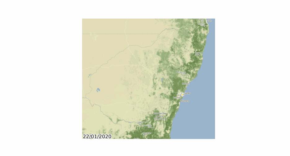
08 地理空间点图表
import geopandas
import pandas_alive
import contextily

gdf = geopandas.read_file( data/nsw-covid19-cases-by-postcode.gpkg )
gdf.index = gdf.postcode
gdf = gdf.drop( postcode ,axis=1)

result = gdf.iloc[:, :20]
result[ geometry ] = gdf.iloc[:, -1:][ geometry ]

map_chart = result.plot_animated(filename= examples/example-geo-point-chart.gif ,
                                 basemap_format={ source :contextily.providers.Stamen.Terrain})
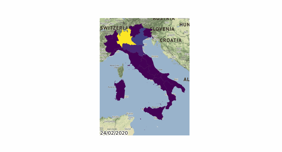
09 多边形地理图表
import geopandas
import pandas_alive
import contextily

gdf = geopandas.read_file( data/italy-covid-region.gpkg )
gdf.index = gdf.region
gdf = gdf.drop( region ,axis=1)

result = gdf.iloc[:, :20]
result[ geometry ] = gdf.iloc[:, -1:][ geometry ]

map_chart = result.plot_animated(filename= examples/example-geo-polygon-chart.gif ,
                                 basemap_format={ source : contextily.providers.Stamen.Terrain})
10 多个动态图表
covid_df = pd.read_csv( data/covid19.csv , index_col=0, parse_dates=[0])

animated_line_chart = covid_df.diff().fillna(0).plot_animated(kind= line , period_label=False,add_legend=False)
animated_bar_chart = covid_df.plot_animated(n_visible=10)

pandas_alive.animate_multiple_plots( examples/example-bar-and-line-chart.gif ,
                                    [animated_bar_chart, animated_line_chart], enable_progress_bar=True)
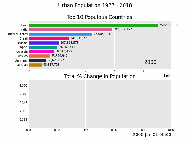
11 城市人口
def
population():
urban_df = pd.read_csv("data/urban_pop.csv", index_col=0, parse_dates=[0])
animated_line_chart = (
urban_df.sum(axis=1)
.pct_change()
.fillna(method= bfill )
.mul(100)
.plot_animated(kind="line", title="Total % Change in Population", period_label=False, add_legend=False)
)
animated_bar_chart = urban_df.plot_animated(n_visible=10, title= Top 10 Populous Countries , period_fmt="%Y")
pandas_alive.animate_multiple_plots( examples/example-bar-and-line-urban-chart.gif ,
[animated_bar_chart, animated_line_chart],
title= Urban Population 1977 - 2018 , adjust_subplot_top=0.85,
enable_progress_bar=True)
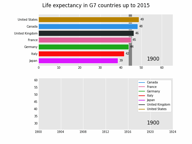
12 G7国家平均寿命
def life():
data_raw = pd.read_csv("data/long.csv")
list_G7 = [
"Canada",
"France",
"Germany",
"Italy",
"Japan",
"United Kingdom",
"United States",
]
data_raw = data_raw.pivot(
index="Year", columns="Entity", values="Life expectancy (Gapminder, UN)"
)
data = pd.DataFrame()
data["Year"] = data_raw.reset_index()["Year"]
for country in list_G7:
data[country] = data_raw[country].values
data = data.fillna(method="pad")
data = data.fillna(0)
data = data.set_index("Year").loc[1900:].reset_index()
data["Year"] = pd.to_datetime(data.reset_index()["Year"].astype(str))
data = data.set_index("Year")
data = data.iloc[:25, :]
animated_bar_chart = data.plot_animated(
period_fmt="%Y", perpendicular_bar_func="mean", period_length=200, fixed_max=True
)
animated_line_chart = data.plot_animated(
kind="line", period_fmt="%Y", period_length=200, fixed_max=True
)
pandas_alive.animate_multiple_plots(
"examples/life-expectancy.gif",
plots=[animated_bar_chart, animated_line_chart],
title="Life expectancy in G7 countries up to 2015",
adjust_subplot_left=0.2, adjust_subplot_top=0.9, enable_progress_bar=True
)
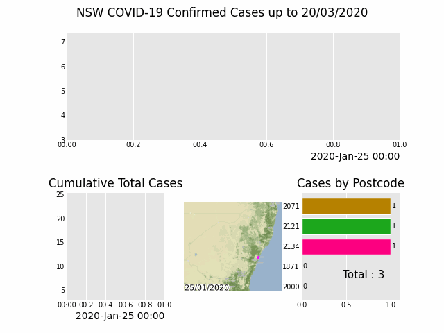
13 新南威尔斯州COVID可视化
def nsw():
import geopandas
import pandas as pd
import pandas_alive
import contextily
import matplotlib.pyplot as plt
import json
with open( data/package_show.json , r , encoding= utf8 )as fp:
data = json.load(fp)
# Extract url to csv component
covid_nsw_data_url = data["result"]["resources"][0]["url"]
print(covid_nsw_data_url)
# Read csv from data API url
nsw_covid = pd.read_csv( data/confirmed_cases_table1_location.csv )
postcode_dataset = pd.read_csv("data/postcode-data.csv")
# Prepare data from NSW health dataset
nsw_covid = nsw_covid.fillna(9999)
nsw_covid["postcode"] = nsw_covid["postcode"].astype(int)
grouped_df = nsw_covid.groupby(["notification_date", "postcode"]).size()
grouped_df = pd.DataFrame(grouped_df).unstack()
grouped_df.columns = grouped_df.columns.droplevel().astype(str)
grouped_df = grouped_df.fillna(0)
grouped_df.index = pd.to_datetime(grouped_df.index)
cases_df = grouped_df
# Clean data in postcode dataset prior to matching
grouped_df = grouped_df.T
postcode_dataset = postcode_dataset[postcode_dataset[ Longitude ].notna()]
postcode_dataset = postcode_dataset[postcode_dataset[ Longitude ] != 0]
postcode_dataset = postcode_dataset[postcode_dataset[ Latitude ].notna()]
postcode_dataset = postcode_dataset[postcode_dataset[ Latitude ] != 0]
postcode_dataset[ Postcode ] = postcode_dataset[ Postcode ].astype(str)
# Build GeoDataFrame from Lat Long dataset and make map chart
grouped_df[ Longitude ] = grouped_df.index.map(postcode_dataset.set_index( Postcode )[ Longitude ].to_dict())
grouped_df[ Latitude ] = grouped_df.index.map(postcode_dataset.set_index( Postcode )[ Latitude ].to_dict())
gdf = geopandas.GeoDataFrame(
grouped_df, geometry=geopandas.points_from_xy(grouped_df.Longitude, grouped_df.Latitude), crs="EPSG:4326")
gdf = gdf.dropna()
# Prepare GeoDataFrame for writing to geopackage
gdf = gdf.drop([ Longitude , Latitude ], axis=1)
gdf.columns = gdf.columns.astype(str)
gdf[ postcode ] = gdf.index
# gdf.to_file("data/nsw-covid19-cases-by-postcode.gpkg", layer= nsw-postcode-covid , driver="GPKG")
# Prepare GeoDataFrame for plotting
gdf.index = gdf.postcode
gdf = gdf.drop( postcode , axis=1)
gdf = gdf.to_crs("EPSG:3857") # Web Mercator
result = gdf.iloc[:, :22]
result[ geometry ] = gdf.iloc[:, -1:][ geometry ]
gdf = result
map_chart = gdf.plot_animated(basemap_format={ source : contextily.providers.Stamen.Terrain}, cmap= cool )
# cases_df.to_csv( data/nsw-covid-cases-by-postcode.csv )
cases_df = cases_df.iloc[:22, :]
from datetime import datetime
bar_chart = cases_df.sum(axis=1).plot_animated(
kind= line ,
label_events={
Ruby Princess Disembark : datetime.strptime("19/03/2020", "%d/%m/%Y"),
# Lockdown : datetime.strptime("31/03/2020", "%d/%m/%Y")
},
fill_under_line_color="blue",
add_legend=False
)
map_chart.ax.set_title( Cases by Location )
grouped_df = pd.read_csv( data/nsw-covid-cases-by-postcode.csv , index_col=0, parse_dates=[0])
grouped_df = grouped_df.iloc[:22, :]
line_chart = (
grouped_df.sum(axis=1)
.cumsum()
.fillna(0)
.plot_animated(kind="line", period_label=False, title="Cumulative Total Cases", add_legend=False)
)
def current_total(values):
total = values.sum()
s = f Total : {int(total)}
return { x : .85, y : .2, s : s, ha : right , size : 11}
race_chart = grouped_df.cumsum().plot_animated(
n_visible=5, title="Cases by Postcode", period_label=False, period_summary_func=current_total
)
import time
timestr = time.strftime("%d/%m/%Y")
plots = [bar_chart, line_chart, map_chart, race_chart]
from matplotlib import rcParams
rcParams.update({"figure.autolayout": False})
# make sure figures are `Figure()` instances
figs = plt.Figure()
gs = figs.add_gridspec(2, 3, hspace=0.5)
f3_ax1 = figs.add_subplot(gs[0, :])
f3_ax1.set_title(bar_chart.title)
bar_chart.ax = f3_ax1
f3_ax2 = figs.add_subplot(gs[1, 0])
f3_ax2.set_title(line_chart.title)
line_chart.ax = f3_ax2
f3_ax3 = figs.add_subplot(gs[1, 1])
f3_ax3.set_title(map_chart.title)
map_chart.ax = f3_ax3
f3_ax4 = figs.add_subplot(gs[1
, 2])
f3_ax4.set_title(race_chart.title)
race_chart.ax = f3_ax4
timestr = cases_df.index.max().strftime("%d/%m/%Y")
figs.suptitle(f"NSW COVID-19 Confirmed Cases up to {timestr}")
pandas_alive.animate_multiple_plots(
examples/nsw-covid.gif ,
plots,
figs,
enable_progress_bar=True
)
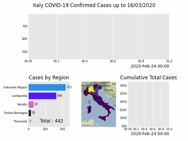
14 意大利COVID可视化
def italy():
import geopandas
import pandas as pd
import pandas_alive
import contextily
import matplotlib.pyplot as plt
region_gdf = geopandas.read_file( data/geo-data/italy-with-regions )
region_gdf.NOME_REG = region_gdf.NOME_REG.str.lower().str.title()
region_gdf = region_gdf.replace( Trentino-Alto Adige/Sudtirol , Trentino-Alto Adige )
region_gdf = region_gdf.replace("Valle D Aosta/Vallée D Aoste
Valle D Aosta/Vallée D Aoste", "Valle d Aosta")
italy_df = pd.read_csv( data/Regional Data - Sheet1.csv , index_col=0, header=1, parse_dates=[0])
italy_df = italy_df[italy_df[ Region ] != NA ]
cases_df = italy_df.iloc[:, :3]
cases_df[ Date ] = cases_df.index
pivoted = cases_df.pivot(values= New positives , index= Date , columns= Region )
pivoted.columns = pivoted.columns.astype(str)
pivoted = pivoted.rename(columns={ nan : Unknown Region })
cases_gdf = pivoted.T
cases_gdf[ geometry ] = cases_gdf.index.map(region_gdf.set_index( NOME_REG
)[ geometry ].to_dict())
cases_gdf = cases_gdf[cases_gdf[ geometry ].notna()]
cases_gdf = geopandas.GeoDataFrame(cases_gdf, crs=region_gdf.crs, geometry=cases_gdf.geometry)
gdf = cases_gdf
result = gdf.iloc[:, :22]
result[ geometry ] = gdf.iloc[:, -1:][ geometry ]
gdf = result
map_chart = gdf.plot_animated(basemap_format={ source : contextily.providers.Stamen.Terrain}, cmap= viridis )
cases_df = pivoted
cases_df = cases_df.iloc[:22, :]
from datetime import datetime
bar_chart = cases_df.sum(axis=1).plot_animated(
kind= line ,
label_events={
Schools Close : datetime.strptime("4/03/2020", "%d/%m/%Y"),
Phase I Lockdown : datetime.strptime("11/03/2020", "%d/%m/%Y"),
# 1M Global Cases : datetime.strptime("02/04/2020", "%d/%m/%Y"),
# 100k Global Deaths : datetime.strptime("10/04/2020", "%d/%m/%Y"),
# Manufacturing Reopens : datetime.strptime("26/04/2020", "%d/%m/%Y"),
# Phase II Lockdown : datetime.strptime("4/05/2020", "%d/%m/%Y"),
},
fill_under_line_color="blue",
add_legend=False
)
map_chart.ax.set_title( Cases by Location )
line_chart = (
cases_df.sum(axis=1)
.cumsum()
.fillna(0)
.plot_animated(kind="line", period_label=False, title="Cumulative Total Cases", add_legend=False)
)
def current_total(values):
total = values.sum()
s = f Total : {int(total)}
return { x : .85, y : .1, s : s, ha : right , size : 11}
race_chart = cases_df.cumsum().plot_animated(
n_visible=5, title="Cases by Region", period_label=False, period_summary_func=current_total
)
import time
timestr = time.strftime("%d/%m/%Y")
plots = [bar_chart, race_chart, map_chart, line_chart]
# Otherwise titles overlap and adjust_subplot does nothing
from matplotlib import rcParams
from matplotlib.animation import FuncAnimation
rcParams.update({"figure.autolayout": False})
# make sure figures are `Figure()` instances
figs = plt.Figure()
gs = figs.add_gridspec(2, 3, hspace=0.5)
f3_ax1 = figs.add_subplot(gs[0, :])
f3_ax1.set_title(bar_chart.title)
bar_chart.ax = f3_ax1
f3_ax2 = figs.add_subplot(gs[1, 0])
f3_ax2.set_title(race_chart.title)
race_chart.ax = f3_ax2
f3_ax3 = figs.add_subplot(gs[1, 1])
f3_ax3.set_title(map_chart.title)
map_chart.ax = f3_ax3
f3_ax4 = figs.add_subplot(gs[1, 2])
f3_ax4.set_title(line_chart.title)
line_chart.ax = f3_ax4
axes = [f3_ax1, f3_ax2, f3_ax3, f3_ax4]
timestr = cases_df.index.max().strftime("%d/%m/%Y")
figs.suptitle(f"Italy COVID-19 Confirmed Cases up to {timestr}")
pandas_alive.animate_multiple_plots(
examples/italy-covid.gif ,
plots,
figs,
enable_progress_bar=True
)
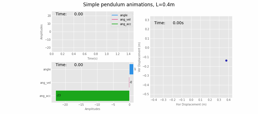
15 单摆运动
def simple():
import pandas as pd
import matplotlib.pyplot as plt
import pandas_alive
import numpy as np
# Physical constants
g = 9.81
L = .4
mu = 0.2
THETA_0 = np.pi * 70 / 180
# init angle = 70degs
THETA_DOT_0 = 0 # no init angVel
DELTA_T = 0.01 # time stepping
T = 1.5 # time period
# Definition of ODE (ordinary differential equation)
def get_theta_double_dot(theta, theta_dot):
return -mu * theta_dot - (g / L) * np.sin(theta)
# Solution to the differential equation
def pendulum(t):
# initialise changing values
theta = THETA_0
theta_dot = THETA_DOT_0
delta_t = DELTA_T
ang = []
ang_vel = []
ang_acc = []
times = []
for time in np.arange(0, t, delta_t):
theta_double_dot = get_theta_double_dot(
theta, theta_dot
)
theta += theta_dot * delta_t
theta_dot += theta_double_dot * delta_t
times.append(time)
ang.append(theta)
ang_vel.append(theta_dot)
ang_acc.append(theta_double_dot)
data = np.array([ang, ang_vel, ang_acc])
return pd.DataFrame(data=data.T, index=np.array(times), columns=["angle", "ang_vel", "ang_acc"])
# units used for ref: ["angle [rad]", "ang_vel [rad/s]", "ang_acc [rad/s^2]"]
df = pendulum(T)
df.index.names = ["Time (s)"]
print(df)
# generate dataFrame for animated bubble plot
df2 = pd.DataFrame(index=df.index)
df2["dx (m)"] = L * np.sin(df["angle"])
df2["dy (m)"] = -L * np.cos(df["angle"])
df2["ang_vel"] = abs(df["ang_vel"])
df2["size"] = df2["ang_vel"] * 100 # scale angular vels to get nice size on bubble plot
print(df2)
# static pandas plots
#
# print(plt.style.available)
# NOTE: 2 lines below required in Jupyter to switch styles correctly
plt.rcParams.update(plt.rcParamsDefault)
plt.style.use("ggplot") # set plot style
fig, (ax1a, ax2b) = plt.subplots(1, 2, figsize=(8, 4), dpi=100) # 1 row, 2 subplots
# fig.subplots_adjust(wspace=0.1) # space subplots in row
fig.set_tight_layout(True)
fontsize = "small"
df.plot(ax=ax1a).legend(fontsize=fontsize)
ax1a.set_title("Outputs vs Time", fontsize="medium")
ax1a.set_xlabel( Time [s] , fontsize=fontsize)
ax1a.set_ylabel( Amplitudes , fontsize=fontsize);
df.plot(ax=ax2b, x="angle", y=["ang_vel", "ang_acc"]).legend(fontsize=fontsize)
ax2b.set_title("Outputs vs Angle | Phase-Space", fontsize="medium")
ax2b.set_xlabel( Angle [rad] , fontsize=fontsize)
ax2b.set_ylabel( Angular Velocity / Acc , fontsize=fontsize)
# sample scatter plot with colorbar
fig, ax = plt.subplots()
sc = ax.scatter(df2["dx (m)"], df2["dy (m)"], s=df2["size"] * .1, c=df2["ang_vel"], cmap="jet")
cbar = fig.colorbar(sc)
cbar.set_label(label="ang_vel [rad/s]", fontsize="small")
# sc.set_clim(350, 400)
ax.tick_params(labelrotation=0, labelsize="medium")
ax_scale = 1.
ax.set_xlim(-L * ax_scale, L * ax_scale)
ax.set_ylim(-L * ax_scale - 0.1, L * ax_scale - 0.1)
# make axes square: a circle shows as a circle
ax.set_aspect(1 / ax.get_data_ratio())
ax.arrow(0, 0, df2["dx (m)"].iloc[-1], df2["dy (m)"].iloc[-1],
color="dimgray", ls=":", lw=2.5, width=.0, head_width=0, zorder=-1
)
ax.text(0, 0.15, s="size and colour of pendulum bob
based on pd column
for angular velocity",
ha= center , va= center )
# plt.show()
dpi = 100
ax_scale = 1.1
figsize = (3, 3)
fontsize = "small"
# set up figure to pass onto `pandas_alive`
# NOTE: by using Figure (capital F) instead of figure() `FuncAnimation` seems to run twice as fast!
# fig1, ax1 = plt.subplots()
fig1 = plt.Figure()
ax1 = fig1.add_subplot()
fig1.set_size_inches(figsize)
ax1.set_title("Simple pendulum animation, L=" + str(L) + "m", fontsize="medium")
ax1.set_xlabel("Time (s)", color= dimgray , fontsize=fontsize)
ax1.set_ylabel("Amplitudes", color= dimgray , fontsize=fontsize)
ax1.tick_params(labelsize=fontsize)
# pandas_alive
line_chart = df.plot_animated(filename="pend-line.gif", kind= line , period_label={ x : 0.05, y : 0.9},
steps_per_period=1, interpolate_period=False, period_length=50,
period_fmt= Time:{x:10.2f} ,
enable_progress_bar=True, fixed_max=True, dpi=100, fig=fig1
)
plt.close()
# Video( examples/pend-line.mp4 , html_attributes="controls muted autoplay")
# set up and generate animated scatter plot
#
# set up figure to pass onto `pandas_alive`
# NOTE: by using Figure (capital F) instead of figure() `FuncAnimation` seems to run twice as fast!
fig1sc = plt.Figure()
ax1sc = fig1sc.add_subplot()
fig1sc.set_size_inches(figsize)
ax1sc.set_title("Simple pendulum animation, L=" + str(L) + "m", fontsize="medium")
ax1sc.set_xlabel("Time (s)", color= dimgray , fontsize=fontsize)
ax1sc.set_ylabel("Amplitudes", color= dimgray , fontsize=fontsize)
ax1sc.tick_params(labelsize=fontsize)
# pandas_alive
scatter_chart = df.plot_animated(filename="pend-scatter.gif", kind= scatter , period_label={ x : 0.05, y : 0.9},
steps_per_period=1, interpolate_period=False, period_length=50,
period_fmt= Time:{x:10.2f} ,
enable_progress_bar=True, fixed_max=True, dpi=100, fig=fig1sc, size=
"ang_vel"
)
plt.close()
print("Points size follows one of the pd columns: ang_vel")
# Video( ./pend-scatter.gif , html_attributes="controls muted autoplay")
# set up and generate animated bar race chart
#
# set up figure to pass onto `pandas_alive`
# NOTE: by using Figure (capital F) instead of figure() `FuncAnimation` seems to run twice as fast!
fig2 = plt.Figure()
ax2 = fig2.add_subplot()
fig2.set_size_inches(figsize)
ax2.set_title("Simple pendulum animation, L=" + str(L) + "m", fontsize="medium")
ax2.set_xlabel("Amplitudes", color= dimgray , fontsize=fontsize)
ax2.set_ylabel("", color= dimgray , fontsize="x-small")
ax2.tick_params(labelsize=fontsize)
# pandas_alive
race_chart = df.plot_animated(filename="pend-race.gif", kind= race , period_label={ x : 0.05, y : 0.9},
steps_per_period=1, interpolate_period=False, period_length=50,
period_fmt= Time:{x:10.2f} ,
enable_progress_bar=True, fixed_max=False, dpi=100, fig=fig2
)
plt.close()
# set up and generate bubble animated plot
#
# set up figure to pass onto `pandas_alive`
# NOTE: by using Figure (capital F) instead of figure() `FuncAnimation` seems to run twice as fast!
fig3 = plt.Figure()
ax3 = fig3.add_subplot()
fig3.set_size_inches(figsize)
ax3.set_title("Simple pendulum animation, L=" + str(L) + "m", fontsize="medium")
ax3.set_xlabel("Hor Displacement (m)", color= dimgray , fontsize=fontsize)
ax3.set_ylabel("Ver Displacement (m)", color= dimgray , fontsize=fontsize)
# limits & ratio below get the graph square
ax3.set_xlim(-L * ax_scale, L * ax_scale)
ax3.set_ylim(-L * ax_scale - 0.1, L * ax_scale - 0.1)
ratio = 1. # this is visual ratio of axes
ax3.set_aspect(ratio / ax3.get_data_ratio())
ax3.arrow(0, 0, df2["dx (m)"].iloc[-1], df2["dy (m)"
].iloc[-1],
color="dimgray", ls=":", lw=1, width=.0, head_width=0, zorder=-1)
# pandas_alive
bubble_chart = df2.plot_animated(
kind="bubble", filename="pend-bubble.gif",
x_data_label="dx (m)", y_data_label="dy (m)",
size_data_label="size", color_data_label="ang_vel", cmap="jet",
period_label={ x : 0.05, y : 0.9}, vmin=None, vmax=None,
steps_per_period=1, interpolate_period=False, period_length=50, period_fmt= Time:{x:10.2f}s ,
enable_progress_bar=True, fixed_max=False, dpi=dpi, fig=fig3
)
plt.close()
print("Bubble size & colour animates with pd data column for ang_vel.")
# Combined plots
#
fontsize = "x-small"
# Otherwise titles overlap and subplots_adjust does nothing
from matplotlib import rcParams
rcParams.update({"figure.autolayout": False})
figs = plt.Figure(figsize=(9, 4), dpi=100)
figs.subplots_adjust(wspace=0.1)
gs = figs.add_gridspec(2, 2)
ax1 = figs.add_subplot(gs[0, 0])
ax1.set_xlabel("Time(s)", color= dimgray , fontsize=fontsize)
ax1.set_ylabel("Amplitudes", color= dimgray , fontsize=fontsize)
ax1.tick_params(labelsize=fontsize)
ax2 = figs.add_subplot(gs[1, 0])
ax2.set_xlabel("Amplitudes", color= dimgray , fontsize=fontsize)
ax2.set_ylabel("", color= dimgray , fontsize=fontsize)
ax2.tick_params(labelsize=fontsize)
ax3 = figs.add_subplot(gs[:, 1])
ax3.set_xlabel("Hor Displacement (m)", color= dimgray , fontsize=fontsize)
ax3.set_ylabel("Ver Displacement (m)", color= dimgray , fontsize=fontsize)
ax3.tick_params(labelsize=fontsize)
# limits & ratio below get the graph square
ax3.set_xlim(-L * ax_scale, L * ax_scale)
ax3.set_ylim(-L * ax_scale - 0.1, L * ax_scale - 0.1)
ratio = 1. # this is visual ratio of axes
ax3.set_aspect(ratio / ax3.get_data_ratio())
line_chart.ax = ax1
race_chart.ax = ax2
bubble_chart.ax = ax3
plots = [line_chart, race_chart, bubble_chart]
# pandas_alive combined using custom figure
pandas_alive.animate_multiple_plots(
filename= pend-combined.gif , plots=plots, custom_fig=figs, dpi=100, enable_progress_bar=True,
adjust_subplot_left=0.2, adjust_subplot_right=None,
title="Simple pendulum animations, L=" + str(L) + "m", title_fontsize="medium"
)
plt.close()
最后如果你想完成中文动态图表的制作,加入中文显示代码即可。
# 中文显示
plt.rcParams[ font.sans-serif ] = [ SimHei ]  # Windows
plt.rcParams[ font.sans-serif ] = [ Hiragino Sans GB ] # Mac
plt.rcParams[ axes.unicode_minus ] = False

# 读取数据
df_result = pd.read_csv( data/yuhuanshui.csv , index_col=0, parse_dates=[0])
# 生成图表
animated_line_chart = df_result.diff().fillna(0).plot_animated(kind= line , period_label=False, add_legend=False)
animated_bar_chart = df_result.plot_animated(n_visible=10)
pandas_alive.animate_multiple_plots( examples/yuhuanshui.gif ,
                                    [animated_bar_chart, animated_line_chart], enable_progress_bar=True,
                                    title= 我是余欢水演职人员热度排行 )
还是使用演员的百度指数数据。
公众号回复「动态图」,即可获取使用到的CSV文件及相关代码。
福利时间
奖品:《Python人工智能开发从入门到精通》x 4
参与方式:文末留言(字数不少于5),赞数最多的4位为本次中奖者
备注:如有问题,请添加小助手微信:MLAPython,备注(姓名-单位-研究方向)