1、单组折线图2、多组折线图3、单组条形图4、多组条形图5、堆积条形图6、水平堆积条形图7、直方图8、分面直方图9、箱图10、面积图11、堆积面积图12、散点图13、单组饼图14、多组饼图15、分面图16、hexbin图17、andrews_curves图18、核密度图19、parallel_coordinates图20、autocorrelation_plot图21、radviz图22、bootstrap_plot图23、子图(subplot)24、子图任意排列25、图中绘制数据表格27、更多pandas可视化精进资料
pandas可视化主要依赖下面两个函数:
https://pandas.pydata.org/pandas-docs/stable/reference/api/pandas.DataFrame.plot.html?highlight=plot#pandas.DataFrame.plot
https://pandas.pydata.org/pandas-docs/stable/reference/api/pandas.Series.plot.html?highlight=plot#pandas.Series.plot
可绘制下面几种图,注意Dataframe和Series的细微差异:'area', 'bar', 'barh', 'box', 'density', 'hexbin', 'hist', 'kde', 'line', 'pie', 'scatter'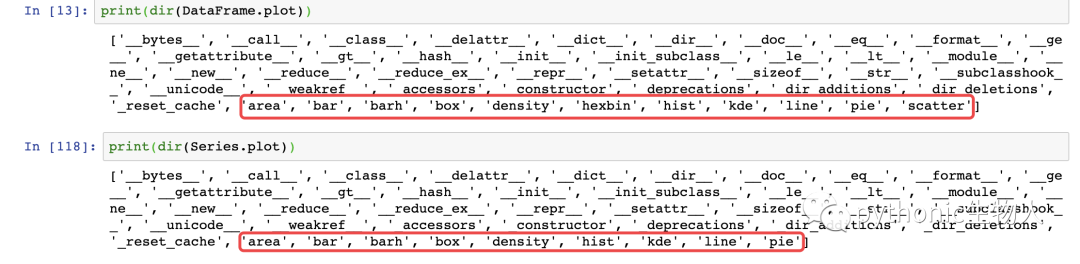 导入依赖包
导入依赖包
import matplotlib.pyplot as plt
import numpy as np
import pandas as pd
from pandas import DataFrame,Series
plt.style.use('dark_background')#设置绘图风格
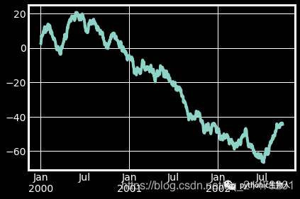
1、单组折线图
np.random.seed(0)#使得每次生成的随机数相同
ts = pd.Series(np.random.randn(1000), index=pd.date_range("1/1/2000", periods=1000))
ts1 = ts.cumsum()#累加
ts1.plot(kind="line")#默认绘制折线图
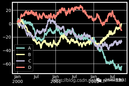
2、多组折线图
np.random.seed(0)
df = pd.DataFrame(np.random.randn(1000, 4), index=ts.index, columns=list("ABCD"))
df = df.cumsum()
df.plot()#默认绘制折线图
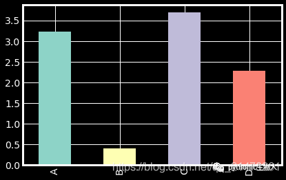
3、单组条形图
df.iloc[5].plot(kind="bar")
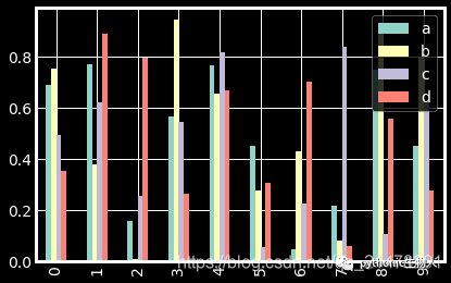
4、多组条形图
df2 = pd.DataFrame(np.random.rand(10, 4), columns=["a", "b", "c", "d"])
df2.plot.bar()
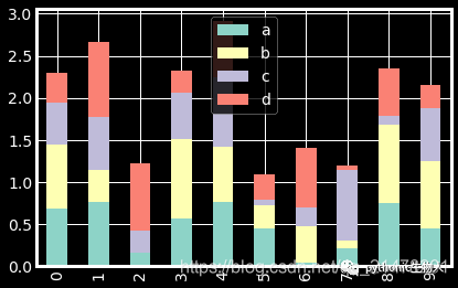
5、堆积条形图
df2.plot.bar(stacked=True)
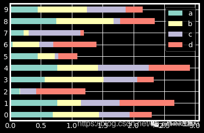
6、水平堆积条形图
df2.plot.barh(stacked=True)
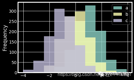
7、直方图
df4 = pd.DataFrame(
    {
        "a": np.random.randn(1000) + 1,
        "b": np.random.randn(1000),
        "c": np.random.randn(1000) - 1,
    },
    columns=["a", "b", "c"],
)
df4.plot.hist(alpha=0.8)
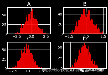
8、分面直方图
df.diff().hist(color="r", alpha=0.9, bins=50)
9、箱图
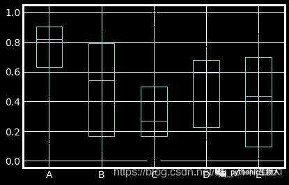
df = pd.DataFrame(np.random.rand(10, 5), columns=["A", "B", "C", "D", "E"])
df.plot.box()
10、面积图
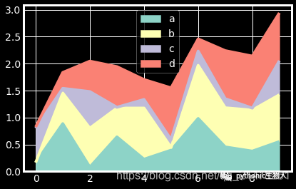
df = pd.DataFrame(np.random.rand(10, 4), columns=["a", "b", "c", "d"])
df.plot.area()
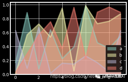
11、堆积面积图
df.plot.area(stacked=False)
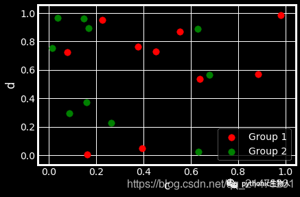
12、散点图
ax = df.plot.scatter(x="a", y="b", color="r", label="Group 1",s=90)
df.plot.scatter(x="c", y="d", color="g", label="Group 2", ax=ax,s=90)
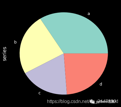
13、单组饼图
series = pd.Series(3 * np.random.rand(4), index=["a", "b", "c", "d"], name="series")
series.plot.pie(figsize=(6, 6))
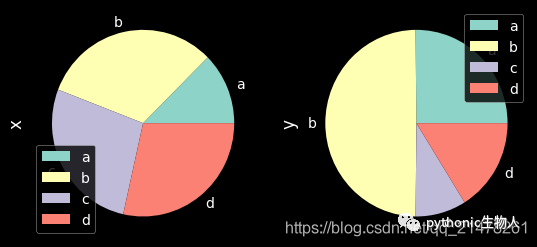
14、多组饼图
df = pd.DataFrame(
    3 * np.random.rand(4, 2), index=["a", "b", "c", "d"], columns=["x", "y"]
)
df.plot.pie(subplots=True, figsize=(8, 4))
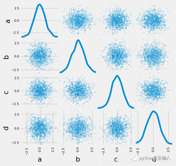
15、分面图
import matplotlib as mpl
mpl.rc_file_defaults()
plt.style.use('fivethirtyeight')
from pandas.plotting import scatter_matrix
df = pd.DataFrame(np.random.randn(1000, 4), columns=["a", "b", "c", "d"])
scatter_matrix(df, alpha=0.2, figsize=(6, 6), diagonal="kde")
plt.show()
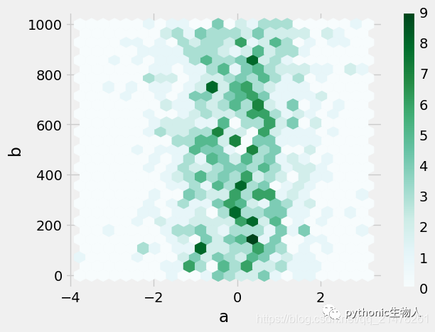
16、hexbin图
df = pd.DataFrame(np.random.randn(1000, 2), columns=["a", "b"])
df["b"] = df["b"] + np.arange(1000)
df.plot.hexbin(x="a", y="b", gridsize=25)
17、andrews_curves图
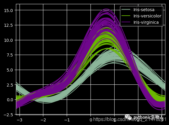
from pandas.plotting import andrews_curves
mpl.rc_file_defaults()
data = pd.read_csv("iris.data.txt")
plt.style.use('dark_background')
andrews_curves(data, "Name")
18、核密度图
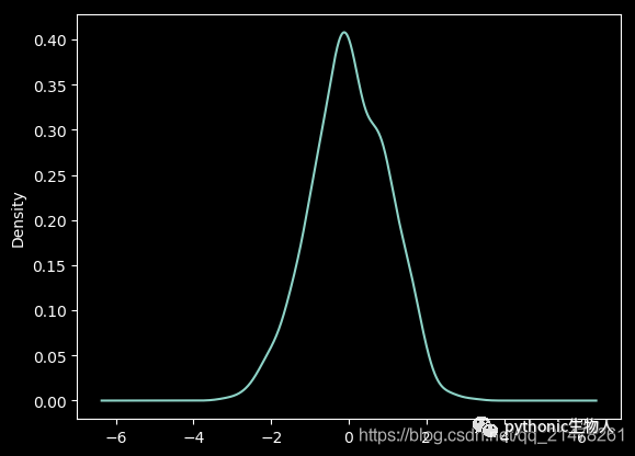
ser = pd.Series(np.random.randn(1000))
ser.plot.kde()
19、parallel_coordinates图
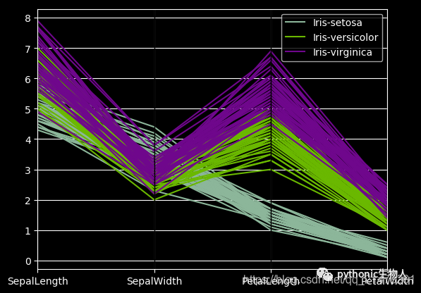
from pandas.plotting import parallel_coordinates
data = pd.read_csv("iris.data.txt")
plt.figure()
parallel_coordinates(data, "Name")
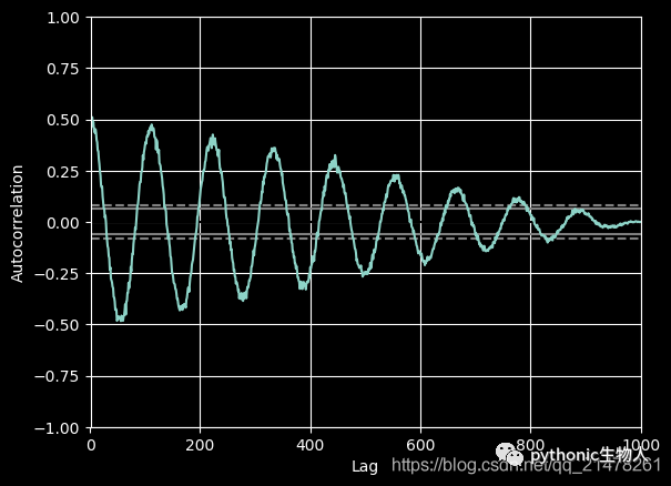
20、autocorrelation_plot图
from pandas.plotting import autocorrelation_plot
plt.figure();
spacing = np.linspace(-9 * np.pi, 9 * np.pi, num=1000)
data = pd.Series(0.7 * np.random.rand(1000) + 0.3 * np.sin(spacing))
autocorrelation_plot(data)
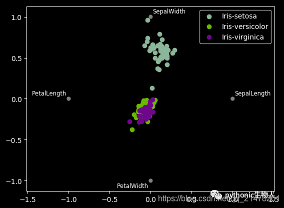
21、radviz图
from pandas.plotting import radviz
data = pd.read_csv("iris.data.txt")
plt.figure()
radviz(data, "Name")
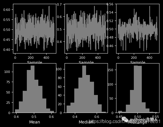
22、bootstrap_plot图
from pandas.plotting import bootstrap_plot
data = pd.Series(np.random.rand(1000))
bootstrap_plot(data, size=50, samples=500, color="grey")
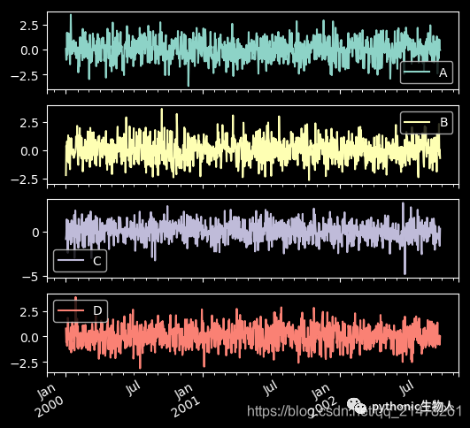
23、子图(subplot)
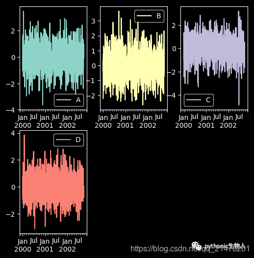
df = pd.DataFrame(np.random.randn(1000, 4), index=ts.index, columns=list("ABCD"))
df.plot(subplots=True, figsize=(6, 6))
24、子图任意排列
df.plot(subplots=True, layout=(2, 3), figsize=(6, 6
), sharex=False)
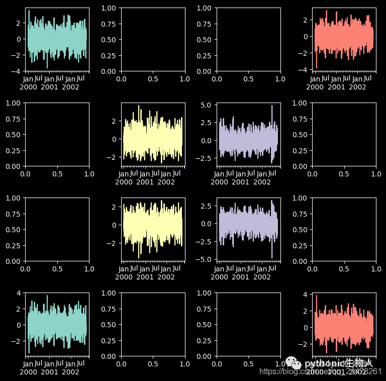
fig, axes = plt.subplots(4, 4, figsize=(9, 9))
plt.subplots_adjust(wspace=0.5, hspace=0.5)
target1 = [axes[0][0], axes[1][1], axes[2][2], axes[3][3]]
target2 = [axes[3][0], axes[2][1], axes[1][2], axes[0][3]]
df.plot(subplots=True, ax=target1, legend=False, sharex=False, sharey=False);
(-df).plot(subplots=True, ax=target2, legend=False, sharex=False, sharey=False)
25、图中绘制数据表格
from pandas.plotting import table
mpl.rc_file_defaults()
#plt.style.use('dark_background')
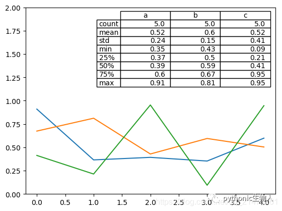
fig, ax = plt.subplots(1, 1)
table(ax, np.round(df.describe(), 2), loc="upper right", colWidths=[0.2, 0.2, 0.2]);
df.plot(ax=ax, ylim=(0, 2), legend=None);
27、更多pandas可视化精进资料
https://pandas.pydata.org/pandas-docs/stable/user_guide/cookbook.html#cookbook-plotting